Building the Grid in Pure CSS
A page built on a 2013-era framework announced its layout in every tag:
class="col-xs-12 col-sm-6 col-md-4" on card after card, one class per
element per breakpoint, with a framework stylesheet along for the ride to
make the classes mean something. The modern equivalent of that entire
apparatus is roughly twenty lines of CSS you can read in one sitting.
A css grid system in modern CSS is a set of custom properties carrying the per-breakpoint decisions — column count, gutter, margin — re-declared inside media queries, plus three classes that consume them: a container that caps and centers the page, a grid that lays out the columns, and span classes that let elements claim column widths. No framework dependency, no build step; the browser’s own layout engine does the work the framework used to simulate.
This article walks that code line by line: the variable layer, the three
classes, the minmax(0, 1fr) gotcha, and the one-line clamping trick that
replaces per-breakpoint class soup. It is the implementation half of the
layout grid topic — what the columns, gutters and
breakpoints should be is the rest of the cluster’s job.
How is the grid split between variables and classes?
The architecture has exactly two layers, and the split is the point.
The variables are the design decisions. --grid-cols, --grid-gutter
and --grid-margin hold one tier’s values at a time: 4 / 16px / 16px on
phones, re-declared to 8 / 24px / 29px from 768px and 12 / 24px / 66px
from 1200px. --container holds the
global cap.
Those few numbers per tier
are the entire layout policy — everything a team actually decides
when it decides “the grid”.
The classes are the mechanics. .grid-container, .grid and the
.col-N spans contain no number of their own; they only read the
variables. The mechanics are written once and rarely touched again — a
redesign or a new breakpoint changes only the :root blocks.
If you work with design tokens, the parallel is exact: the variables are layout tokens at runtime. The same columns/gutter/margin values that live in a token file’s layout section become custom properties here, and the classes play the role components play everywhere else in a token system — consumers of decisions, never owners of them.
What does the complete grid CSS look like?
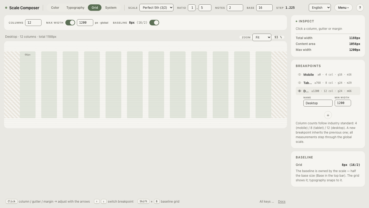
This is the shape of Scale Composer’s CSS export for its default grid, annotated:
/* Grid tokens
 * Global max-width: 1200px
 * Mobile:  ≥0px    →  4 cols · gutter 16px · margin 16px
 * Tablet:  ≥768px  →  8 cols · gutter 24px · margin 29px
 * Desktop: ≥1200px → 12 cols · gutter 24px · margin 66px
 */

:root {                       /* the mobile tier is the default */
  --container: 1200px;
  --grid-cols: 4;
  --grid-gutter: 16px;
  --grid-margin: 16px;
}

@media (min-width: 768px) {   /* tablet re-declares the decisions */
  :root {
    --grid-cols: 8;
    --grid-gutter: 24px;
    --grid-margin: 29px;
  }
}

@media (min-width: 1200px) {  /* desktop re-declares them again */
  :root {
    --grid-cols: 12;
    --grid-gutter: 24px;
    --grid-margin: 66px;
  }
}

.grid-container {             /* caps and centers the page */
  max-width: var(--container);
  margin-inline: auto;
  padding-inline: var(--grid-margin);
}

.grid {                       /* lays out the columns */
  display: grid;
  grid-template-columns: repeat(var(--grid-cols), minmax(0, 1fr));
  gap: var(--grid-gutter);
}

/* Spans — clamped to the current tier's column count */
.col-1  { grid-column: span min(1, var(--grid-cols)); }
.col-2  { grid-column: span min(2, var(--grid-cols)); }
/* … .col-3 through .col-11 follow the same pattern … */
.col-12 { grid-column: span min(12, var(--grid-cols)); }
The three classes divide the labor cleanly. .grid-container owns the
page frame: max-width caps it, margin-inline: auto centers it,
padding-inline keeps content off the viewport edge by the tier’s margin.
.grid owns the columns: repeat(var(--grid-cols), minmax(0, 1fr))
creates equal fluid tracks and gap places the gutter between them — the
basic mechanics of CSS Grid
handle all of the arithmetic. The .col-N classes own nothing but a
claim: span N columns, whatever a
column currently is.
Open this export, annotated, in Scale Composer — the grid view generates the block above from its per-breakpoint settings, with every gutter and margin snapped to the shared spacing scale.
Why minmax(0, 1fr) instead of plain 1fr?
Because 1fr alone has a floor. It is shorthand for minmax(auto, 1fr),
and auto means “at least this content’s minimum size”. Put a long
unbroken URL, a wide table or a <pre> block into one column of a
repeat(12, 1fr) grid and that column quietly grows past its fair share;
the other eleven shrink to make room, and the equal-columns promise breaks
in whichever row happens to contain the widest content. It is one of the
most-met debugging surprises in Grid precisely because nothing errors —
the layout is just wrong, and only in rows with awkward content.
minmax(0, 1fr) removes the floor. Every track is exactly one fraction of
the free space, always; content wider than its column overflows the column
— visibly, fixably — instead of bending the whole grid around itself.
Honest tracks, honest overflow.
How do spans survive smaller breakpoints?
This line is where the class-soup era actually ends:
.col-8 { grid-column: span min(8, var(--grid-cols)); }A naive span 8 misbehaves on phones: the mobile tier has four explicit
columns, and Grid honors an oversized span by creating implicit tracks —
the four-column grid silently becomes an eight-column one, and everything
else on it shrinks and misaligns. Wrapping the span in
min(N, var(--grid-cols)) re-evaluates the claim per tier instead: a
.col-8 element takes eight of twelve columns on desktop, all eight on
tablet, and clamps to all four on a phone — full width, which is what
stacking is. No second class, no extra media query.
The framework era solved the same problem with per-tier classes
(col-md-8 col-sm-4): one decision per element per breakpoint, encoded in
markup. The clamp replaces that taxonomy with a default — and where the
default wrap isn’t the design you want, a span re-declared inside a media
query is now the exception rather than the system.
What does a page built on it look like?
A three-section page — hero, article with sidebar, card row — is markup plus claims:
<body class="grid-container">
  <header class="grid">
    <h1 class="col-12">Hero — full width at every tier</h1>
  </header>

  <main class="grid">
    <article class="col-8">Article body</article>
    <aside class="col-4">Sidebar</aside>
  </main>

  <section class="grid">
    <div class="col-4">Card</div>
    <div class="col-4">Card</div>
    <div class="col-4">Card</div>
  </section>
</body>
At the desktop tier the numbers work out like this: the container caps at 1200px, the margins take 2 × 66px, the eleven gutters take 11 × 24px = 264px, and each column gets (1200 − 132 − 264) ÷ 12 = 67px. The article spans 8 × 67 + 7 × 24 = 704px, the sidebar and each card 340px. On a 375px phone every one of those spans clamps to four columns and the page becomes a clean single-column stack — nothing extra was written to make that happen.
What can a twenty-line grid not do?
It positions boxes on one shared set of columns, and that is all it does.
It has no answer for aligning the insides of sibling cards to one
another (that is subgrid’s job), no masonry packing, no named areas, no
auto-placement cleverness. None of that is a flaw in the pattern; it marks
the point where you stop using the system and start using CSS Grid
directly — grid-template-areas or subgrid on the specific component
that needs it. The system covers the page; Grid itself covers the special
cases.
Export a grid with your own numbers
The fastest way to own this pattern is to generate it from decisions you made yourself. Set the columns, gutters and margins per breakpoint in the grid view — each measure steps through the same spacing scale the rest of the system draws from — then read the stylesheet that falls out: export the grid CSS with your own breakpoint values in Scale Composer.