Column Spans and Nesting
On a CSS grid, an element claims its width as a span: grid-column: span 4 — or a .col-4 utility class — takes four of the current tier’s
columns, internal gutters included. Building a page on a grid is the
arithmetic of spans (sections divide twelve desktop columns into patterns
like 8 + 4 or 4 + 4 + 4) plus the judgment behind the arithmetic: content
width first, hierarchy second, alignment third.
The grid defines the columns; spans decide what sits on them. This article covers the span grammar, the handful of patterns most pages are built from, the three decisions behind a span, what a nested grid does and does not inherit, and what happens to spans on a phone — the composition layer of the layout grid.
What does grid-column: span N actually do?
The grid-column
property places an element on the grid’s column lines, and the span
keyword is its relative form: occupy N tracks from wherever the element
lands. A span is a width claim in column units, not pixels — a span-4
element is four columns plus the three gutters between them wide.
With common desktop numbers (1200px container, 66px margins, 24px gutters, twelve columns of 67px each), span 4 works out to 4 × 67 + 3 × 24 = 340px and span 8 to 704px. The same claim produces different true widths at other tiers — which is exactly what makes spans portable where pixel widths are not.
What span patterns cover most pages?
A short vocabulary recurs across most twelve-column layouts:
| Pattern | Desktop spans | Typical use |
|---|---|---|
| Article + sidebar | 8 + 4 | long-form content with a meta rail |
| Even split | 6 + 6 | comparisons, image-and-text pairs |
| Card row | 4 + 4 + 4 | features, pricing, teasers |
| Nav + content | 3 + 9 | docs, settings, dashboards |
| Editorial asymmetry | 5 + 7 | tension without disorder |
These patterns recur because 12 has many factors — halves, thirds and quarters all land on whole columns, and the asymmetric pairs (5 + 7, 8 + 4) still sum cleanly.
How do you choose a span?
Content width first. Start from what the content needs, then convert. A sidebar is comfortable around 300px: at the desktop numbers above, span 4 gives 340px — room to breathe — while span 3 gives 249px, tight for anything beyond links. A line of body text reads best somewhere near 45–75 characters, which at 16px lands in span-7-to-8 territory. The span is the conversion of a content requirement into column units, not a number picked for its own elegance.
Hierarchy second. Width is read as importance: in an 8 + 4 layout, few readers mistake the sidebar for the main event. If two areas matter equally, 6 + 6 says so; if they don’t, giving them equal width quietly misinforms.
Alignment third. Spans that share grid lines create the vertical edges that make a page feel structured. In the 8 + 4 over 4 + 4 + 4 stack, the article–sidebar boundary lands on the same line as the third card’s left edge — one continuous edge down the page. The intuitive why: the eye reads shared edges as intentional structure, and reads near-misses as sloppiness — an edge that almost aligns often disturbs more than one that clearly doesn’t, because it looks like a failed attempt at the first.
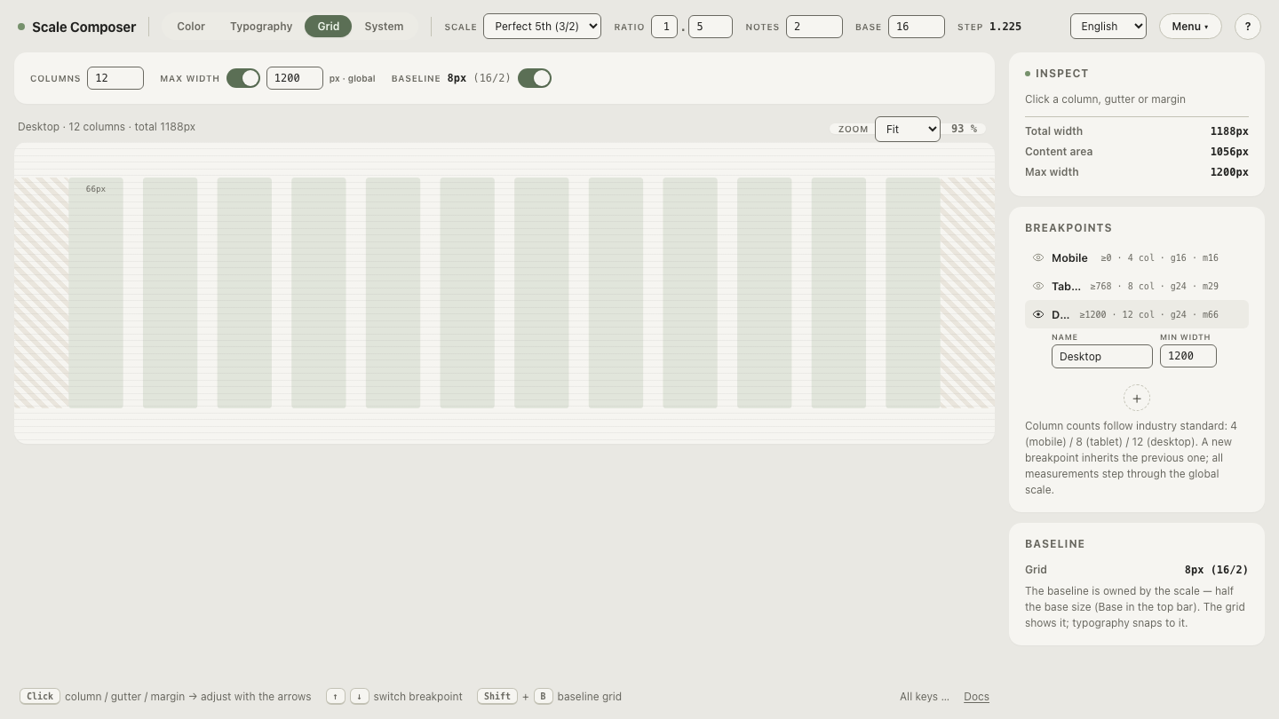
See these patterns live on the default grid in Scale Composer — the 8 + 4, 6 + 6 and 4 + 4 + 4 rows on the twelve-column desktop tier, with the shared edges visible where the patterns stack.
Does a nested grid inherit the page grid?
No — and knowing exactly what carries over prevents the common surprises.
Any spanned element can declare display: grid and host its own grid, but
the inner grid’s tracks are entirely its own: it inherits no column count,
no line positions, nothing geometric. Custom properties do inherit, so an
inner gap: var(--grid-gutter) picks up the tier’s gutter — the numbers
flow down; the tracks don’t. One consequence worth knowing: an even
split of an even span, using the same gutter, lands back on the page’s
column lines (half of a span-8 article is exactly a span-4 width), but
most other inner divisions drift off the page grid entirely.
The more useful question is whether the page grid belongs inside a component at all. Usually not: the page grid’s job is to position components, and a component’s insides are governed by its own padding and gap logic. A card doesn’t need to know it sits on a twelve-column page; it needs consistent internal spacing wherever it’s dropped. Keeping that boundary is what lets components move between layouts without renegotiation.
The genuine exception is alignment across siblings: making the titles,
prices and buttons of three neighboring cards sit on shared rows
regardless of content length. That is what subgrid is for — a nested
grid that adopts its parent’s tracks instead of defining its own. It is
the newer tool of this article, with broad but relatively recent browser
support, so check your support floor before leaning on it.
What happens to spans on a phone?
Spans are per-tier decisions, and there are two ways to make them.
The default is the clamp
built into the grid’s span classes:
grid-column: span min(N, var(--grid-cols))
caps every claim at the tier’s column count, so a desktop 8 + 4 becomes
two full-width rows on a four-column phone — a clean stack, written
nowhere. The clamp is right whenever “everything full width” is the
correct small-screen answer, which for text-led pages it usually is.
Explicit re-spanning takes over when the wrap needs art direction. A 6 + 6 pair on an eight-column tablet clamps to 6 + 6 — but 6 + 6 > 8, so the two elements wrap onto separate rows at six-of-eight wide each: ragged, not stacked. One media query re-declaring them to span 4 + 4 (side by side) or 8 + 8 (full-width stack) states the intent. Clamping is graceful degradation; re-spanning is design.
How does one card row behave from desktop to phone?
Trace three .col-4 cards through the default tiers:
| Tier | Columns | Card math | Result |
|---|---|---|---|
| Desktop, 1200px container | 12 | span 4 → 4 × 67 + 3 × 24 = 340px | three across |
| Tablet, 768px viewport | 8 | span min(4, 8) = 4 → 343px | two across + one |
| Phone, 375px viewport | 4 | span min(4, 4) = 4 → 343px | stacked, full width |
Desktop and phone come out exactly as intended, for free. The tablet row
is the honest case: the clamp guarantees nothing overflows, but three
span-4 cards on eight columns wrap 2 + 1, leaving an orphan. If that
bothers the design, it’s one explicit rule at that tier — give the third
card span 8 as a full-width closer, or drop all three to full width —
either way the exception is a line, not a system.
Watch a span clamp in place
The clamp is easier to trust once you’ve watched it happen. Load the 8 + 4 pattern and step the preview from desktop to tablet to phone: the spans hold at twelve and eight columns, then fold to full width at four — watch the desktop spans clamp down to a phone stack in Scale Composer.