4, 8, 12: Columns per Breakpoint
Put a 12-column grid on a 375px phone and watch what happens to it. Even with the margins stripped to zero and the gutters squeezed to 8px, each column comes out at (375 − 11 × 8) ÷ 12 ≈ 24px wide. Nothing real fits in one — no button, no input, no thumbnail. A modest 300px card spans ten of the twelve columns, so every element ends up choosing between “nearly everything” and “everything,” the spans in between go unused, and the grid keeps drawing guides while informing none of the decisions.
Responsive grids therefore drop the column count instead of shrinking the columns: 4 columns on phones, 8 on tablets, 12 on desktops, with column width held roughly constant across all three. The count is the lever that adapts; the unit stays a meaningful size. This article — part of our layout grid guide — covers why that inversion works, what the real numbers look like per tier, and how one layout maps across them.
Why does the column count drop instead of the columns shrinking?
Because a grid guides only while its unit is a meaningful size — a width something on the page could actually be. When a column is ≈24px, moving a boundary by one column changes almost nothing, and no real element occupies a countable few columns; the grid has become decoration. On a 4-column phone grid, the same 375px viewport with 16px gutters and margins gives columns of (375 − 32 − 48) ÷ 4 ≈ 74px — and now the spans map onto the layouts a phone actually uses: 4 is full width, 2 is a half, 1 is a quarter-width unit for icons and avatars. Every available span is a real choice again.
Why 4, 8 and 12 — and not some other ladder?
Each count matches the layout vocabulary of its screen. A phone composes in fulls, halves and the occasional quarter — 4 columns covers exactly that. A tablet adds two-up arrangements and narrow sidebars — 8 columns brings usable quarters (spans of 2) and sidebar splits like 5 + 3 and 6 + 2. A desktop needs the full vocabulary, thirds included — which is 12.
The ladder also preserves proportion across tiers. Because 4 doubles to 8, halves stay halves (2 of 4, 4 of 8) and quarters stay quarters (1 of 4, 2 of 8); 12 keeps both (6 and 3) and adds thirds. An 8-column tablet layout of 6 + 2 maps up to desktop’s 9 + 3 by straight proportion. Designs don’t translate across tiers by accident — the counts are chosen so they can.
What changes per breakpoint — and what stays constant?
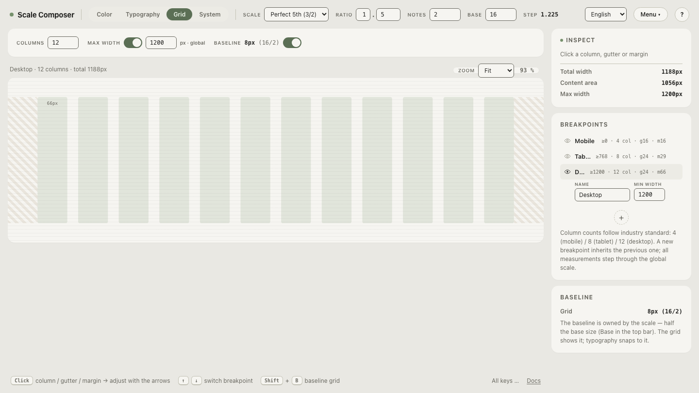
Less than you might expect. Here are Scale Composer’s grid-view defaults, with the grid total computed as columns × column width + (columns − 1) × gutter + 2 × margin:
| Tier | Applies from | Columns | Column width | Gutter | Margin | Grid total |
|---|---|---|---|---|---|---|
| Mobile | 0 (375px preview) | 4 | 66px | 16px | 16px | 344px |
| Tablet | 768px | 8 | 66px | 24px | 29px | 754px |
| Desktop | 1200px (1440px preview) | 12 | 66px | 24px | 66px | 1188px |
The totals check out line by line: 4 × 66 + 3 × 16 + 2 × 16 = 344, sitting just inside the 375px preview; 8 × 66 + 7 × 24 + 2 × 29 = 754 ≈ 768; and 12 × 66 + 11 × 24 + 2 × 66 = 1188 ≈ 1200.
Read down the columns of the table and the division of labor is plain. Gutters and margins step modestly (16 → 24, 16 → 29 → 66). Column width doesn’t move at all — 66px on every tier, so a one-column unit feels the same on a phone as on a desktop. The column count carries the entire adaptation: 4, 8, 12.
Open the three-tier grid in Scale Composer — the grid view holds one layout system per breakpoint, each with its own columns, column width, gutter and margin, and the measures step through the shared scale with arrow keys.
How does one layout map across the tiers?
Column spans are per-tier decisions, not scaled values. Trace a landing page with three sections through all three tiers:
| Section | Desktop (12) | Tablet (8) | Mobile (4) |
|---|---|---|---|
| Hero | 12 | 8 | 4 |
| Three feature cards | 4 + 4 + 4 | 4 + 4, third card at 8 below | 4 each, stacked |
| Article + sidebar | 8 + 4 | 8, sidebar below at 8 | 4 each, stacked |
Notice what the middle column forces. Eight has no thirds, so the card row cannot survive the trip from desktop as a row — the honest options are two-up with the third dropping below, or a full stack. And the 8 + 4 article layout doesn’t become “5.3 + 2.7” on tablet; it becomes a different decision (content full width, sidebar demoted). A tier with fewer columns isn’t a shrunken desktop — it’s a smaller vocabulary, and the layout is re-phrased in it.
In CSS this is one grid-template-columns declaration per tier inside
media queries — where those tier boundaries should sit is a question of
content, not device models.
The mechanics are documented in MDN’s
CSS grid layout
reference. What the code can’t decide for you is the re-phrasing itself:
which spans each tier gets is design, not arithmetic.
Check the totals at every tier
The table above is easier to trust after you’ve broken it. Load the three tiers and change one variable at a time: drop desktop from 12 columns to 8 and watch the column width the leftover arithmetic hands back; step a gutter up one scale notch and watch the grid total drift away from its breakpoint. The totals recompute live, so every configuration shows its own arithmetic — check the tier totals yourself in Scale Composer.