What Is a 12-Column Grid?
A 12-column grid divides the page into twelve equal-width columns separated by fixed gutters, and elements are sized by spanning whole columns — a sidebar spans three, the main content spans nine. The columns themselves are invisible scaffolding; what the reader experiences is alignment, because every block on the page starts and ends on the same small set of edges.
It has been the working convention of interface layout for close to two decades, and it outlived the frameworks that popularized it. This article — the anchor of our layout grid guide — covers why the number is twelve, where the convention comes from, what the parts are, and what the arithmetic looks like with real numbers.
Why twelve columns and not ten or sixteen?
Divisibility. Twelve divides evenly by 2, 3, 4 and 6, so the divisions pages are actually built from — halves, thirds, quarters, sixths — all land on whole columns:
| Division | On 12 columns | On 10 columns |
|---|---|---|
| Halves | 6 + 6 | 5 + 5 |
| Thirds | 4 + 4 + 4 | 3⅓ — impossible |
| Quarters | 3 + 3 + 3 + 3 | 2½ — impossible |
| Sixths | six spans of 2 | 1⅔ — impossible |
| Fifths | 2.4 — impossible | five spans of 2 |
Ten buys you fifths — a division layouts rarely call for — at the price of thirds and quarters, which they call for constantly. Sixteen keeps halves, quarters and eighths but loses thirds, and thirds are the backbone of card rows and feature sections. Twelve is the smallest count that keeps every division designers routinely reach for.
The intuitive version: a grid helps only while the layout you want lands on whole columns. The moment a design needs half a column, the grid has stopped being a guide and become an obstacle. Twelve makes that moment rare.
Where does the 12-column grid come from?
Newspapers divided their pages into columns long before screens, for practical reasons — short lines set faster and read denser. Josef Müller-Brockmann and the Swiss school of the mid-20th century turned that practice into a formal design method — grid systems as the rational skeleton beneath a page. The web then settled on twelve specifically through 960.gs and later Bootstrap, whose class-based grids made 12 columns the default vocabulary of a generation of developers; CSS Grid eventually made the framework machinery unnecessary, and the convention survived without it — because the agreement, not the code, was always the useful part.
What are the parts of a 12-column grid?
Four, with deliberately different behavior:
- Columns — the twelve fluid units. Their width isn’t chosen directly; it’s what remains after the fixed parts are taken out.
- Gutters — the fixed spaces between columns, eleven of them.
- Margins — the fixed space on each side, between the outermost columns and the container’s edge.
- Container — the cap on the whole assembly. Below its max-width the grid is fluid; past it, the layout stops growing.
One line ties them together: gutters and margins come off the top, and the twelve columns share whatever is left. That’s the entire arithmetic — how wide gutters and margins should be is a spacing question with its own proportional rules.
What does the arithmetic look like with real numbers?
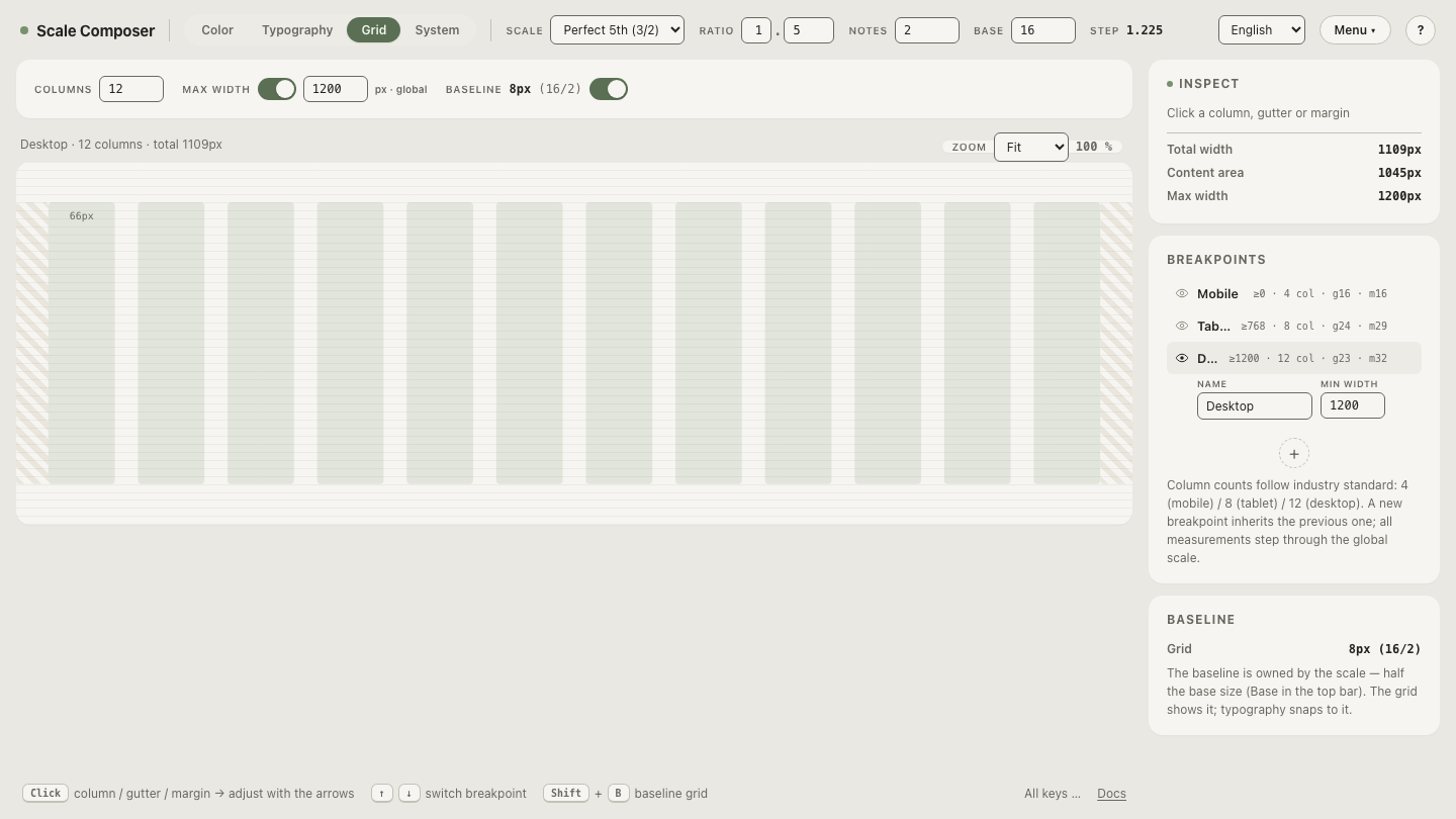
Take a 1200px container with 23px gutters and 32px margins — gutter and margin both steps from a spacing scale:
fixed width   = 2 × 32 + 11 × 23 = 64 + 253 = 317px
leftover      = 1200 − 317       = 883px
column width  = 883 ÷ 12         ≈ 73.6px
Now map layouts onto it. A span’s width is its columns plus the gutters inside it — spanning absorbs the gutters it crosses:
| Layout | Spans | Widths |
|---|---|---|
| Content + sidebar | 8 + 4 | ≈750px + ≈363px |
| Three cards | 4 + 4 + 4 | ≈363px each |
The content span works out to 8 × 73.6 + 7 × 23 ≈ 750px, the sidebar to 4 × 73.6 + 3 × 23 ≈ 363px. Add the one gutter still separating them — 750 + 23 + 363 = 1136 — and you’re back at the container minus its margins (1200 − 64). The books balance at every level, which is what makes a grid auditable rather than approximate.
Open this 12-column anatomy in Scale Composer — columns, gutter, margin and container are each set per breakpoint in the grid view, the measures step through the shared spacing scale with arrow keys, and the leftover arithmetic recomputes as you step.
What are the common span patterns?
A handful of patterns cover most pages, and all of them fall straight out of the divisibility table:
| Pattern | Spans | Typical use |
|---|---|---|
| Full width | 12 | heroes, page titles, footers |
| Content + sidebar | 8 + 4 | articles, documentation, listings |
| Even split | 6 + 6 | comparisons, image beside text |
| Three-up | 4 + 4 + 4 | card rows, feature sections |
| Four-up | 3 + 3 + 3 + 3 | dense card grids, galleries |
Asymmetric variants — 9 + 3, 7 + 5 — are just as legitimate; they trade the neat divisions for a more particular emphasis.
Does everything have to align to the columns?
No — and this is the most common overreading of the system. The grid positions containers, not their contents. A card spanning four columns doesn’t need its internal padding, its button, or its line breaks to land on column edges; inside the card, the card’s own spacing rules take over. Forcing every interior element onto the page grid produces layouts that are technically aligned and practically rigid. The 12-column grid is a page-level agreement about where blocks begin and end — the top level of a hierarchy, not a law that reaches all the way down.
Lay your own spans on the grid
Patterns stick faster when you place them yourself. Load the 12-column grid
and walk through the table’s layouts — 8 + 4, then 6 + 6, then 4 + 4 + 4 —
and watch each span absorb its interior gutters. The grid view’s CSS export
writes the same arithmetic as media queries with .grid and .col-1
through .col-12 classes, spans clamped to the active breakpoint’s column
count, so what you lay out is
what ships —
lay spans on the 12-column grid in Scale Composer.