Choosing a Container Max-Width
Run a small measurement before any theory. Open a text-heavy site you trust — a newspaper, a documentation site, a long-form magazine — on the widest monitor available, and drag the browser window slowly from narrow to full width. The layout grows with the window for a while, and then, somewhere past 1100px, it stops: the columns freeze, and every further pixel of window goes into the empty margins on either side. Measure a few sites with the devtools ruler and the stopping points cluster — most land between 1100 and 1400px.
That stopping point is the container max-width: the cap on how wide a layout may grow. Below the cap the grid is fluid and absorbs the viewport; past it the columns hold their size, the page rides centered, and the margins absorb everything else. It is one number capping every layout in the system, and this piece — part of our layout grid guide — covers why the cap exists, where the common values come from, and when to switch it off.
What does a container max-width actually do?
It splits the viewport range into two regimes. Below the cap, the grid’s
columns share whatever width the window offers — the
fluid regime, where
the layout and the viewport are the same thing. Above the cap, the layout
detaches from the window: the grid holds its designed width, sits centered,
and the margins do the growing. In CSS the whole pattern is
max-width
plus automatic inline margins:
.container {
  max-width: 1200px;    /* the cap */
  margin-inline: auto;  /* centers the capped page */
  padding-inline: 66px; /* the grid's outer margins */
}
The choice of max-width over width is what buys both regimes with one
property: a fixed width: 1200px would overflow small screens, while
max-width only binds once the window exceeds it.
Why cap the layout at all?
Three reasons, in descending order of force.
Line length. Body text reads best around 45–75 characters per line — the long-standing typographic band — and an uncapped column ignores that budget entirely: on a 2560px monitor, a full-width paragraph at 16px runs to roughly (2560 − 132) ÷ 8 ≈ 300 characters per line, several times past the top of the band. This is the failure that makes caps non-optional for anything meant to be read.
Interaction distance. Related controls drift apart as the layout stretches: a filter panel pinned to the left edge and the results it controls drifting toward the right can end up more than half a screen apart on an ultrawide display, and every glance between them becomes a head movement instead of an eye movement.
Composition. A layout designed at 1200px doesn’t keep its proportions at 2400: the hero’s image-to-text balance, the whitespace relationships, the visual weight of a card row all stretch out of the ratios they were designed in. The cap is what lets a composition stay the composition.
Where do the common values come from?
The 1100–1400px range dominates because that’s where twelve columns of readable text width, plus their gutters and margins, happen to land. You can run the arithmetic backward and watch the convention assemble itself.
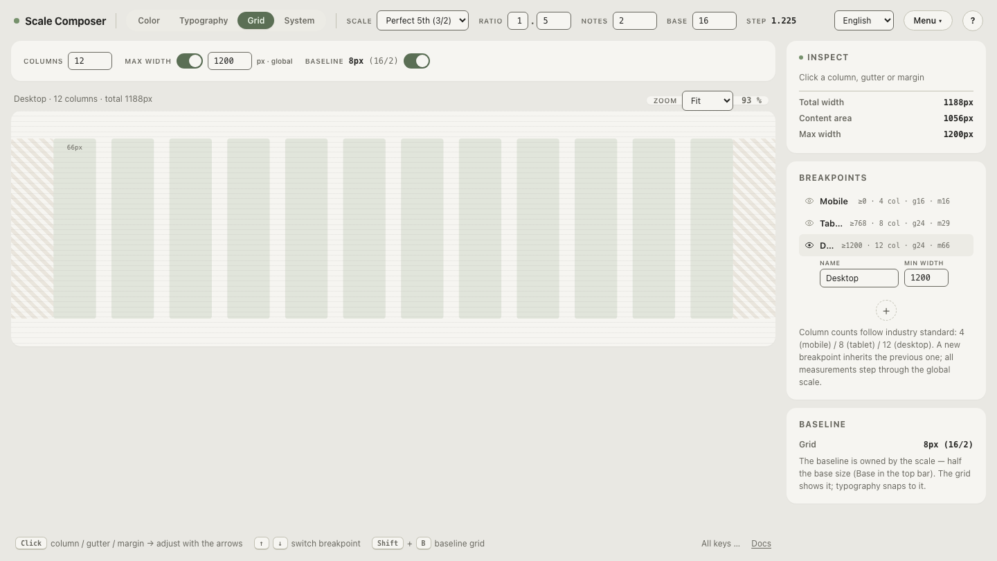
Start from the text. Long-form body text is commonly set around 18–21px; at 21px an average character occupies ≈10.5px, so a 66-character line — the classic comfortable measure — needs a column of ≈693px. Give that article column 8 of the grid’s 12 columns. With 24px gutters, the span must satisfy 8 × column width + 7 × 24 ≈ 696px, which solves to a column width of 66px. Now total the whole grid at Scale Composer’s desktop defaults:
12 × 66  (columns)  =  792px
11 × 24  (gutters)  =  264px
 2 × 66  (margins)  =  132px
                       ──────
grid total          = 1188px  ≈ the 1200px convention
Smaller body sizes shift the spans, not the conclusion — at 16px, a 66-character column is ≈528px, close to a 6-of-12 span (≈516px). Either way the cap lands in the same neighborhood, because it’s answering the same question: the container max-width is the width at which a 12-column grid full of readable text runs out of reasons to grow. The 1100–1400px range isn’t fashion; it’s this arithmetic evaluated with different body sizes and gutters.
Open the 1200px container anatomy in Scale Composer — the container max-width is one global value across all breakpoints, and the desktop tier’s twelve 66px columns with 24px gutters and 66px margins total 1188px inside it.
When should a layout not be capped?
Two established exceptions, one partial and one total.
Full-bleed sections. Heroes, media bands and edge-to-edge color fields escape the container — but their content stays inside it. The pattern is an outer section with no max-width carrying the background, and an inner container, capped and centered, carrying the text and controls:
.band {
  /* full-bleed: background and imagery run edge to edge */
}
.band > .container {
  max-width: 1200px;    /* the content inside stays capped */
  margin-inline: auto;
  padding-inline: 66px;
}
The band gets the drama of the full viewport; the headline inside it still aligns with every other capped section on the page.
Data-dense applications. Dashboards, data tables and editors genuinely use width — an extra 400px is another visible column of data, another hour on the timeline. A workable rule of thumb, offered as exactly that: documents are read, applications are operated — reading needs the cap, operating often doesn’t. Many products are honestly both, and split the difference: marketing and docs pages capped, the app surface fluid.
Turn the cap off and watch
The distinction lands fastest when you toggle it. In Scale Composer the container is a single global max-width, and it can be disabled entirely — the fluid-layout case. Switch it off and watch the desktop grid claim the whole preview: the columns stretch, the grid total chases the viewport, and the text spans that were sized for reading run past their band — switch the container off and watch the grid go fluid.