Setting Up Layout Grids in Figma
A Figma layout grid is a per-frame overlay that elements snap to, and the setup that mirrors a responsive web grid is: column-type grids with stretch columns and fixed gutter and margin, one frame per breakpoint — a 1440px desktop frame at 12 columns / 24 gutter / 66 margin, a 768px tablet frame at 8 / 24 / 29, a 375px mobile frame at 4 / 16 / 16 — each saved as a grid style so any new frame gets its tier’s grid in one click.
The numbers matter as much as the mechanics: a layout grid is the design side of the same layout grid the code implements, and the two only stay one system if they share values. This article covers the settings, the three-tier setup with real numbers, how the stretch model maps to the web’s fluid columns, and the audit trick for screens that already shipped.
What do Figma’s layout grid settings mean?
Layout grids live per frame — select a frame, add a grid — and come in three types: a uniform square grid, rows, and columns. For page layout, columns are the relevant type, and four settings define them (Figma’s own reference is the layout grids doc):
- Count — how many columns the frame carries.
- Type — stretch, fixed (a set column width, gutters absorb nothing), or center (a fixed block of columns centered in the frame).
- Gutter — the space between columns.
- Margin — the space from the frame edge to the outermost columns (stretch type only).
Stretch is the setting that matches modern web grids: margins are pinned,
gutters are fixed, and the columns split whatever width remains — the
same division of labor as 1fr tracks in CSS, where fixed members come
off the top and fractions share the leftover. Fixed and center types
correspond to the
older fixed-canvas model; they
still fit print-like
artboards, but for responsive work stretch is the honest default.
How do you set up the three breakpoint grids?
One frame per breakpoint, one column grid per frame, then each saved as a style. With the common tier values:
| Frame | Width | Columns | Type | Gutter | Margin |
|---|---|---|---|---|---|
| Desktop | 1440px | 12 | stretch | 24 | 66 |
| Tablet | 768px | 8 | stretch | 24 | 29 |
| Mobile | 375px | 4 | stretch | 16 | 16 |
The walkthrough: create the three frames at those widths, add a column
grid to each, set count/type/gutter/margin from the table, then save each
grid as a style — Grid/Desktop, Grid/Tablet, Grid/Mobile. The
styles are the reuse layer: from then on, no one re-types four values per
frame; a new screen gets its tier’s grid applied in one click, and a
change to a style propagates to every frame using it.
Because the columns stretch, the style carries the decisions and the frame width sets the outcome. The desktop style on its 1440px frame computes columns of (1440 − 2 × 66 − 11 × 24) ÷ 12 = 87px; the same style applied to a 1280px frame yields ≈73.7px columns. Same grid, different widths — which is precisely how the web version behaves between breakpoints.
How do the design numbers stay in sync with code?
The classic failure is quiet divergence: the designer eyeballs a three-column-ish arrangement, the developer implements exact twelfths, and every handoff renegotiates whose numbers are real. The drift is not carelessness — it is two sources of truth doing what two sources always do. The fix is one source.
Scale Composer’s Figma export ships the grid as a variable collection with
one mode per breakpoint: switch the mode and grid/columns,
grid/gutter, grid/margin and grid/min-width flip from desktop to
tablet to mobile values, with the container max-width alongside. The tier
values arrive in the file as data rather than hand-typed settings — the
same numbers the CSS export re-declares per media query.
Open the grid’s Figma export in Scale Composer — the Grid collection with its three modes, one per breakpoint, next to the grid view that generated it.
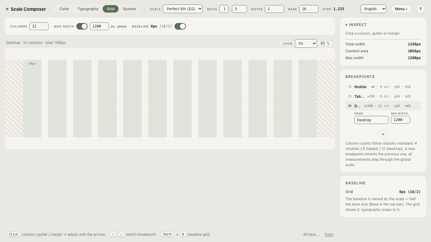
One honest scope note: Figma applies layout grids per frame. The variables carry the tier’s numbers into the file where everyone can read and reference them, but putting a grid on a frame — and keeping the grid styles’ values matched to the collection — remains a designer action, not an automatic binding.
How do you work with a grid once it’s on the frame?
Three behaviors do most of the day-to-day work. Snapping: with the grid visible, dragged and resized elements snap to column edges, which is what makes “span four columns” a gesture instead of arithmetic. Visibility: grids toggle on and off with a keyboard shortcut (the Ctrl/Cmd-G class of shortcut, depending on platform), so the overlay is a tool you summon, not wallpaper you learn to ignore. Constraints: elements constrained left-and-right, or set to scale, follow the stretch columns when the frame resizes — pin a sidebar to its columns and a wider frame widens it the way the browser would.
How do you audit a shipped screen against the grid?
Drop a production screenshot into a frame, size the frame to the screenshot’s width, and apply the tier’s grid style over it. Every drift becomes visible at a glance: elements straddling gutters, margins that grew in translation, a sidebar that renders at five columns’ width when the file says four. The trick costs a minute and turns “the build feels off” into a list of specific, pointable misalignments — the same one-source logic as the variables, run in reverse as a check.
Run the parity check on one frame
Set up the three styles from the table above, then verify the loop closes: apply the desktop style to a 1200px frame — the container width — and the columns compute to (1200 − 132 − 264) ÷ 12 = 67px, the same column width the browser produces inside a capped container. On the 1440px working frame the identical style yields 87px columns: that wider grid is what an uncapped page computes at a 1440px viewport, so which of the two the browser actually shows is decided by one code-side setting, the container max-width. Numbers you can check beat numbers you trust — export the Grid collection and check it against your own frames.