Breakpoints: Content over Devices
Search for a breakpoint cheat-sheet and you’ll find viewport widths named after hardware: iPhone, iPad, laptop, desktop. Those charts rot with every product cycle, and they were never quite true even when fresh — real devices now span nearly every width from 320px up. The most famous number on them makes the point: 768px is the classic iPad reporting its portrait viewport, 768 × 1024 CSS pixels. That device is museum hardware; the number is still in a large share of the world’s stylesheets. The convention outlived its device.
A CSS breakpoint is a viewport width at which the layout changes — and the durable way to place one is where the content fails, not where a device chart points: where line length leaves its readable band, where a sidebar starves the content beside it, where cards compress below usable width. This piece — part of our layout grid guide — works through those failure signals, why near-standard values are usually fine anyway, and how breakpoints ship as tokens.
Why not just design for devices?
Three reasons. The chart is unstable: every product cycle adds widths, and a breakpoint named after a device inherits that churn. The media query never knew the device anyway — it only ever measured the viewport, so “iPad” was always a polite fiction for “768px wide.” And real windows live between the chart’s entries: split-screen tablets, resized desktop windows, folding screens. A layout verified only at the chart’s widths can still fail between them; a layout placed by its own failure points cannot, because the failure points are the definition.
Where does a breakpoint belong?
Where a layout visibly stops working. Three failure signals cover most pages, each with an observable symptom:
- Line length leaves the band. Body text runs past roughly 75 characters per line and the eye starts missing the return trip to the next line — re-read lines, skipped lines. The stop belongs where the text column would exceed its budget.
- The sidebar starves the content. Keeping sidebar and content side-by-side too long squeezes the content column below what it needs while the sidebar sits comfortably. The stop belongs where side-by-side first leaves both columns usable.
- The cards compress. A row of cards held too long clips its titles and wraps its buttons — cards below roughly 250–280px stop doing their job. The stop belongs where the next card fits at full working width.
Each symptom names its own fix, and the breakpoint is simply the width where the fix switches on.
What does a content-driven audit look like?
Take a page with all three ingredients — an article column, a three-card feature row, a sidebar — set in 16px body text, where an average character occupies ≈8px:
| Failure signal | Arithmetic | Where the stop belongs |
|---|---|---|
| Text passes 75 characters | 75 × 8 ≈ 600px column + 2 × 16px margins ≈ 632px | by ≈632px — or cap the column instead |
| Three-up cards need room | 3 × 260 + 2 × 24 + 2 × 29 ≈ 886px | not at 768 — three-up waits for the next tier |
| Sidebar needs its column | ≈600 content + 24 gutter + 300 sidebar + 2 × 66 margins ≈ 1056px | side-by-side from the ≈1200 stop |
Two honest readings follow. First, the audit lands near the standard stops
anyway — 768 covers the text (arriving a little late; between ≈632 and 768
the lines run slightly over, which you can accept or solve with a
max-width on the column, the one failure a cap fixes without a
breakpoint). Second, the card row does not get its own stop: three-up
becomes possible at ≈886px, but nothing fails there — two-up stays
comfortable all the way to 1200. Possible is not the same as needed.
Why do standard breakpoints persist anyway?
Because ecosystems converge. Frameworks cluster their defaults near 640, 768, 1024 and 1280; teams inherit those values, tooling and test rigs assume them, and designers sketch at them. And that is mostly fine — content tolerances are ranges, not points. A layout whose true failure is at 730px is served perfectly well by a stop at 768.
The honesty runs both directions. Don’t fetishize custom breakpoints: the win over near-standard values is usually small, and a bespoke 743px stop buys mostly explanation overhead. But don’t treat the standards as physics either: the content principle earns its keep exactly when a layout genuinely fails between the standard stops — which is when you’re entitled to move one.
Should media queries be min-width or max-width?
Mobile-first — base styles serve the narrowest tier, and each min-width
query adds what a wider tier earns — has become the modern default, and for
a structural reason: the narrow layout is usually the simple one (a single
column), so the base case stays clean and wider tiers are additive rather
than subtractive.
.cards {
  display: grid;
  grid-template-columns: 1fr;   /* mobile: one column */
  gap: 16px;
}
@media (min-width: 768px) {
  .cards { grid-template-columns: repeat(2, 1fr); gap: 24px; }
}
@media (min-width: 1200px) {
  .cards { grid-template-columns: repeat(3, 1fr); }
}
Each min-width guard is a tier’s entry point; the full query syntax,
including the newer range forms like (768px <= width < 1200px), is on
MDN’s @media reference.
How do breakpoints become design tokens?
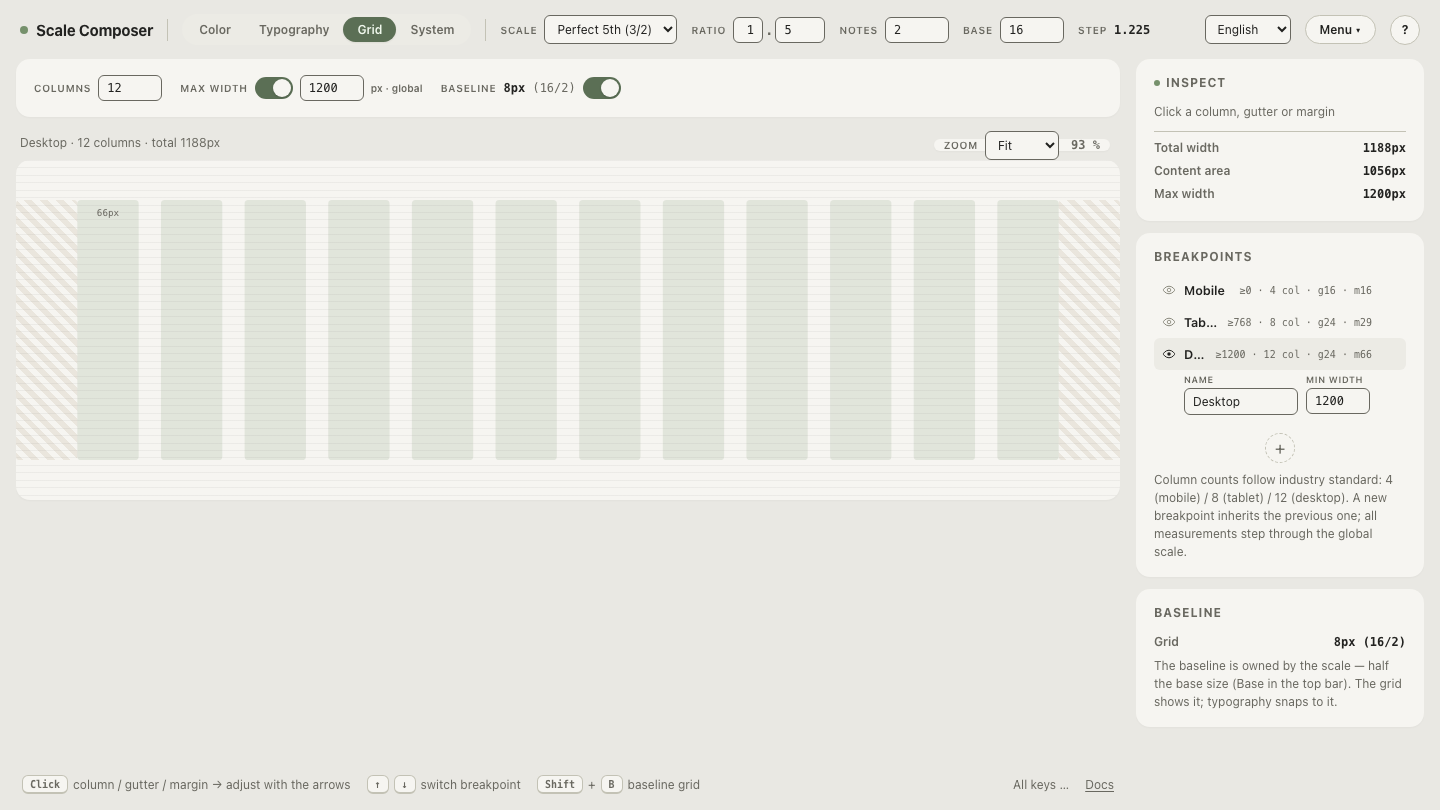
Breakpoints are decisions, and decisions drift when they live only in stylesheets — one project at 768, its sibling at 780, nobody remembers why. Treating them as tokens puts them in the same pipeline as color and type: in Scale Composer, the grid view owns the layout section of the DTCG export, where each breakpoint ships its min-width, columns, column width, gutter and margin, alongside the shared container max-width. Change a tier once and every consumer of the token file sees it. The Figma export carries the same structure as a Grid collection with one mode per breakpoint, so a designer switches tiers the way they’d switch light and dark.
See the three tiers as layout tokens in Scale Composer — the grid view’s export panel shows each breakpoint’s values next to the grid that produces them.
How many breakpoints do you need?
Three tiers cover most products — the audit above needed two stops for three failure signals. A fourth earns its place only when a real layout fails between the existing stops, and the audit shows the discipline in miniature: three-up cards fit from ≈886px, but nothing failed at 886, so no tier. Name the failing layout, compute the width it fails at, and only then — add a fourth tier with its own column count in Scale Composer.