7 Type Scale Mistakes That Break a Design System
Audit the font sizes in a two-year-old product and you rarely find the six sizes the design system documentation promises. You find twenty-odd: the six, plus 15px “for the sidebar”, 17px “because 16 looked small in that card”, 30px “close enough to 28” — each shipped by a reasonable person solving a local problem.
Most type scale mistakes share one mechanism: the scale stops being the source that sizes, line heights, and spacing are actually derived from, and turns into documentation that production quietly diverges from. The seven below are the common routes to that state — each named as the failure you can observe, then the mechanism behind it, then a one-sentence fix.
These are typography mistakes at the design-system level, not matters of taste; they assume you know what a modular scale is. If you don’t yet, start with our type scale guide.
1. Off-scale values creep in — “just this once, 17px”
The failure: the codebase accumulates sizes the scale never generated, one reasonable exception at a time, until the scale describes nothing and constrains nobody — decoration in the documentation.
The mechanism: every exception is locally rational and globally corrosive. The first 17px solves a real problem; it also establishes that the scale is negotiable, and each following exception is easier to justify than the last. The traditional typographic scale that print carried for centuries — 6, 7, 8, 9, 10, 11, 12, 14, 16, 18, 21, 24 points and upward — held partly because it was physically closed: type was metal, cast in those sizes, and there was no 17pt to reach for. Digital type removed the constraint but not the need for it, so the discipline has to be explicit.
The fix: treat the scale as closed — when a needed size is missing, change the scale (adjust the ratio, subdivide a step), never add a value beside it.
2. The ratio is too steep for the product
The failure: the team routinely skips levels — pages jump from h1 to h4, and the top half of the scale goes quietly unused.
The mechanism: a ratio chosen for how it looks in a specimen rather than for the product’s text density. Compare a golden-ratio scale with a flat one, both on a 16px base:
| Step | Ratio 1.618 | Ratio 1.2 |
|---|---|---|
| 1 | 26px | 19px |
| 2 | 42px | 23px |
| 3 | 68px | 28px |
| 4 | 110px | 33px |
In a text-dense product the 1.618 column fails almost immediately: nothing exists between 16 and 26, where most interface text lives, and a 110px h1 belongs on a poster, not a dashboard. Faced with that, teams don’t abandon hierarchy — they abandon the scale.
The fix: choose the ratio from text density — roughly 1.125–1.25 for dense UI, steeper for editorial work — and subdivide intervals when you need in-between sizes rather than tolerating gaps.
3. Sizes are on a scale, line heights are guessed
The failure: columns that start aligned drift apart; the space after headings looks different on every page; layouts feel noisy and nobody can point at why.
The mechanism: line height, not font size, is what actually occupies vertical space. If sizes are systematic but each element’s line height is an ad-hoc 1.3, 1.45, or “28px looked right”, every text block’s height is arbitrary — vertical relationships can’t add up because there is no unit they’re counted in.
The fix: derive line heights from a baseline unit of half the base — 8px on a 16px base — and allow only whole or half multiples: body 16px on a 24px line (three baselines), h2 38px on 48px (six).
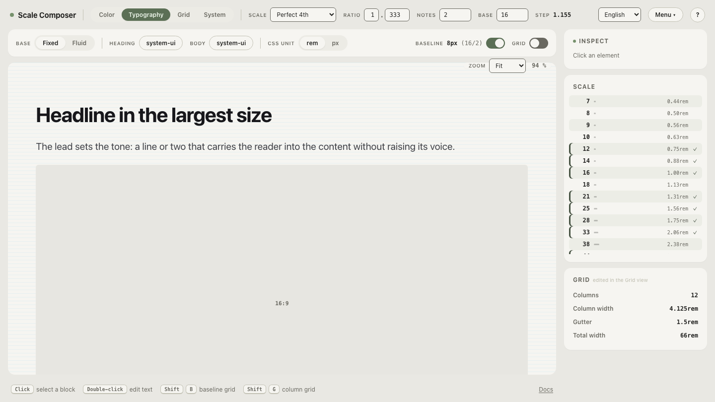
That baseline discipline is easiest to judge against a working reference. Open a coherent scale in Scale Composer — base 16, perfect fourth, every line height snapped to the 8px baseline, spacing derived from the same progression. The four remaining mistakes are all visible as departures from this picture.
4. Tokens are named after values — and lie after a retune
The failure: the system retunes its ratio from 1.333 to 1.25, and
font-24 now outputs 21px. Or, more commonly, nobody retunes — because
renaming font-24 across hundreds of call sites costs more than living with
the wrong ratio.
The mechanism: a value-based name welds every call site to today’s output instead of to the size’s job. Role names describe the job, and the job survives a retune — which is the point of generating sizes from two parameters in the first place.
The fix: name tokens for roles (body, heading-lg), never for values.
5. Type is scaled, spacing isn’t
The failure: the text is proportioned but the gaps around it are eyeballed — cards, stacks, and sections feel subtly off even where the typography itself is careful.
The mechanism: proportion is perceived from size and space together. When font sizes follow a ratio but margins and padding follow habit — 12px here, 20px there — half the system speaks a different language, and the eye has two rule-sets to reconcile instead of one.
The fix: derive spacing steps from the same base and scale as the type — in Scale Composer, spacing steps come from the same progression, so the two can’t diverge.
6. Heading sizes are chosen per page, not derived once
The failure: the h2 is 32px on the marketing site, 28px in the docs, and 30px in the app — visible in any side-by-side screenshot, invisible in any single-page review.
The mechanism: each per-page decision is a fork, and each fork is defensible in its own context. But what makes typography a system is recognition — the reader’s sense, and the team’s, that this is one product — and recognition compounds only when the ladder is derived once and reused everywhere.
The fix: derive the heading ladder from the scale once, and let per-page decisions choose roles, never pixel values.
7. Everything ships in px
The failure: a reader raises their browser’s default font size — a setting some low-vision readers depend on — and the site ignores it completely.
The mechanism: px is absolute, while rem resolves against the user’s default font size (16px unless they’ve changed it). Page zoom still works on px-set text, but the font-size preference is a different accessibility channel — it enlarges text without enlarging the whole layout — and px-only CSS switches that channel off.
The fix: express the scale in rem — divide each px value by 16 — and let px live only in design-tool mockups.
Stress-test your scale before production does
These type scale problems share one more trait: each is cheap to catch early and expensive to unwind after a hundred pages depend on it. The fastest diagnostic is deliberate abuse — push the ratio to its extremes and watch which levels break first. Toward 1.1, adjacent steps collapse into near-duplicates nobody can tell apart; past 1.6, the display sizes outgrow any realistic container. Run that experiment on the stress-test scale in the Scale Composer — the levels that break first there are the ones production would have broken for you.