Naming Typography Tokens (display, heading, body, caption)
Name typography tokens after the role the text plays — display,
heading-lg, body-md, caption — never after their values (font-24) or
the HTML elements they style (h2-size). Value names go stale the moment
the scale is retuned, and element names couple visual style to document
markup, which are two different decisions. A role name states the one thing
about the token that is meant to stay true: what job this text does.
The second half of the rule is just as important: a typography token is
composite. Size, line height, weight and letter spacing travel together
under the role name — a body-md that only carries a size isn’t a style, it’s
a number. This article covers both halves, the t-shirt-size convention that
keeps role sets small, and the export path that carries the names into CSS,
Tailwind and Figma. It’s part of our type scale guide.
Why not name tokens after values?
Because values are the part of the system designed to change. Suppose your
scale generates a 24px heading size and you name the token font-24. Next
quarter the ratio is nudged from 1.25 to 1.333 and that step now computes to
25px. Your options are both bad: rename the token everywhere it’s used — a
breaking change across every stylesheet, component and design file that
references it — or keep a token called font-24 whose value is 25, which is
worse, because now the name actively lies.
A role name survives the retune untouched. heading-md can move from 24px to
25px and every usage remains correct, because the name never claimed a value —
it claimed a job, and the job didn’t change. This is the same reasoning that
leads color systems away from names like blue-500 for semantic slots: name
the decision, not the current answer.
Why not name tokens after elements?
h2-size looks harmless — until style and markup need to disagree, which in
real products is constantly. Heading levels in HTML express document
structure: an h2 is “a section one level below an h1”, a fact that screen
readers and outlines rely on. Visual rank is a separate decision. A card title
might be an h3 on the dashboard and an h2 on its own page while looking
identical in both places; a legal page might carry six levels of structure but
only three levels of visual differentiation.
Element-named tokens force a choice between two failure modes: pick the
element for its looks (wrong outline, an accessibility cost) or pick it for
structure and get the wrong style. Role-named tokens dissolve the conflict —
any element can wear heading-md, and the document outline stays an
independent, semantic decision.
What does a typography token actually contain?
A complete text style. The properties of a text style are tuned as a unit: a 28px heading gets its 36px line height because it’s 28px, its 600 weight because headings rank by darkness, its −0.01em letter spacing because built-in font spacing reads loose as sizes grow. Apply the size without the rest and you haven’t applied the style — you’ve applied a fragment and left the other three properties to whatever the context happens to inherit.
This is why the DTCG token format
defines typography as a composite type: one token whose value is the whole
bundle — family, size, weight, line height, letter spacing — rather than five
loose tokens hoping to be used together.
How does the t-shirt-within-role convention work?
Most systems settle on a two-part name: the role family first, a
t-shirt size within the role second — body-sm, body-md, body-lg.
The families are few and stable: display at the top, a run of heading
sizes, a run of body sizes, and the small utility roles — caption and
overline — at the bottom. The t-shirt suffix absorbs growth: when a design
genuinely needs a larger body style, body-lg appears without renaming
anything that exists.
Two conventions keep the sets honest. Roles that occur once don’t get a
suffix — caption rather than caption-md — until a second variant actually
exists. And display sits above the heading run as its own family rather
than as heading-xl, because its job (a hero statement read in one glance)
differs from a heading’s job (wayfinding), and its properties — tighter line
height, tighter tracking — break the heading pattern rather than extend it.
What does a full role set look like?
Here is a worked set, generated from a 16px base at ratio 1.333 with two notes per interval, with line heights snapped to the 8px baseline (half the base) and font family omitted for brevity:
{
  "type": {
    "display":    { "$type": "typography", "$value":
      { "fontSize": "51px", "lineHeight": "56px", "fontWeight": 700, "letterSpacing": "-0.02em" } },
    "heading-lg": { "$type": "typography", "$value":
      { "fontSize": "38px", "lineHeight": "48px", "fontWeight": 700, "letterSpacing": "-0.015em" } },
    "heading-md": { "$type": "typography", "$value":
      { "fontSize": "28px", "lineHeight": "36px", "fontWeight": 600, "letterSpacing": "-0.01em" } },
    "heading-sm": { "$type": "typography", "$value":
      { "fontSize": "21px", "lineHeight": "28px", "fontWeight": 600, "letterSpacing": "0em" } },
    "body-lg":    { "$type": "typography", "$value":
      { "fontSize": "18px", "lineHeight": "28px", "fontWeight": 400, "letterSpacing": "0em" } },
    "body-md":    { "$type": "typography", "$value":
      { "fontSize": "16px", "lineHeight": "24px", "fontWeight": 400, "letterSpacing": "0em" } },
    "body-sm":    { "$type": "typography", "$value":
      { "fontSize": "14px", "lineHeight": "20px", "fontWeight": 400, "letterSpacing": "0em" } },
    "caption":    { "$type": "typography", "$value":
      { "fontSize": "12px", "lineHeight": "16px", "fontWeight": 400, "letterSpacing": "0.02em" } },
    "overline":   { "$type": "typography", "$value":
      { "fontSize": "12px", "lineHeight": "16px", "fontWeight": 500, "letterSpacing": "0.08em" } }
  }
}
Every size sits on the scale, every line height is a multiple of the 8px baseline, and each token reads as a complete style — the reviewer can see at a glance that small sizes gain weight and tracking while large sizes shed both.
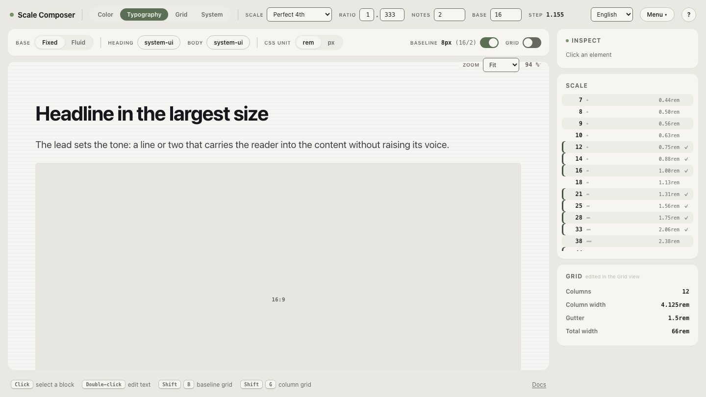
This is the shape Scale Composer assembles as you assign scale steps to roles: open the token export for this scale — the semantic levels from caption to display, each gathered with its size, line height, weight and letter spacing under its role name.
How do role tokens travel into code and design tools?
The role names are the contract; the formats are transports. From one DTCG
source the same set exports as CSS custom properties, as a Tailwind v4
@theme block, and as Figma Variables — so the body-md a designer applies
in Figma and the body-md a developer references in a stylesheet are the same
token, not two conventions that happen to rhyme. That shared vocabulary is the
real payoff of role naming: “make it heading-sm” is an instruction both
sides can execute without a translation table, and a scale retune propagates
to every surface by regenerating the exports rather than renaming anything.
Name your own set
Naming is easiest done while the values are still live:
open the same role set as Tailwind v4 @theme output, rename
a level, and check the instinct that matters — would this name still be true
if every pixel value in the file changed tomorrow? If yes, it’s a role. If
no, it’s a value wearing a name tag.