How Many Font Sizes Does a Design System Need?
A design system needs one font size per typographic role — caption, body variants, heading levels, display — and defining the roles first typically lands the count between nine and twelve named sizes. The number is an output, not a target: when a system keeps adding sizes without adding roles, the hierarchy isn’t growing, it’s drifting.
This article works through the role inventory, shows an eleven-level set on a real scale, and draws the line between a justified addition and drift. The scale mechanics behind it are covered in our type scale guide.
Why count roles instead of sizes?
A size means nothing on its own — it is an answer to a job. The jobs are remarkably stable across products: something small and quiet (captions, labels), something for sustained reading in two or three densities (body small, medium, large), a run of heading levels (typically four), and something enormous for openers (display). Count those and you arrive at nine before touching a single pixel value.
Published systems tend to confirm the range. Material Design 3’s type scale, for example, is organized entirely as roles — display, headline, title, body, label — each in three sizes. The vocabulary differs between systems; the underlying move is the same: name the jobs, then assign each job a size.
This is also why “how many font sizes?” has a stable answer while “which sizes?” doesn’t. The pixel values depend on your base and ratio; the set of jobs text performs barely changes from product to product.
What do eleven levels look like on a real scale?
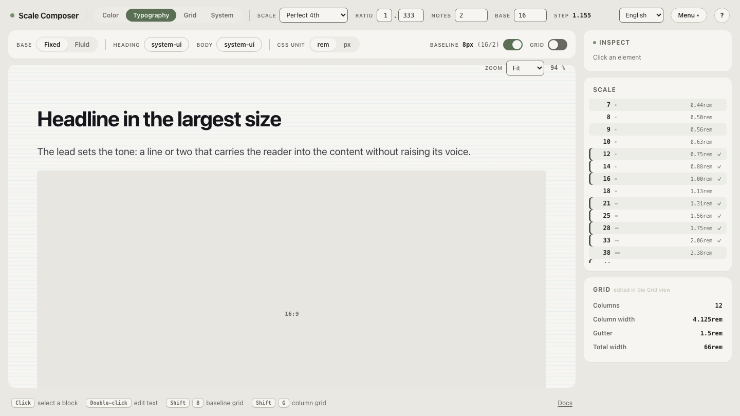
Here is a complete role set on a perfect fourth (1.333) with two notes per
interval and a 16px base — the modular-scale formula
size = base × ratio^(i/notes) generates every value:
| Role | Step | Size (rounded) |
|---|---|---|
| caption | −2 | 12px |
| body-small | −1 | 14px |
| body-medium | 0 | 16px |
| body-large | +1 | 18px |
| heading-4 | +2 | 21px |
| heading-3 | +3 | 25px |
| heading-2 | +4 | 28px |
| heading-1 | +5 | 33px |
| display-small | +6 | 38px |
| display-medium | +7 | 44px |
| display-large | +8 | 51px |
Eleven roles, eleven sizes, no orphans — every size exists because a job exists, and every job has exactly one size.
Open this eleven-level setup in Scale Composer to see the same steps rendered as live text, from caption to display.
How does a scale act as a budget?
Without a scale, adding a size is frictionless and invisible: a 17px value enters through one component’s stylesheet, nobody reviews it as a decision, and a year later an audit finds 14, 15, 16, 17, and 18px all doing the same job. With a scale, a new size must either land on an existing step — which raises the visible question which role is this? — or sit off the formula, which is immediately detectable. The scale converts silent drift into an explicit decision. That is its budgeting function, and it has little to do with aesthetics.
The reason the budget can stay small is perceptual. A reader doesn’t measure text; they compare it. Hierarchy is carried by differences big enough to register, and two sizes a pixel or two apart don’t read as two levels — they read as an inconsistency, or a mistake. Extra sizes past that threshold add no expressive power; they add noise. A dozen roles or so approximates how many distinctions a layout can make before the distinctions stop registering.
When is adding a size justified — and when isn’t it?
Add a size when a new role appears. A product that grows data-dense tables acquires a genuine new job: numeric values that must stay legible at high density, sitting between caption and body-small. That role recurs on every data screen, deserves a name, and — on a scale with notes — often finds a half-step already waiting for it.
Don’t add a size because one screen “needs” 17px. That request is almost always a layout problem wearing a typography costume: the real gap is spacing, weight, or color, and the honest fix is either using those tools or bending the screen to the system. The test is transferable: if you can name the role and expect it to recur across screens, add it; if you can only name the screen, don’t.
What happens when the scale can generate more sizes than you need?
More than you might expect. Lower the ratio and raise the notes and the formula becomes generous: a 1.125 ratio with three notes per interval spaces adjacent sizes roughly 4% apart — about 37 steps between a 12px caption and a 51px display. No role set needs 37 sizes.
That generosity isn’t a flaw in the scale; it’s a reminder of where restraint lives. The scale is a menu, not a shipping list — the named roles select from it, and the discipline is choosing not to use every step it can produce.
Count the steps yourself
Seeing the surplus makes the budget argument stick: open a low-ratio, many-notes scale in Scale Composer and count the steps between caption size and display size. Then pick the eleven that would earn names in your system — and notice how confident the other twenty-plus rejections feel once the roles are written down.