Margin vs Padding: System Rules
A developer stacks a card above a heading. The card has margin-bottom: 24px,
the heading has margin-top: 16px, so the gap should be 40px. The browser
renders 24. No error, no warning — the 16px margin has simply vanished,
absorbed by a CSS behavior called margin collapsing that most people meet
exactly this way: as a mystery gap that matches neither element’s arithmetic.
Padding is the space inside an element’s border; margin is the space outside it. The rule that keeps a design system composable goes one step further: padding belongs to the component — it’s part of what the component is — while margin belongs to the layout — a statement about where the component happens to be placed. A button owns its padding the way it owns its border radius; it should carry no opinion about its distance to neighbors.
This article covers the box-model definition, the ownership rule that matters
more than the definition, the collapsing behavior behind the vanished 16px,
and the parent-owned gap pattern that sidesteps collapsing entirely — with
every distance drawn from the same spacing scale.
What is the difference between margin and padding in CSS?
In the
CSS box model,
every element is a set of nested rectangles: content, then padding, then
border, then margin. Padding sits inside the border, so it takes the element’s
background color, extends its clickable area, and — with
box-sizing: border-box — counts toward the element’s declared width. Margin
sits outside the border: always transparent, never clickable, and, in vertical
stacks, able to merge with neighboring margins.
A compact way to hold the distinction: padding changes what the element looks like; margin changes how it relates to everything around it. That asymmetry is why the two deserve different owners.
When should you use margin, and when padding?
Take a button. Its padding — say 11px vertical, 16px horizontal — is part of
its identity: it’s what makes the button feel like the same button in a
toolbar, a form, and a dialog. Its distance to the next element is not part of
its identity. In a dense toolbar the right gap might be 8px; between form
fields, 16px; below a hero paragraph, 32px. If the button ships with
margin-right: 16px, it’s correct in one of those places and wrong in the
others — and every wrong place grows an override. Multiply by fifty components
and the stylesheet becomes an argument between components about space none of
them should own.
Hence the system rule: components define their padding and never their outer margins; containers define the distances between their children. Any component can then be dropped into any layout without negotiation — which is most of what “composable” means for spacing.
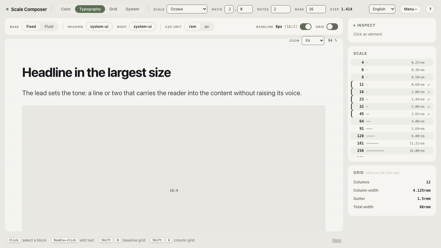
See the two roles on one scale in Scale Composer — the small steps (8, 11, 16) do the inside work as component padding, while the larger steps (16, 23, 32, 45) do the outside work as layout gaps, all generated from one base and ratio.
Why do vertical margins collapse?
When two block elements stack in normal document flow, their adjacent vertical margins don’t add — they merge into a single margin equal to the larger of the two:
| Margin below element A | Margin above element B | Expected gap | Rendered gap |
|---|---|---|---|
| 24px | 16px | 40px | 24px |
| 16px | 16px | 32px | 16px |
| 24px | 24px | 48px | 24px |
The behavior is deliberate. CSS was designed for documents, where paragraphs carry margin above and below; if those margins added, every paragraph pair would be double-spaced. Collapsing to the larger value gives running text an even rhythm for free. In application layout, the same behavior reads as a bug: two explicit values produce a third value that appears in neither stylesheet. It has less-known variants too — a child’s top margin can collapse through its parent’s edge and push the parent’s whole container down — which is why “where is this gap coming from?” remains such a durable debugging genre.
Two useful boundaries: horizontal margins never collapse, and the children of flex and grid containers never collapse in either direction.
What should you use instead of sibling margins?
Give the space to the parent. Flex and grid containers have a gap property
that places a fixed distance between children — no collapsing, no
first-and-last-child exceptions, no component opinions:
.stack {
  display: flex;
  flex-direction: column;
  gap: 16px;      /* between children */
  padding: 23px;  /* between children and the container edge */
}
The division of labor becomes clean: the container’s padding handles the
distance from its edge to its content, gap handles the distances between
children, and each child handles only its own padding. Every distance on the
screen has exactly one owner, and the mystery-gap class of bug loses its
habitat.
Margins don’t leave the toolbox entirely.
Prose is the standing exception:
the right distance there depends on the pair — heading-to-paragraph differs
from paragraph-to-paragraph — and a container’s uniform gap can’t vary per
pair. Between components, though, parent-owned gap is the pattern most modern
layouts have converged on.
Should margin, padding, and gap share one scale?
Yes — they’re the same design decision (how far apart do things sit?) held by different owners, so they should draw from the same short menu. A spacing scale generated from a 16px base, ratio 2, and two notes per doubling gives 8, 11, 16, 23, 32, 45, 64: the small end covers padding inside compact components, the middle covers gaps between elements, and the large end covers sections. When inside and outside distances come from one scale, a card’s padding and the gap between cards stay proportional even though different owners set them.
Who owns each distance at page scale?
The ownership rule pays off most visibly on a full page, where dozens of gaps would otherwise be dozens of local decisions. Gutters are the parent-owned gap idea applied to the whole layout: columns don’t own their distances, the grid does — 4 columns on mobile, 8 on tablet, 12 on desktop, every gutter and margin a step on the same scale. When you can name the owner of every distance on the page, the margin-vs-padding question has answered itself: step the gutters and margins through this scale in the grid view.