What Is a Spacing Scale?
A spacing scale is a short, ordered set of allowed distances — the only values a design uses for gaps, padding, and margins. Instead of picking any number, you pick a step from a menu of eight or so: 8, 11, 16, 23, 32, 45, 64. Well-built scales are non-linear — dense at the small end, sparse at the large end — because that matches how people perceive space.
This article covers why the steps shouldn’t be evenly spaced, how three numbers generate a whole scale, how many steps products tend to need, and what to call them. It’s the piece that turns the grid conventions in the wider spacing hub into a complete system.
Why shouldn’t the steps be evenly spaced?
The obvious menu is linear — the 8-point grid’s 8, 16, 24, 32, 40, 48, 56, 64. It fails at both ends. At the small end it’s too coarse: the jump from 8 to 16 doubles the distance, with nothing in between for the tight spacing inside compact components — the gap 4pt half-steps exist to fill. At the large end it’s too fine: 56 and 64 are practically indistinguishable as section gaps, so the menu spends four options — 40, 48, 56, 64 — on distinctions few readers will register. Options that add no expressive range still invite inconsistency.
The underlying reason is perceptual. The difference between 8px and 12px is obvious — one gap is half again the other. The difference between 72px and 80px is barely visible, even though it’s the same 8 pixels. The eye reads proportions, not absolute amounts. Perception research describes this pattern in general terms as the Weber–Fechner law — we tend to notice changes in proportion to the stimulus they change. That’s an observation about perception rather than a design rule, but it explains why a scale that feels evenly stepped is one where each step grows by a ratio, not by a fixed increment.
How do you generate a spacing scale?
From three numbers and one formula:
size = base × ratio^(i/notes)- Base anchors the scale — commonly the body text size, so spacing and typography grow from the same root.
- Ratio sets how fast the steps grow — a ratio of 2 means the scale doubles across each interval.
- Notes subdivide each interval. The term borrows from music, where an octave is divided into notes: two notes per doubling puts one extra step between 16 and 32.
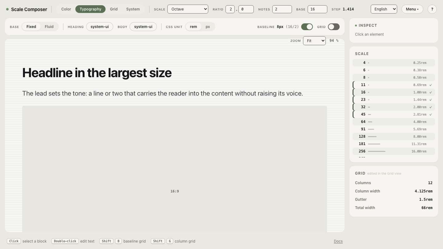
With base 16, ratio 2, and two notes:
| Step i | 16 × 2^(i/2) | Rounded |
|---|---|---|
| −2 | 8.00 | 8 |
| −1 | 11.31 | 11 |
| 0 | 16.00 | 16 |
| 1 | 22.63 | 23 |
| 2 | 32.00 | 32 |
| 3 | 45.25 | 45 |
| 4 | 64.00 | 64 |
Each step is about 41% larger than the one before (2^(1/2) ≈ 1.414). Compare that against the linear menu: at the small end the scale offers 8, 11, and 16 where linear offered only 8 and 16; at the large end it jumps 32 → 45 → 64 in two moves where linear spent four. Dense where fine distinctions are visible, sparse where they aren’t — the perceptual shape, produced by arithmetic.
See it recompute live: open this scale in Scale Composer — drag the ratio and every step moves together; add a note and the in-between values appear. The same three numbers drive the type scale and the baseline (half the base), so spacing and typography stay related by construction.
How many steps does a spacing scale need?
Somewhere between 6 and 10 covers many products. A useful way to budget them: one or two micro steps for the inside of components (icon gaps, chip padding), three or four middle steps for the space between elements and components, and two or three large steps for sections and page regions. Fewer than six forces compromises at one end or the other; many more than ten and the menu stops being short — the decision fatigue the scale was meant to remove creeps back in. Data-dense products sit at the top of that range (more notes per interval); content-heavy sites sit comfortably at the bottom.
What should the steps be called?
Two conventions dominate in practice: numeric (space-1 through space-7)
and t-shirt sizes (xs through 3xl). Numbers keep the ordering obvious and
extend painlessly; t-shirt names are easier to hold in your head but offer no
natural name between md and lg if a step gets inserted later. Either
works — what hurts is switching after the names have spread through components
and stylesheets. The naming question becomes concrete the moment the scale is
exported as spacing tokens, and it deserves
its own treatment there.
Make the same scale fluid
A fixed scale answers “which distances are allowed” — but the same layout also has to work at 360px and at 1440px. Open this scale in fluid mode: the export switches from fixed pixel steps to CSS clamp() expressions that slide between a minimum and a maximum, and every step shares the same viewport slope — so the scale keeps its internal proportions while the absolute sizes adapt to the screen. The menu stays short; it just learns to breathe.