Gutters and Gaps: Spacing Between Columns
A gutter is the space between columns in a layout grid — the distance
modern CSS calls gap. Common widths are 16px on phones and 24px on tablets
and desktops, and in a systematized layout the gutter is not a bespoke
number but a spacing-scale step, chosen per breakpoint.
The word is far older than CSS, and the rules for sizing it are proportional rather than fixed. This article covers where the term comes from, how wide gutters should be, how the column–gutter–margin trio divides a page, and the CSS that implements it — one corner of the broader spacing system.
Why is it called a gutter?
Print inheritance. In a bound book, the gutter is the inner margin where two
facing pages meet — the channel of white space running into the spine.
Typographic grid systems borrowed the word for the space between any two
columns of text, and digital layout inherited it from those print grids
along with most of its column vocabulary. CSS, standardizing the property
decades later, chose the plainer name: gap. Designers tend to say gutter,
stylesheets say gap; both name the same distance.
How wide should a gutter be?
The common answers are 16px on mobile and 24px on tablet and desktop, and they’re reasonable defaults straight off the 8-point grid. But fixed numbers hide the actual rule, which is proportional. A gutter is sized against two neighbors:
- The column width. Somewhere around a quarter to a third of a column separates cleanly — wide enough that adjacent columns don’t shear into each other, narrow enough that the page doesn’t break apart into strips.
- The page margin. The gutter should not exceed the margin. When it does, the layout leaks at the edges: the outermost columns sit closer to the viewport edge than to their own neighbors.
The perceptual mechanism behind both rules is grouping by proximity, in the Gestalt vocabulary: things separated by less space read as belonging together. Columns hold together as one page because the space between them is visibly smaller than the space around them. Invert that relationship and the outer columns start to group with the viewport edge instead of with each other.
How do columns, gutters, and margins relate?
The three members of the trio have deliberately different behavior:
| Member | Behavior | Source |
|---|---|---|
| Column width | Fluid — absorbs viewport change | computed leftover |
| Gutter | Fixed at each breakpoint | a spacing-scale step |
| Margin | Fixed at each breakpoint, ≥ gutter | a spacing-scale step |
One formula ties them together: column width = (container − 2 × margin − (n − 1) × gutter) ÷ n. The fixed members come off the top; the columns split whatever remains. That’s why gutters and margins are natural scale steps while column widths rarely are — the columns are where the arithmetic flexes.
What do real numbers look like at 4, 8, and 12 columns?
Using the spacing scale generated from a 16px base, ratio 2, and two notes per doubling — 8, 11, 16, 23, 32, 45, 64 — the step nearest the conventional 24 is 23 (16 × 2^(1/2) = 22.63, rounded):
| Breakpoint | Columns | Gutter | Margin | Column width |
|---|---|---|---|---|
| Mobile, 375px viewport | 4 | 16px | 16px | 73.75px |
| Tablet, 768px viewport | 8 | 16px | 23px | 76.25px |
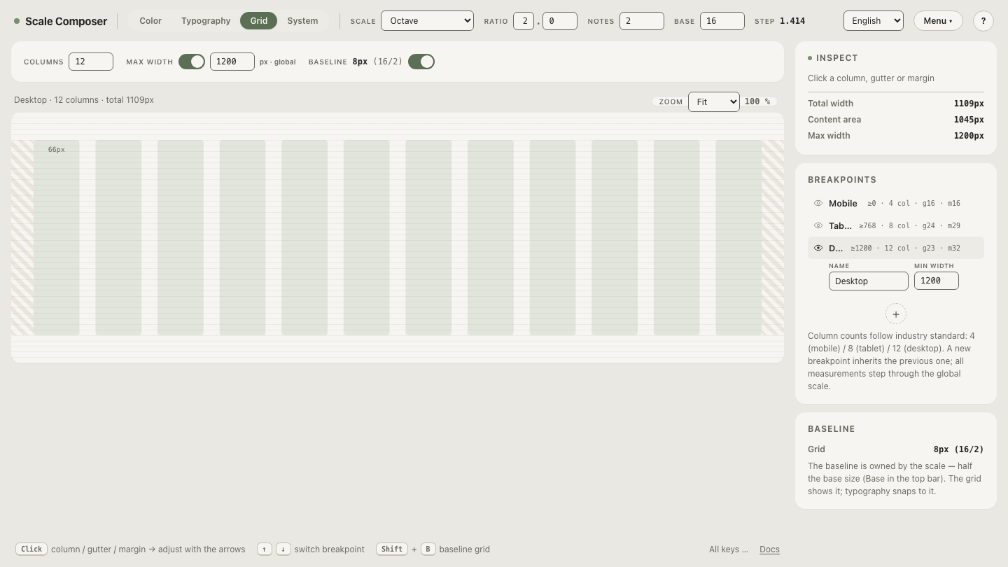
| Desktop, 1200px container | 12 | 23px | 32px | ≈73.6px |
The totals check out line by line: 4 × 73.75 + 3 × 16 + 2 × 16 = 375, and 12 × 73.58 + 11 × 23 + 2 × 32 = 1200. Two things are worth noticing. Column widths hover between 73 and 77px across all three breakpoints — different devices, same-feeling columns — while the gutter-to-column ratio stays inside the quarter-to-third band (16 / 73.75 ≈ 22% on mobile, 23 / 73.6 ≈ 31% on desktop). And the margin never drops below the gutter.
Open this three-breakpoint grid in Scale Composer — the grid view defaults to 4, 8, and 12 columns per breakpoint inside a global container max-width, with gutters and margins drawn from the same scale as everything else.
What’s the CSS for a gutter?
grid-template-columns declares the columns; gap is the gutter:
.page {
  display: grid;
  grid-template-columns: repeat(12, 1fr);  /* fluid columns */
  gap: 23px;                               /* gutter — a scale step */
  max-width: 1200px;                       /* container */
  padding-inline: 32px;                    /* page margin, one step up */
  margin-inline: auto;
}
The 1fr columns are the fluid member of the trio: the browser runs the
same leftover arithmetic as the table above, at every viewport width.
gap also works in
flexbox and multi-column layout, and takes a two-value form — gap: 32px 23px sets row and column gaps separately, which starts to matter the moment
a grid wraps to more than one row. Before gap reached grid and flexbox,
gutters were faked with
margins on the columns and a negative
margin on the
container — a pattern worth recognizing in older codebases, not repeating.
Step the gutters through the scale
Sizing rules stick faster when the layout moves. Load the desktop breakpoint and step the gutter through neighboring scale steps — 16, 23, 32 — with the margin held at 32: at 16 the twelve columns begin to crowd, and at 32 the gutter catches up with the margin and the page starts to lose its frame. One keypress per step is the whole experiment — step the gutters and margins through the scale with your arrow keys in Scale Composer.