prefers-color-scheme: Doing It Right in CSS
prefers-color-scheme is the CSS media feature that reports which color
scheme the user has asked for — light or dark — as set in the operating
system or browser. Doing it right means using it only as the default: custom
properties define the light theme on :root, the media query flips those
defaults when the system prefers dark, and a data-theme attribute set by a
manual toggle overrides both. The query alone is not an implementation,
because most real products also need the toggle — and a toggle cannot
override a media query from CSS.
This is the implementation reference for the switching machinery in our dark mode guide: the query, the override pattern, and the four gotchas that fill support forums.
What does the media query actually read?
The user’s stated preference, passed down from the environment: the OS appearance setting (or a browser-level override where one exists) surfaces in CSS as a media feature, exactly like a viewport width does. The simplest form:
@media (prefers-color-scheme: dark) {
  /* styles for users who asked for dark */
}
No JavaScript is involved, and the query is live: change the OS setting and matching styles apply immediately. The feature’s values and support notes are on MDN’s reference page. What the query does not know about is your UI — it reports the system, not the button in your header.
Why does a manual toggle need to override the media query?
Because every real product ends up with three states, not two: follow the system, forced light, and forced dark. A user whose OS runs dark may still want your app light (long reading sessions are a common reason), and the reverse. The media query can express only the first state — so the robust pattern layers an attribute on top:
:root {
  color-scheme: light dark;
  --background:   oklch(0.94 0.008 262.9);
  --text-primary: oklch(0.28 0.02 262.9);
}

/* default: follow the system */
@media (prefers-color-scheme: dark) {
  :root {
    --background:   oklch(0.22 0.015 262.9);
    --text-primary: oklch(0.94 0.008 262.9);
  }
}

/* forced states: the attribute wins over the default */
[data-theme="light"] {
  color-scheme: light;
  --background:   oklch(0.94 0.008 262.9);
  --text-primary: oklch(0.28 0.02 262.9);
}

[data-theme="dark"] {
  color-scheme: dark;
  --background:   oklch(0.22 0.015 262.9);
  --text-primary: oklch(0.94 0.008 262.9);
}

body { background: var(--background); color: var(--text-primary); }
Read it as a cascade of defaults: :root says light, the media query says
“unless the system prefers dark”, the attribute says “unless the user told
us otherwise”. With no attribute present, the site follows the system; with
one, the user’s in-app choice wins. The JavaScript side is one line plus
storage:
const saved = localStorage.getItem("theme");   // "light" | "dark" | null
if (saved) document.documentElement.dataset.theme = saved;
null — the third state — means “set no attribute and let the media query
decide”. Storing "system" explicitly and removing the attribute works the
same way.
That is the entire worked example: about twenty-five lines of CSS and three of JavaScript cover system-following, both forced states, and native form controls. The values themselves come in pairs — one per theme, per role — which is where the token layer hands the pattern its data.
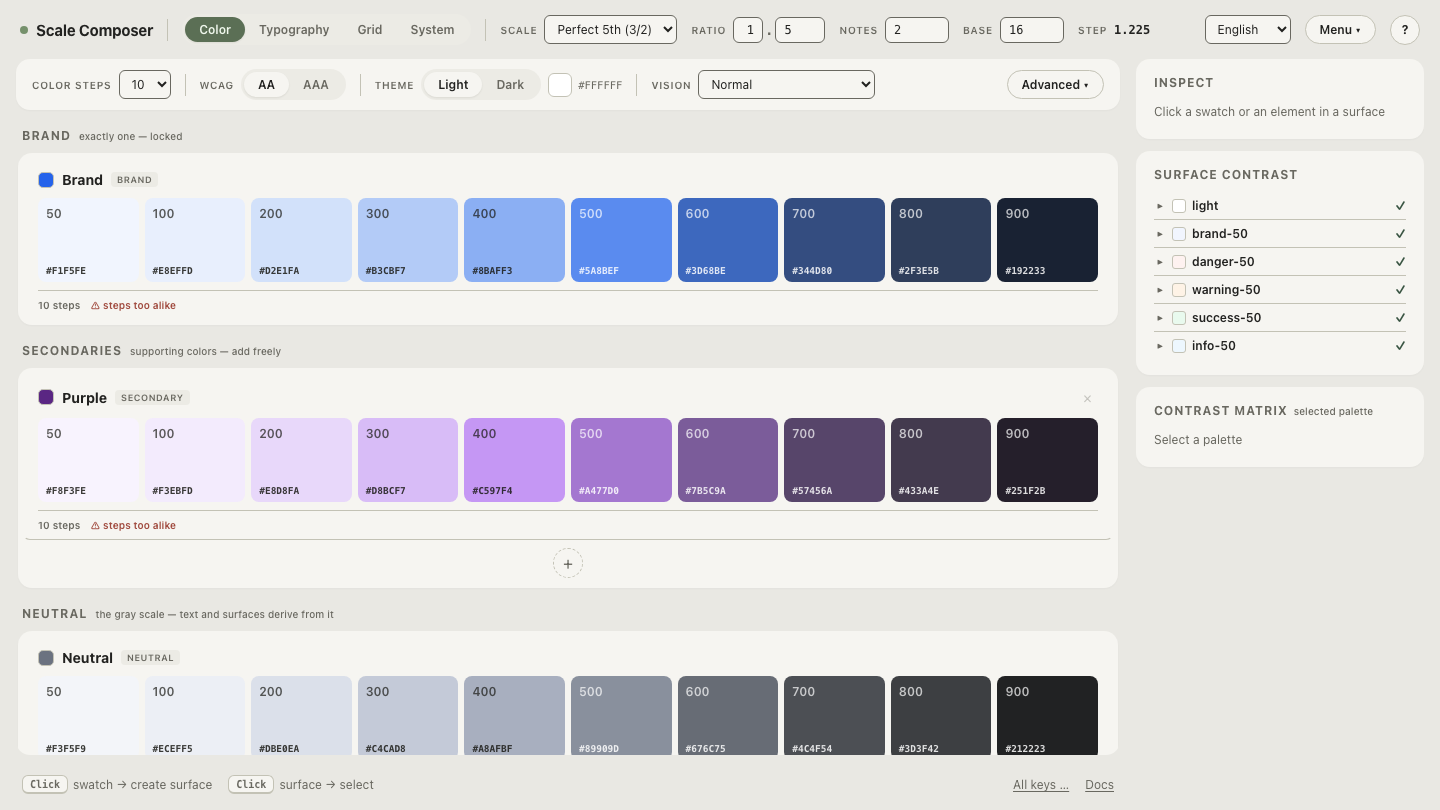
See a role set holding both themes’ values in Scale Composer — each semantic role with its light and dark value side by side, ready to paste into the two blocks above.
What are the gotchas that fill support forums?
Form controls ignore your theme. Your CSS paints the page dark, but
scrollbars, checkboxes and dropdowns stay light — because the browser
paints those, and it was never told. The fix is the one-liner already in the
pattern above: color-scheme: light dark tells the browser which schemes the
page supports, and the forced-state blocks narrow it so native controls
follow the override, not just the query.
The flash of the wrong theme. A dark-preference user loads the page,
sees a white flash, then the theme applies. It happens when the stored
override is applied by a script that runs after first paint. The honest fix
is an inline script in the <head> — before the stylesheet-dependent render,
not deferred, not bundled — that reads localStorage and sets the attribute.
It is render-blocking by design; keep it to those few lines.
Images and embeds don’t follow. A <picture> element can
swap sources per theme
with media="(prefers-color-scheme: dark)", but that follows the system,
not your data-theme override — a known asymmetry of the attribute pattern.
Iframes resolve the query in their own context. For content that must track
the in-app toggle, CSS (or a small script) has to do the swapping.
The switch animates everything. A blanket transition: all on
theme-affected elements turns the flip into a slow crossfade of every color
on screen. Scope transitions to the properties that need them, or briefly
disable transitions while switching.
Does the query make the dark theme good?
No — it only answers which theme to show. Whether the dark theme is worth switching to is decided by the palette behind the custom properties: a dark set derived with its own lightness curve and a chroma boost reads as a designed theme, while inverted light values read as a negative of one. The query is routing; the values are the product. Deriving those values is the rest of this hub’s subject.
Check the pattern against your own values
The two blocks in the pattern are only as good as the pairs you fill them with. Load a palette and check every role’s anchor under both themes — the same role names resolving per theme, contrast floors re-checked on each side, so the values you paste into the media query and the attribute block are already verified pairs.