Images and Media in Dark Mode
The dashboard’s dark theme shipped in good shape: a near-black page, tidy surface steps, off-white text, checked contrast throughout. Then the content loaded. Every chart was a screenshot with a white plot background, the product photos were shot on white, and the help panel embedded a video with a white thumbnail. At night the interface read as a row of lit windows on a dark wall — the theme was dark; the page was not.
Images are the part of the page a theme cannot recolor: photographs,
screenshots and embeds keep their own pixels in both modes. Unhandled, a
white-background image becomes the brightest object in a dark UI by a wide
margin — against a near-black page it sits at roughly 20:1, brighter than any
text in the theme. The working responses, roughly in order of cost: dim media
slightly in dark mode, serve dark variants of the graphics you own, draw icons
and diagrams in currentColor, and mat what remains inside a frame. The
palette those fixes sit inside — the anchor, the surfaces, the text values —
is the subject of our dark mode guide; this article is
about the pixels that palette cannot reach.
Why do bright images wreck a dark theme?
Because the eye keeps adapting to the brightest thing it sees. Vision adjusts to the average luminance of the visual field, and a dark theme works by holding that average low — moderate-luminance text reads clearly because the whole field agrees on how dark the world is. A bright rectangle breaks the agreement: adaptation resets toward the image, and everything around it goes murky. The image does not just sit on the page; it re-calibrates the page around itself.
The numbers say how lopsided it is. Against a page at L ≈0.15 — ≈#070B14 —
a white image field measures ≈20:1, while the theme’s own brightest body text
runs ≈15:1. The screenshot out-contrasts every headline on the screen, and
attention follows contrast whether or not the content deserves it.
Should images be dimmed in dark mode?
Slight dimming is the cheapest effective fix, and it is one rule:
@media (prefers-color-scheme: dark) {
  .content img,
  .content video {
    filter: brightness(0.85);
  }
}
A ≈0.85 multiplier takes a white image field from ≈20:1 down to ≈14:1 against the same page — into the register of the theme’s own bright text rather than above it. The image stops being the loudest object on screen, and most photographs survive the change without visible harm.
The caveat is fidelity. The filter multiplies every channel, so it dims the product along with its background — and a fabric color or a paint swatch that sells on accuracy should be dimmed gently (0.9-class) or not at all. Dimming is a blunt instrument: it does not know what the image shows, only how bright it is. It earns its place as the default treatment for content imagery, with exceptions declared where color is the merchandise.
How do you serve a different image per theme?
For graphics you own — logos, illustrations, charts — the robust answer is to ship two assets and let the browser choose:
<picture>
  <source srcset="revenue-chart-dark.svg"
          media="(prefers-color-scheme: dark)">
  <img src="revenue-chart-light.svg" alt="Revenue by quarter">
</picture>
The <source> element’s media query selects the dark variant whenever the
user’s system asks for it; the <img> remains the fallback everywhere else.
The full behavior of the element is documented on
MDN’s picture reference.
The cost is honest: two assets to produce and keep in sync, forever. It is worth paying for the graphics that carry meaning — and the dark variant should be designed for the dark ground, not generated from the light one: transparent or theme-colored backgrounds, and colors chosen for near-black the way the rest of the dark palette was.
When does currentColor solve it?
For icons and single-color diagrams, the token-friendly answer is to stop
shipping color in the asset at all. An inline SVG drawn with
fill="currentColor" or stroke="currentColor" inherits the CSS text color
of its context — which means it inherits the semantic text token, which means
it re-themes the moment the theme switches, with no second asset and no
filter. Arrows, status glyphs, empty-state line art and simple architecture
diagrams can all travel this way.
The limit is in the name: one color. The technique covers graphics that are
drawings of lines, not pictures of things — the moment an asset needs its own
palette, it graduates to the <picture> treatment above.
What is the frame pattern?
Some brightness cannot be dimmed or replaced: user-uploaded photos, third-party thumbnails, the chart that must stay white for fidelity. The remaining move is to change what the brightness means. A useful analogy is the gallery wall: a white photograph on a dark wall is never hung bare — it gets a mat and a frame, and the mat negotiates between the bright print and the dark room. The interface equivalent is to place bright media on an elevated surface with visible padding: the image reads as content presented in a frame instead of a hole burned in the theme.
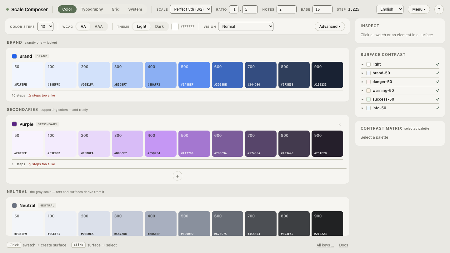
The frame is built entirely from the palette’s existing machinery — an elevated surface a step above the page (L ≈0.19-class over an L ≈0.15 anchor), padding wide enough to read as deliberate, and optionally a hairline border from the border role. Nothing in this workflow touches the image’s pixels; the palette’s job is to receive them well. Open the frame’s palette in Scale Composer — the dark page anchor with the elevated surface and border values a media frame draws from, and the lightness gap between the steps measured.
What should you never do to images in dark mode?
Two treatments recur and both read as damage. Auto-inverting photographs —
extending the theme’s filter: invert() to media — turns them into negatives:
skies go orange, faces go cyan, and no amount of hue rotation fully rescues
them. Inversion has a place for pure-black-on-white line art and nowhere else
in the image pipeline. Heavy dimming is the subtler failure: push the
brightness filter toward 0.5 and imagery stops looking adapted and starts
looking broken — readers judge photographs against memory, not against the
page, and a photo darkened that far reads as a failing panel rather than a
design decision.
What about screenshots in documentation?
Documentation is the special case because screenshots are its content — page after page of large, mostly-white rectangles if the product was captured in light mode. Two honest options exist. The thorough one: capture a dark-theme screenshot set for the dark-theme docs, so the pictures match the page around them — at the real cost of doubling the capture and maintenance matrix. The pragmatic one: keep a single set and apply the frame pattern consistently, so every screenshot sits matted on an elevated surface and the brightness reads as framed content. Wrapper dimming works as a stopgap for text-heavy captures, but small UI text in screenshots loses legibility quickly, so dim documentation captures more gently than photography.
Set the stage for the pixels you can’t change
The images will arrive as bright as they are; what a design system controls is the stage they land on. Build the media frame’s values — the elevated surface, border and page roles that mat bright content, exported as tokens with the rest of the dark theme, so the frame ships as system rather than as improvisation.