Semantic Tokens for Theme Switching
Theme switching is a naming problem before it is a CSS problem. Dark mode
design tokens are semantic roles — background, surface, text-primary —
where each role holds two values, one per theme, and components reference only
the role name. Switch the theme and every reference re-resolves at once; no
component carries an opinion about which mode it is in. The engineering risk
is not the switch but the mapping: a dark theme’s role-to-value table is not a
mirror of the light one, so it has to be derived and re-checked, never
flipped.
The layered setup underneath fits in one paragraph:
primitive tokens name the raw material
(the ramp steps — brand-600, neutral-100), semantic tokens
name UI jobs and point at primitives, and components consume semantics only.
The naming arguments and the design-file mechanics have their own guides; this
article — part of our dark mode guide — is about what the
semantic layer does when a second theme arrives.
Why does each role need two values?
Because a role’s meaning is stable and its value is not. background means
“the page’s resting color” in any theme; the value doing that job is
near-white in light mode and near-black in dark. The semantic layer is the
theme boundary: everything above it — components, layouts, screens — stays
theme-blind, and everything below it changes wholesale.
This is also the intuitive reason the pattern works for the people using it. A designer or developer thinking in roles asks what is this surface for, which has one answer; thinking in values asks which gray is this, which has two answers that must be kept in sync by hand. Names that promise a job instead of a value are what make the second theme a data change rather than a second design.
Why isn’t the dark mapping a mirror of the light one?
The tempting mental model is to flip the scale — if light mode uses
neutral-100 for the page, dark mode uses its opposite number. Deriving the
mapping and checking it produces something more interesting. Six roles from a
palette seeded with #2563eb — oklch(0.546 0.215 262.9):
| Role | Light | Dark (derived) | A straight mirror would say |
|---|---|---|---|
background | neutral-100 (L ≈0.94) | neutral-900 (L ≈0.22) | neutral-800 — but the page anchors at the scale’s bottom so the elevation ladder has room above it |
surface (card) | neutral-50 (L ≈0.97) | neutral-800 (L ≈0.28) | neutral-900 — which would sink the card below the page and invert elevation |
text-primary | neutral-800 (L ≈0.28) | neutral-100 (L ≈0.94) | neutral-100 — holds, though hand-tuned themes often over-soften to neutral-200, which reads thin |
text-secondary | neutral-600 (L ≈0.47) | neutral-300 (L ≈0.78) | neutral-300 — the mirror holds |
border-subtle | neutral-200, darker than the card | neutral-700, lighter than the card | the same steps — but the relationship flips direction |
accent | brand-600 (≈#3E65B5) | ≈oklch(0.70 0.14 262.9) from the dark ramp | brand-300 of the light ramp — the wrong ramp entirely |
Three asymmetries are worth naming. First, background and surface cross
their mirrors: raised surfaces must be lighter than what they sit on in dark
mode, so the card lands above the page on the lightness scale even though
mirroring would have placed it below. Second, text: neutral-200 on the dark
page still clears the arithmetic floor (≈12:1 against the 4.5:1 requirement),
but light-on-dark text tends to render thinner than the numbers suggest —
APCA, which models polarity, reports the pair lower than its light-theme twin
— so the derivation lands a step lighter than caution would pick. Third, the
accent’s dark value does not come from the light ramp at all:
a derived dark palette runs its own lightness curve
with chroma boosted by roughly 20 %,
because dark surroundings mute perceived colorfulness.
The practical consequence: the two mappings should be produced by one
derivation, not maintained as two lists. Scale Composer’s token export carries a
semantic and a semantic-dark section generated from the same seeds — every
role re-derived per theme, WCAG floors re-checked, APCA reported alongside,
and onFill roles re-verified, since a fill that carried white text on light
may want dark text on dark.
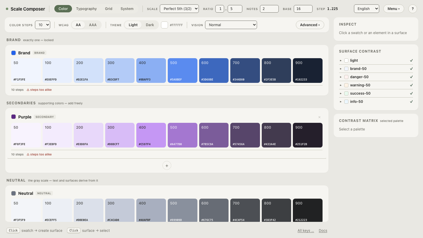
Open the export with both semantic sections in Scale Composer — the same role names on both sides, the dark values visibly not a mirror of the light ones.
Which theme-switching patterns fail at scale?
Three patterns recur, and all three fail the same way — the mapping gets scattered instead of declared once.
dark: variants per component. Tailwind’s dark: prefix restates the
dark value at every usage site: bg-white dark:bg-gray-900 on every card, in
every file. For a small site this is fine — the whole mapping fits on one
screen. For a system it is a maintenance tax: changing what “surface” means in
dark mode is a find-and-replace across the codebase, and any component that
missed its dark: twin ships broken in one theme.
if (isDark) in component code. Theme conditionals move the mapping into
logic, where it can branch, drift and escape review. A component that asks
which theme is active has taken on a responsibility the token layer already
carries.
Two stylesheets. A dark.css maintained next to a light.css starts as
a copy and drifts from the first edit that touches only one file. Nothing
enforces that both files answer the same questions.
How do CSS custom properties carry the switch?
By re-declaring the same names under a theme scope. Components reference the custom property; the property’s value depends on which declaration currently applies — the mechanics are CSS custom properties plus the cascade, nothing more.
:root {
  --color-background:   oklch(0.94 0.008 262.9);  /* neutral-100 */
  --color-surface:      oklch(0.97 0.005 262.9);  /* neutral-50  */
  --color-text-primary: oklch(0.28 0.02 262.9);   /* neutral-800 */
  --color-accent:       oklch(0.546 0.215 262.9); /* brand core  */
}

[data-theme="dark"] {
  --color-background:   oklch(0.22 0.015 262.9);  /* neutral-900 */
  --color-surface:      oklch(0.28 0.02 262.9);   /* neutral-800 */
  --color-text-primary: oklch(0.94 0.008 262.9);  /* neutral-100 */
  --color-accent:       oklch(0.70 0.14 262.9);   /* dark ramp   */
}

.card {
  background: var(--color-surface);
  color: var(--color-text-primary);
}
The .card rule is the point: it appears once, mentions no theme, and is
correct in both. The dark block can equally hang off the
prefers-color-scheme media query, or — the robust pattern — the query sets
the default and the attribute overrides it; the wiring details are
their own article. Whichever trigger you choose, the CSS export from a token source
generates both blocks from the same derivation, which is what keeps the two
mappings from drifting apart.
Watch a switch resolve
The mapping is easiest to trust after watching it move. Flip the theme preview on the full role set — every semantic role re-resolving at once, the asymmetries from the table above visible in place: the card staying lighter than the page, the accent jumping to a lighter step of a re-derived ramp, no component-level decisions anywhere.