The Color view
Seed one brand color and the Color view derives the rest: a full OKLCH ramp, a brand-tinted neutral scale, the four functional colors, and the semantic roles your CSS actually uses — with WCAG contrast floors enforced as you work.
The toolbar

- Steps — how many values each ramp gets (the familiar 50–900 runs ten). Step lightness follows a curve shaped by the global scale’s ratio, so the color progression and the type progression share a skeleton.
- Chroma curve — how saturation is distributed across the ramp (bell keeps the mids vivid and the ends calm).
- WCAG level — the contrast floor (AA or AAA) that the semantic derivation must respect.
- Dark — generates the dark variant of every ramp as its own derivation, with its own lightness curve and a slight chroma boost — not an inversion of the light theme.
- Advanced — progressive disclosure for the sharper knobs (per-ramp hue offset, chroma multiplier, lightness floor, P3 gamut). A dot on the button marks when something in there deviates from defaults.
Ramps and roles

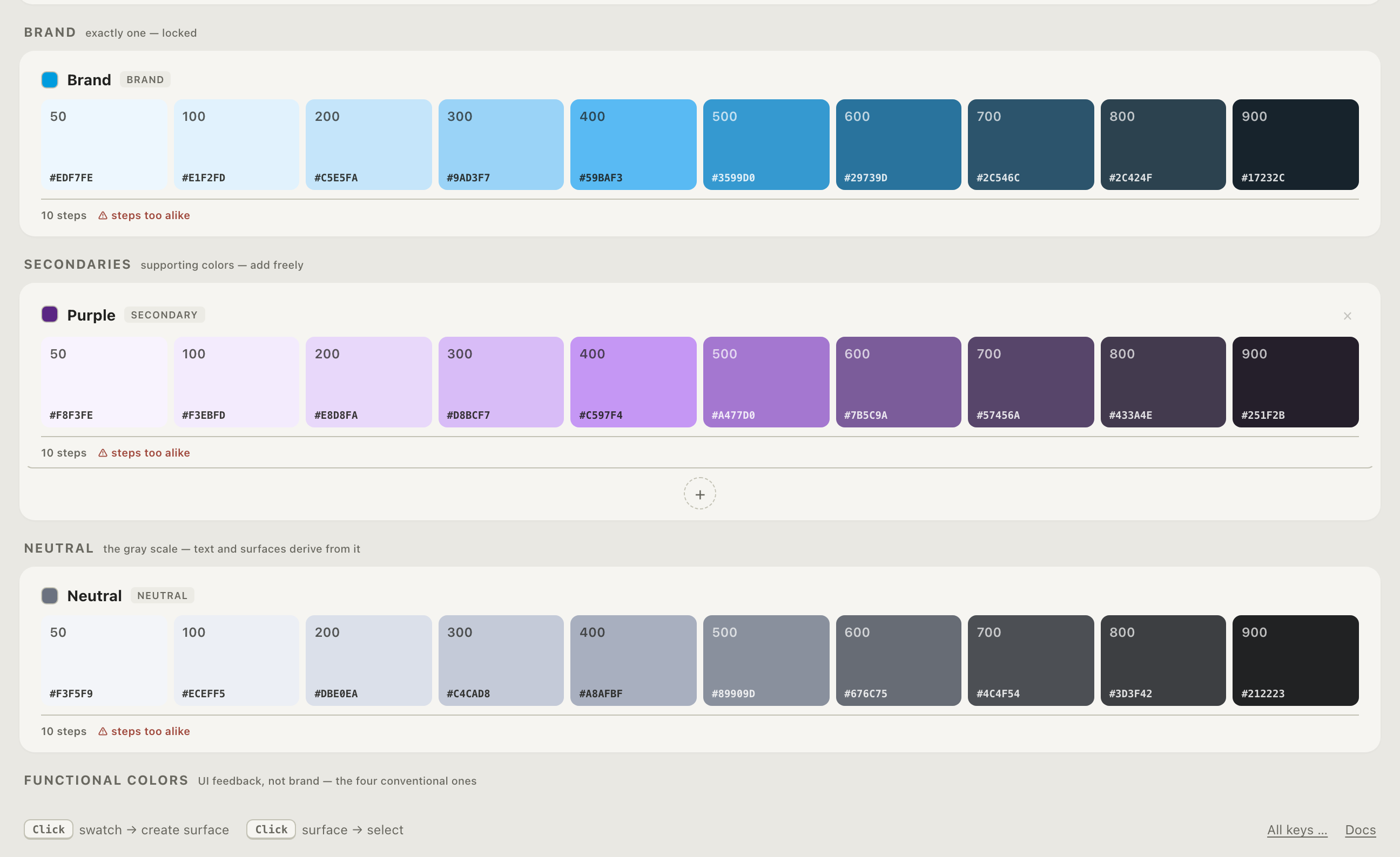
Each palette is one card: seed at the top, derived steps below, with hex values and step labels. The tool warns when adjacent steps are too alike to be distinguishable — a just-noticeable-difference check, not an aesthetic opinion.
Palettes are grouped by role, and the grouping is a convention the tool enforces rather than a suggestion:
- Brand — exactly one; the seed everything else responds to.
- Secondary — as many as you want; the ”+” lives here.
- Neutral — exactly one, tinted by the brand hue so grays belong to the family.
- Functional — exactly four: danger, warning, success, info. The fixed set is the point — these names are what downstream code expects.
Page anchors and dark mode

The two anchors define the page background in light and dark. The dark anchor follows the darkest brand step automatically — “night is tinted by the brand” — until you deliberately break the link with a custom pick; a relink button restores it.
The sidebar

Select any swatch and the sidebar inspects it: OKLCH components, hex, contrast against both anchors (WCAG ratio and APCA Lc side by side), and harmony suggestions derived from the seed — a deep, a counter-hue, a steel, a tint — each one click from becoming a secondary palette.
Vision-deficiency simulation (protanopia, deuteranopia, tritanopia) renders the whole canvas through the corresponding matrices — a check, presented without judgment.
Theory
The learn section covers the ideas in depth: OKLCH · color scales · contrast · dark mode · brand color systems.