Typography for Forms and Inputs
There is a form failure so common it has become a named anti-pattern: the placeholder-as-label form. Every field is a clean empty box with pale gray text inside — “Email address”, “IBAN”, “VAT number” — and the moment the user clicks and types, the label vanishes. Fill in six fields, get interrupted, come back, and the form is a wall of anonymous boxes: checking what you typed against what was asked is impossible without emptying fields to see their labels again. On a checkout or a bank transfer, that isn’t friction — it’s abandoned carts and mis-sent money.
Form typography is set for scanning and verifying rather than continuous reading: input text at a 16px minimum, labels above the field at body size or one step down in a medium weight, helper and error text small but not below roughly 13px, errors signaled by more than color, and monospace for anything checked character by character. Each rule on that list exists because form errors, unlike prose misreadings, cost real money and time. This article is part of our typography guide.
Why do forms need different typography from body text?
Prose is read in flow — the eye rides context and predicts upcoming words. Forms are read in a different mode entirely: scan to the next field, read a short label, produce text of your own, then verify what you produced. The verification step is the unusual one. Reading your own freshly typed characters is harder than reading typeset prose, because there is no sentence context to predict from — nothing in an IBAN suggests whether the next digit should be a 4 or a 9, so every character must be individually decoded — legibility work rather than readability work.
That makes forms typography’s highest-stakes habitat. A slightly-too-gray paragraph costs comfort; a mis-verified account number costs a support ticket, a failed payment, or worse. The rules below are ordinary typographic ideas pushed harder because the price of failure is higher.
What font size should form inputs use?
Sixteen pixels, minimum, for the text inside the field. Two reasons — one mechanical, one perceptual.
The mechanical one is the iOS zoom gotcha: when a focused input’s font size is below 16px, Safari on iPhone zooms the whole page in to compensate. The layout jumps, the field slides off-center, and the user has to pinch back out after every field. This is long-standing behavior, and setting input text at 16px or above is the plain fix — the browser is effectively enforcing a floor for text you are expected to type into.
The perceptual reason is verification reading. Body prose survives 14px because context does part of the work; your own typed IBAN at 14px gets no such help, and character-by-character checking needs the extra size. Teams building desktop-only internal tools sometimes drop inputs to 14px and get away with it — but anywhere a phone can reach the page, 16px is the floor.
Where should labels go — above, beside, or inside the field?
Above the field, left-aligned with it. Usability guidance built on how eyes travel through forms — reflected in the W3C’s form labeling tutorial — favors top labels: the eye moves down a single column, and each label–field pair is taken in as one unit. Labels beside the field force a zigzag scan and an awkward variable gap between label and box; they also break first on narrow screens.
Labels inside the field — the placeholder pattern from the opening — fail structurally rather than stylistically: the label is destroyed by the act of answering it. Placeholders still have a legitimate job as supplementary format hints (“name@company.com”) — just never as the only name a field has.
How should labels, helper text and errors be styled?
- Labels: body size or one step down, medium weight. On a 16px scale that means 16px or 14px at weight 500 — present enough to scan, quiet enough not to compete with what the user types. Attachment is spacing, not styling: a label belongs visibly closer to its own field than to the field above it (the proximity principle from perception — things nearer each other read as belonging together). If label-to-field is 8px, field-to-next-label should be 20px or more.
- Helper text: small, but not below ~13px. One step down from body is natural; below roughly 13px, the text that explains formats and edge cases becomes the text nobody can read.
- Error text: same floor, and never hue alone. Red text plus an icon plus a message — color-blind users lose pure hue signals, so the error must also be findable by shape and position (never color alone, in form clothing). A medium weight helps it register.
- Input text itself: full-contrast ink. A surprising number of shipped forms style the user’s typed text in the same pale gray as placeholders — the user’s own words then read as a suggestion rather than an answer, and verification gets harder for no reason. Typed text is content, not hint.
What does one form field look like on a 16px scale?
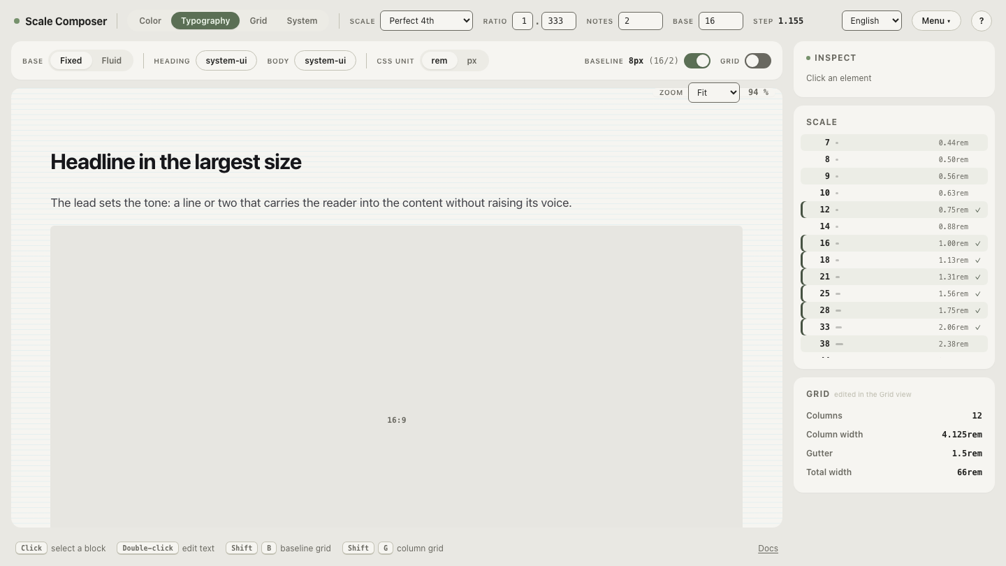
From a 16px base scale (ratio 1.333, two notes per interval → 12, 14, 16, 18, 21…), a complete field anatomy:
| Part | Size | Weight | Line height | Color |
|---|---|---|---|---|
| Label | 14px | 500 | 20px | full-contrast ink |
| Input text | 16px | 400 | 24px | full-contrast ink |
| Helper text | 14px | 400 | 20px | accessible gray (≥ 4.5:1) |
| Error text | 14px | 500 | 20px | red + icon (≥ 4.5:1) |
The spacing comes from the same system: 8px from label to field, 20–24px between fields, and every line height a multiple of the 8px baseline unit — so a long form stacks onto one vertical rhythm instead of accumulating per-field drift.
You can inspect these levels as live type: open the form’s three text levels in Scale Composer — label, input and helper drawn from one 16px scale, each with its own weight and letter-spacing — and type your own labels into the specimen to judge them at real sizes.
When should an input be monospace?
Whenever the reading mode is character-by-character: confirmation codes,
IBANs, license keys, API tokens, card numbers. The reason is fixed pitch —
every character occupies the same width, so the fifth character sits in the
same place in every string, digits can be compared column against column, and
a missing character changes the string’s length visibly. Proportional faces
are optimized for word shapes; verification doesn’t read words. Pair the
monospace with grouping (SE35 5000 0000 …) and you have given the user’s
eye the same structure the bank’s validator uses.
Build the dense variant
Back-office forms trade air for rows on screen, and the compression is a good test of which rules bend: labels can drop to 12px medium with slightly opened letter-spacing, line heights tighten by one baseline step, field gaps shrink from 24px toward 16px — while helper text holds at 14px (the scale’s next step down, 12px, crosses the ~13px floor) and input text stays at 16px, because the zoom behavior and verification reading don’t care how dense your dashboard is. To see which rules compressed and which refused, load the dense variant of the same field anatomy.