Never Rely on Color Alone
“Never rely on color alone” is the plain-language form of WCAG success criterion 1.4.1, Use of Color: color must not be the only visual means of conveying information, indicating an action, prompting a response, or distinguishing one element from another. It does not ban color — it bans color as the sole carrier of meaning. The fix is redundancy: pair every color-coded signal with a second cue, whether an icon, a text label, a shape, an underline or a position. It is the accessibility rule that costs almost nothing to meet while you build and a fortune to retrofit after launch, because by then the missing cues are scattered across every screen.
Why color needs a partner at all connects directly to the physiology in our contrast guide: a meaningful share of users cannot distinguish the hue you are relying on. But the rule is broader than color blindness — it also covers low-contrast conditions, grayscale printing, and simply not noticing a subtle tint. Redundancy answers all of them at once.
What exactly does WCAG 1.4.1 require?
The criterion targets four jobs color often does alone: conveying information, indicating an action, prompting a response, and distinguishing a visual element. In each case color may do the job — it just cannot be the only thing doing it. A red error message is fine; a message that is an error only because it is red is not.
The intuitive why is worth stating, because it makes the rule feel less like compliance and more like engineering. Color is a fast channel — the eye reads it pre-attentively, before you focus — but it is not a universal one: it fails for color-blind users, for grayscale output, in bright sun, on a cheap projector. Every robust signaling system built for the real world uses redundancy for exactly this reason. A traffic light is the canonical example: it encodes stop-versus-go in position (top versus bottom) as well as color, so it still works for a red–green color-blind driver and for a faded, sun-bleached lamp. Interfaces earn the same durability the same way.
What does relying on color alone look like?
The failure gallery is short and instantly recognizable:
- Required fields marked by a red asterisk — where “red” is the only thing separating it from a decorative star.
- Error states that only tint the input border red, with no icon, message or change of shape.
- Links distinguished from body text by color only — the classic, and the reason underlines exist.
- Chart series separated only by hue, so the legend is unreadable to anyone who can’t tell the lines apart.
- Status dots that are green or red and nothing else.
- Diff views that mark additions and deletions with red and green fills alone.
Each of these ships constantly, and each converts to accessible with one added cue.
What are the fix patterns?
Pair the color with a second channel that carries the same meaning:
- an icon — a check, a cross, a warning triangle;
- a text label — “Required”, “Error”, “Sale”;
- a shape — a filled versus outlined badge;
- a pattern — hatching or dashes in a chart fill;
- an underline — the native “this is a link” cue;
- a position — the traffic-light move, order carrying the meaning.
The color stays. It is doing useful work — it is fast, and for most users it is the first thing read. You are adding a floor beneath it so the meaning does not fall through when color fails.
Isn’t this just “avoid color”? The nuance most people miss
No — and getting this wrong leads to timid, colorless design in the name of accessibility. The criterion is about meaning, not decoration. A brand-colored primary button is completely fine: the color decorates, while the button’s shape and its label (“Save changes”) carry the meaning. The color could vanish and the button would still be a labeled button. Contrast that with a red-versus-green toggle where both states are identical rectangles with identical labels — there the color is the only difference between on and off, and that is the violation. Ask of any element: if the color disappeared, would the meaning survive? If yes, the color is decorating; if no, it is carrying, and it needs a partner.
The official Understanding 1.4.1 document is the authoritative reference, and it is where one narrow carve-out lives. Links may be distinguished from surrounding text by color alone if that color difference reaches at least 3:1 against the body text and another visual cue appears on hover and focus. It is a genuine exception — but the conditions are strict enough that they mostly prove the rule: even the sanctioned color-only case demands a second cue the moment the user interacts. In practice, an underline is simpler and safer.
Worked example: a form error, three ways
Take an email field that failed validation. Watch what each version communicates, and what survives a red–green CVD simulation.
| Version | Cues present | Under deuteranopia |
|---|---|---|
| Color only | Red border, red text #dc2626 | Red shifts to a dull olive (≈#8f801b); border reads as a slightly-off neutral, and its contrast against white falls from ≈4.83:1 to ≈4:1 — nothing says error |
| + Icon | Red border, red text, warning triangle | The triangle’s shape carries “problem” regardless of hue — the error is legible before color is decoded |
| + Icon + text | All the above, plus “Enter a valid email address” | Fully explicit: the message states the problem and how to fix it; color is now the fastest cue, not the only one |
The color-only version is not subtly worse — it is invisible as an error to a red–green viewer, who sees a field with a mildly discolored border and no idea anything is wrong. The two-line fix (icon plus message) makes the error survive color blindness, grayscale, and a distracted glance, at no cost to the design for everyone else.
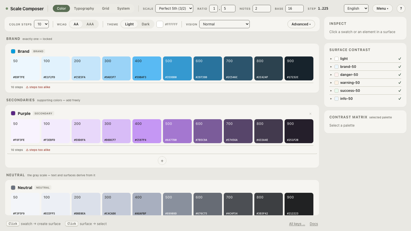
Open a set of signals built with color plus a second channel — status roles, error states and focus indicators, each carrying an icon or label alongside the hue, shown with the color channel simulated away.
How do you audit your own interface for it?
Turn off the color. Load your palette and run it through a CVD simulation — then walk your key states (required, error, success, active, selected) and ask the single question that decides every case: with the hue gone, does the meaning survive? Every “no” is a place one icon, label or underline turns a color-only signal into a robust one — found now, while it costs a line of markup instead of a redesign.