4pt vs 8pt Grid: When to Use Which
The 4pt and 8pt grids are layers of one spacing method, not rival systems: multiples of 8 handle layout-level spacing — the gaps between components and sections — while multiples of 4 handle fine inner spacing, such as icon padding and label-to-input gaps, plus typography. The practical question is not which grid to adopt but which layer each distance belongs to.
This article covers what separates the two grids, what pushes a product toward the 4pt layer, why small distances need finer steps in the first place, and the documentation habit that keeps the two layers from collapsing into one noisy menu. It builds on the foundations covered across the spacing system hub.
What is the difference between a 4pt and an 8pt grid?
Only the step size. An 8pt grid allows 8, 16, 24, 32, 40…; a 4pt grid allows 4, 8, 12, 16, 20, 24… — twice as many values below any ceiling. Every value an 8pt grid permits, a 4pt grid permits too, which is why the pair is better described as one grid with a half-step than as two systems.
The trade-off is direct. A shorter menu means fewer decisions and more consistency between screens designed by different people; a finer menu means more expressive range at small sizes, and more room to drift apart. Neither wins outright, so mature systems tend to run both at once, each scoped to its own layer:
- 8-multiples for layout: space between components, space between sections, container padding, fixed component heights.
- 4-multiples inside components: icon-to-label gaps, padding in chips and badges, the distance from a label to its input — and typography, where sizes and line heights often land on 4s.
Platform conventions operate at this level too; Apple’s Human Interface Guidelines on layout are one example of the margin and spacing guidance a grid has to coexist with on a real platform.
When does a product need the 4pt layer?
Three pressures push a product beyond pure 8s:
- Data density. Tables, dashboards, admin panels: in a 32px-tall row, 8px of cell padding is already a quarter of the height. Dense products need 4 and 12 — values the 8pt menu doesn’t have.
- Compact components. Chips, badges, toolbar buttons, sidebar list items: inside a 24px-tall element, the jump from 8 to 16 skips over the value that fits.
- Small type. Labels and captions at 12–14px sit closer to their neighbors than body text does. The gap between a 12px label and its input reads right at 4px; 8px already looks detached.
Content-heavy pages, by contrast, live comfortably on 8s — long text, generous sections, few compact controls. If a product is mostly reading, the 4pt layer may never earn its keep.
Why do small distances need finer steps?
Because the eye judges a gap relative to the elements it separates, not in absolute pixels. Add 4px inside a 24px-tall chip and the component visibly changes — the gap grew by a proportion anyone can see. Add the same 4px to a 64px section gap and few people will notice anything. The resolution you need is proportional to the distance you’re setting: fine steps up close, coarse steps far apart.
That’s the intuition behind the layering. Small spacing isn’t more important than large spacing — it’s the range where a 4px difference is still a visible decision, so the menu has to offer it there.
What does the split look like in practice?
Here is a dense form measured distance by distance:
| Distance | Value | Layer |
|---|---|---|
| Label to its input | 4px | 4pt — inner |
| Input to its helper text | 4px | 4pt — inner |
| Icon to text inside the field | 8px | shared (8 is also a 4-multiple) |
| Field to the next field | 16px | 8pt — layout |
| Field group to the next group | 32px | 8pt — layout |
| Form to the surrounding section | 64px | 8pt — layout |
Read down the value column: the fine distinctions cluster at the small end, and every layout-level distance is an 8-multiple. That distribution — dense at the bottom, sparse at the top — is what a non-linear spacing scale produces from a formula rather than from case-by-case rulings.
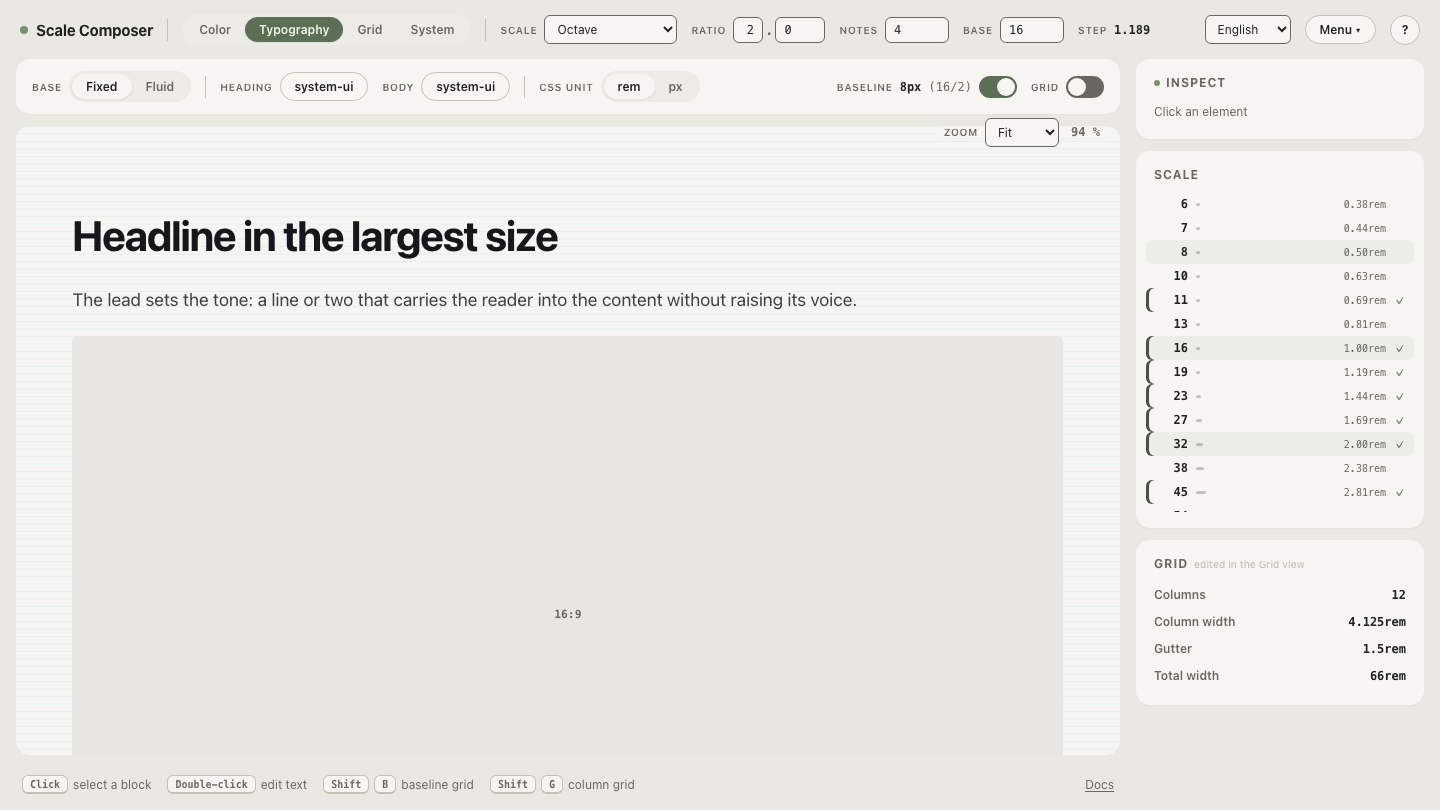
See the dense end live: open this 4pt-friendly scale in Scale Composer — the base stays the same, but each interval of the scale is subdivided into more notes, so the small end gains the in-between steps a dense UI needs while the top keeps its big layout jumps.
Doesn’t allowing 4s everywhere defeat the point?
Yes — this is the pitfall. The value of a grid is the short menu: a handful of values everyone picks from, so screens built independently still come out related. Allow 4-multiples everywhere and the menu below 64px grows from 8 options to 15; adjacent screens start disagreeing about section gaps again — 20 here, 24 there — and the consistency the grid existed to buy erodes quietly.
The fix costs one sentence in your spacing documentation: inner spacing and typography may use 4-multiples; spacing between components and sections uses 8-multiples. With the boundary written down, a 12px section gap becomes a reviewable violation instead of a matter of taste, and the 4pt layer adds precision without reopening every decision the 8pt grid had already closed.
Try the layout layer against real columns
The other half of the answer is seeing how little the fine steps matter at layout scale. Open the grid view with an 8pt layout scale loaded and step the gutters and margins through the scale — 4 columns on mobile, 8 on tablet, 12 on desktop. Moving a gutter one step is clearly visible; the 4px refinements that earned their place inside a chip would be invisible out here. That contrast is the whole argument for layering the two grids instead of choosing between them.