Keeping Figma and Code Spacing in Sync
Figma and code spacing stay in sync when neither side maintains its own list: one generated scale is exported to both — as Figma Variables for the design file, as CSS custom properties or a Tailwind theme for the codebase — so designers and developers read the same values from the same source. Plugins, redline reviews, and lint rules police the symptom; a single source removes the cause.
Without that source, the drift follows a predictable script. Designers keep a spacing list in Figma; developers keep another in CSS. Nobody decides to diverge — a gap gets nudged to 20 to rescue a crowded card, a 22 gets rounded to 24 “to stay on grid” — and a year later a redline is a negotiation: is that 20 or 24? The honest answer is often “22 in the file, 20 in production.”
This article covers where the drift comes from, what Figma Variables are, the export workflow that lets one scale feed both sides, and an audit for existing products — the design-to-code half of a complete spacing system.
Why do Figma and code spacing values drift apart?
Because two lists are maintained by hand under independent pressures. The design file gets edited to fix visual problems frame by frame; the stylesheet gets edited to fix layout bugs and to accommodate content. Each edit is local, reasonable, and invisible to the other side. No individual change is a mistake — the divergence is the sum of many correct decisions made against two different sources of truth.
You can hear the drift in handoff conversations. A synced team argues about which step a gap should be (“that’s a section break, use the large step”); a drifted team argues about what the value is (“the file says 22, the build says 20”). When measurement replaces meaning, the lists have already parted.
What are Figma Variables?
Figma Variables are named values — a number such as space/3 = 16 — that can
be bound to auto-layout gaps and padding in place of raw numbers; Figma’s
introduction to variables
covers the mechanics. Bind a frame’s gap to space/3 and the frame follows
the variable: change the variable once and every bound frame updates. It’s the
design-file equivalent of a CSS custom property — a reference where a number
used to be.
One honest scope note: Variables make the design side capable of reading spacing tokens, but a hand-typed collection of variables is still a hand-maintained list. The sync comes from generating that collection from the same spacing scale the code reads — not from the feature itself.
How does one scale feed both design and code?
Three moves:
- Generate. One scale from three numbers — base 16, ratio 2, two notes per doubling — produces the steps 8, 11, 16, 23, 32, 45, 64.
- Export both ways. The same steps leave as Figma Variables for the
design file and as CSS custom properties or a Tailwind v4
@themeblock for the codebase, with DTCG tokens as the neutral interchange format. - Bind and reference. The designer binds auto-layout gaps and padding to the variables; the developer references the custom properties. Neither side types a pixel value again.
| Step | Value | In Figma | In CSS |
|---|---|---|---|
| space-1 | 8px | space/1 bound to a gap | var(--space-1) |
| space-3 | 16px | space/3 bound to card padding | var(--space-3) |
| space-5 | 32px | space/5 bound to a section gap | var(--space-5) |
Open this scale with the Figma Variables export in view — the seven steps and the names they carry into both environments.
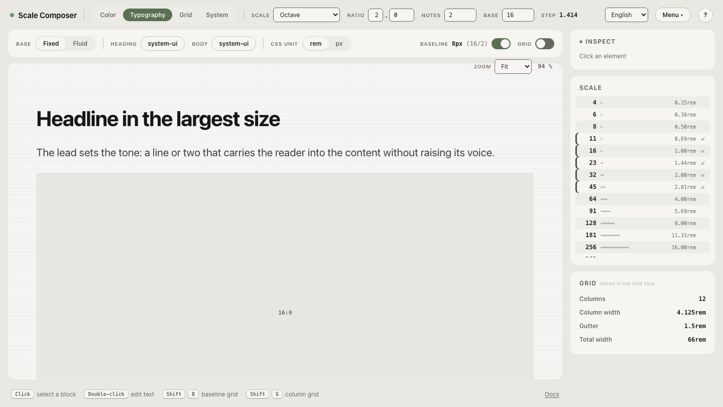
From here, a spacing change is an upstream event: adjust the base or the ratio once, re-export both sides, and the change arrives in the design file and the build as the same numbers. The redline negotiation disappears because there is nothing local left to negotiate.
How do you measure spacing drift in an existing product?
Inventory the distinct spacing values on each side and compare. In code, grep
the stylesheets for margin, padding, and gap values and count the
distinct results; in Figma, sample the gaps and padding across your core
screens. A typical unsynced audit looks something like: 41 distinct values in
CSS, 13 in Figma, 9 shared between them. The mismatch count is the drift,
in one number — and the audit doubles as the migration plan: map each existing
value to its nearest scale step (22 → 23; a lonely 20 becomes a judgment call
between 16 and 23), then converge side by side rather than in one rewrite.
Does syncing the values guarantee consistent spacing?
No — and it’s worth being precise about what the sync buys. Shared exports solve the values: both sides now agree on what exists. Which step goes where — card padding versus section gap versus icon spacing — is usage discipline, and that remains human judgment on both sides of the handoff. A designer can bind the wrong variable to a gap and it will be faithfully, consistently wrong in code too.
What the shared source changes is that the wrong choice becomes visible and
nameable: “that should be space-4, not space-5” is a conversation two
people can settle in a comment thread, where “is that 20 or 24?” was
archaeology. Values by machine, roles by judgment — that’s the realistic
division.
Set up the parity export
Start from the scale rather than from either list: generate the steps, then
put the two exports side by side — the same seven values rendered once as
Figma Variables and once as a Tailwind @theme block — and change the ratio
to watch both update together. That simultaneous movement is the whole
argument for a single source, visible in one screen:
open the parity export in Scale Composer.