Choosing Min and Max Viewports
A team ships a fluid hero with the glide set from 320px to 1920px — the full
range of screens they could imagine. Their layout’s container caps at 1200px.
On every viewport wider than that, the columns stand still while the type
keeps growing: a 3.157rem display heading that renders at ≈53.9px when the
container stops widening has climbed to ≈56.8px by 1920px, inside columns
that never gained a pixel. The text is outgrowing its own layout — fewer
characters fit each line, and nothing else on the page explains why.
The viewport range should span where your layout actually lives: set vp-min at the smallest real screen you serve — commonly 360–390px — and vp-max where your layout stops growing, typically the container’s max-width. Outside the range, the clamp holds its minimum or maximum flat, which is correct behavior, not a defect. The two endpoints are the least-discussed numbers in the fluid formula, and they control everything the slope does. This article is part of our fluid typography guide.
Where should the glide start?
At the smallest viewport your audience genuinely uses — for most products today, a 360–390px phone. Setting vp-min lower (320px is the traditional reflex) isn’t dangerous, but it spends part of your glide on widths that barely appear in analytics anymore: the slope flattens to cover them, and the widths people actually hold get less of the change. The clamp’s minimum already protects anything narrower — a 300px viewport simply gets the smallest size.
The endpoint is a property of your layout and your traffic, not of any device catalog — the device-model trap that plagued breakpoint selection applies unchanged to fluid endpoints.
Where should the glide end?
Where the layout stops growing. Many layouts cap their content width with a container max-width — beyond it, extra viewport becomes margin, and the measure (characters per line) is frozen. If type keeps gliding past that point, size grows against a fixed line length, which is exactly the failure in the opening: text outgrowing its columns. So a clean working convention: vp-max = the container’s max-width. Type and layout then stop changing at the same width, and the composition that was true at 1279px is still true at 2560px, just centered in more margin.
If your container caps at 1200px, glide to 1200. If your layout is genuinely full-width — no cap, fluid columns all the way up — a wider vp-max is defensible, because the line length is still growing along with the type. The convention isn’t a law; it’s an agreement between two systems about where “large” ends.
What happens outside the viewport range?
The clamp holds flat: below vp-min every size sits at its minimum, above vp-max at its maximum. This is the designed behavior, and it’s worth saying plainly because it looks like a bug the first time you resize past an endpoint and nothing moves. An ultrawide monitor gets your maximum sizes — the largest composition you designed — not a poster-sized extrapolation of the slope. A 280px foldable gets your minimum, not text collapsing toward zero. The range is a promise about where interpolation happens; the endpoints are promises about what happens everywhere else.
How much does the range change the slope?
More than either base size does. The
slope is growth divided by range.
Each vw unit is 1% of the viewport width
(viewport units),
so a narrow range concentrates the same growth into fewer percent. Here is
the same 16→18px pair across three ranges:
| Range | Span | Slope term | Preferred value | Character |
|---|---|---|---|---|
| 360→1280 | 920px | ≈0.2174vw | 15.22px + 0.2174vw | steady — ≈0.22px per 100px of viewport |
| 320→1920 | 1600px | 0.125vw | 15.6px + 0.125vw | barely perceptible — the glide is still unfinished on a 1440px laptop |
| 360→768 | 408px | ≈0.4902vw | 14.24px + 0.4902vw | fast — the full change is complete by tablet width |
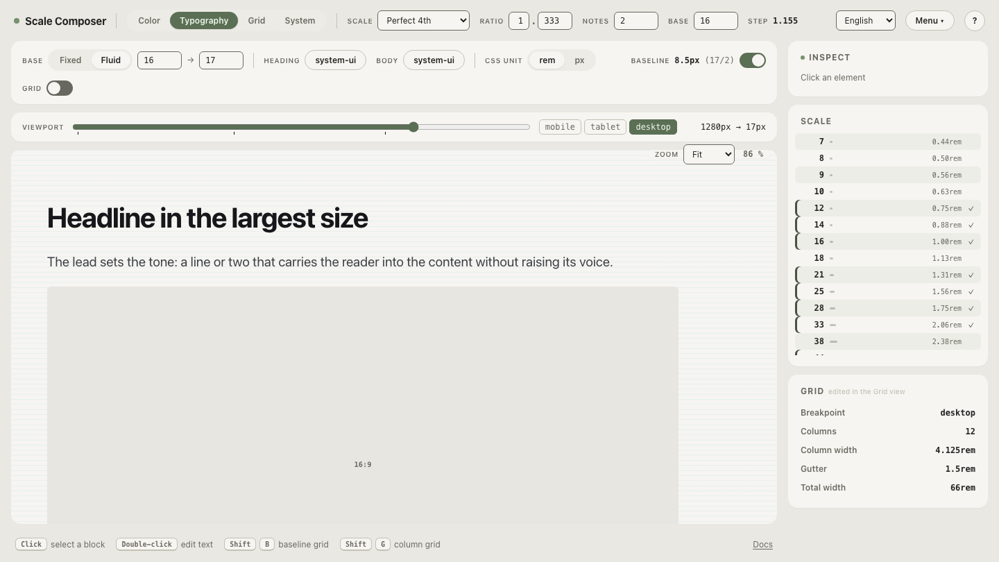
All three verify at their endpoints: 15.22 + 0.2174 × 3.6 ≈ 16 and 15.22 + 0.2174 × 12.8 ≈ 18; 15.6 + 0.125 × 3.2 = 16 and 15.6 + 0.125 × 19.2 = 18 exactly; 14.24 + 0.4902 × 3.6 ≈ 16 and 14.24 + 0.4902 × 7.68 ≈ 18. Same two base sizes, three completely different behaviors — the range is where a fluid system’s character is set. You can feel the difference directly: open the viewport-range controls and drag vp-max inward — the scale’s glide visibly steepens while the endpoint sizes stay put.
Should the glide match the layout grid’s breakpoints?
They’re independent systems — fluid type has no breakpoints of its own. The layout grid keeps stepping its columns regardless of what type does. But independent doesn’t mean unrelated: the two should agree at the edges. vp-max aligned with the container cap is one such agreement; another is checking type at the widths where columns change, because a column jump changes line length, and line length is the context your gliding sizes live in. The glide doesn’t need to know about your breakpoints — it needs to end where the layout’s growth ends.
Test your endpoints
Endpoints are cheap to test and expensive to guess: load the same 16→18 pair on the narrow 360→768 range and drag the preview across both edges — watch the glide finish early and hold flat above 768px. Then set vp-max to your own container’s cap and check the top of your scale at exactly that width. If the largest heading looks right where the columns stop growing, your range is doing its one job: spanning where the layout lives, and nowhere else.