Adapting Brand Colors for Dark Mode
A deep navy brand — ≈oklch(0.38 0.14 265), the confident near-black blue
that anchored every light-mode screen — ships in a dark theme and disappears.
Against a near-black page (L ≈0.22), the primary button now separates from
its background at ≈1.7:1, well under the 3:1 floor for UI components. The
color that was the brand reads as a slightly blue shadow.
The fix is not a new brand color. In dark mode, the brand color’s job is done by a different step of the same ramp — typically one or two steps lighter than the light-mode core, taken from a dark palette derived with its own lightness curve and a chroma boost of roughly 20 %. Recognition survives because hue and role carry the brand, not the exact coordinate. How that derivation works across the whole palette is the subject of our dark mode guide; this article is about the brand color specifically — fills, big surfaces and logos.
Why does the canonical brand value fail on near-black?
Because it was chosen against white. A brand core is typically tuned to sit confidently on light surfaces — dark enough to carry white text, saturated enough to feel vivid against a pale page. Move it onto near-black and it can fail in either direction.
Too dark to separate. The navy above is the extreme case, but even a
mid-lightness core struggles: #2563eb — oklch(0.546 0.215 262.9) — sits
at ≈3.3:1 against a near-black page. Enough for a large fill to register, but
as link or text color it misses the 4.5:1 body-text floor that it cleared
easily on white.
Too dull to feel like itself. Colors read less colorful against dark surroundings — the perceptual effect behind the derived ramp’s chroma boost — so a value that separates adequately can still land flat, a grayer version of the brand. The two failures compound: darkening the surroundings mutes the color exactly when it also has less lightness contrast to lean on.
Which step does the brand’s job in dark mode?
A lighter one, from the ramp the brand already owns. The ramp exists precisely so that the brand is a family of related values rather than one coordinate; in dark mode the accent role re-points from the core to a step one or two positions lighter, and the values come from the derived dark ramp — same seed, its own lightness curve, chroma boosted ≈20 % to counter the muting.
The reason this doesn’t cost recognition: human color perception judges color relative to its surroundings, not as absolute values — the visual system’s color constancy — so a lighter, slightly more saturated blue in the brand’s role on a dark page reads as the same brand blue. It is the same equity logic rebrands rely on: hue plus role carry identity; the exact coordinate is negotiable.
What do the numbers look like for a real brand blue?
Take #2563eb as the light-mode core and derive the dark palette from the
same seed. The dark ramp’s accent step lands around ≈oklch(0.70 0.14 262.9)
— ≈#6F9CF5 — visibly lighter, and carrying more chroma than the light
ramp holds at that lightness (≈0.115 there; the dark ramp’s ≈20 % boost
lifts the request to ≈0.14, still inside the gamut ceiling of ≈0.157 at that
lightness and hue).
| Light-mode core | Dark-mode accent step | |
|---|---|---|
| Value | #2563eb = oklch(0.546 0.215 262.9) | ≈oklch(0.70 0.14 262.9) ≈ #6F9CF5 |
| Vs. its page | strong separation on near-white | ≈6.4:1 on the near-black page |
| White label | ≈5.2:1 — passes 4.5:1 | ≈2.7:1 — fails |
| Dark label (L ≈0.22) | ≈3.3:1 — fails | ≈6.4:1 — passes |
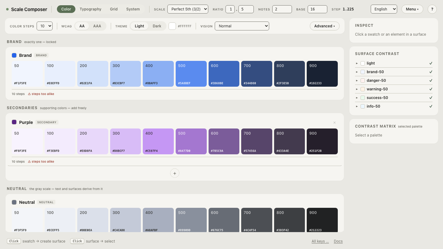
Open this seed with its derived dark ramp in Scale Composer — the light core and the dark accent step marked on their own curves, the chroma boost visible in the dark ramp’s values.
What happens to buttons and their labels?
The table’s last two rows are the part that surprises teams: the label flips. The light-mode button is a mid-blue fill with white text — ≈5.2:1, comfortably legible. The dark-mode accent step is light enough that white text on it drops to ≈2.7:1 and fails, while a near-black label passes at ≈6.4:1. A fill that carried white text in one theme wants dark text in the other.
This is why onFill roles have to be re-checked per theme rather than
assumed — Scale Composer re-derives them with the rest of the semantic roles,
so the dark theme’s button label is a checked value, not an inherited habit.
Any workflow that hand-ports a palette needs the same discipline: every
fill-plus-label pair re-verified on the dark side.
Do large brand surfaces survive the translation?
Usually not as-is. A vivid full-bleed brand hero — the saturated blue band that opens the light-mode landing page — tends to read oppressive on a dark screen: a large, bright, high-chroma field is exactly what dark mode’s low-luminance environment is trying to avoid. The pattern that translates is inversion of quantity, not of color: tinted-dark surfaces (a near-black with the brand hue in it) carrying small, vivid accents. The brand stays present in the surface’s undertone and concentrated in the moments that matter — buttons, links, highlights — instead of painted across the region.
What about the logo?
Logos are assets, not tokens: a token pipeline can re-derive a color role, but it cannot repaint an SVG’s internals or a raster mark. The honest one-line answer is to ship a dark-variant asset — same mark, adjusted fills — and switch it with the theme, the same way the values switch.
Run the flip on your own brand
The label flip is the check most worth doing before shipping. Run the on-fill check on the dark accent step — your seed’s derived dark ramp, the accent’s fill-and-label pairing re-verified for the dark theme, so the button that works at noon in light mode still works at midnight in dark.