Contrast for Borders, Icons and UI Components
Look at the input borders in the products you use daily: a whisper of gray
on white, often a #D1D5DB-class value that measures ≈1.5:1 against the
page. In a dim room, on a low-quality panel, or through aging eyes, the
field boundary simply is not there — the user aims for a text box they cannot
see the edges of. The border passed every review, because reviews look at
text contrast, and a border is
not text.
WCAG covers this under 1.4.11, Non-text Contrast: the visual information required to identify a component or its state — field boundaries, meaningful icons, focus indicators, checked-versus-unchecked differences — needs 3:1 against its adjacent colors. Not against the page: against whatever sits next to it. It is the least-known of the contrast criteria and the one that forces the most judgment calls, which is why it earns its own piece of our contrast guide.
Which UI parts need 3:1 contrast?
Success Criterion 1.4.11 draws its line at identify or operate: whatever a user must see to know a control exists, what it is, and what state it is in. In practice:
- Input borders — when they are the field’s only visible boundary. If nothing else marks where the field starts, the border is doing the identifying and owes 3:1.
- Meaningful icons — the trash can that is the delete button, the magnifier that is search. An icon with a visible text label beside it is off the hook; the label identifies the control.
- Focus indicators. The ring or outline that shows where keyboard focus is must be findable, and 3:1 is its floor.
- Control states — the visual difference that says checked versus unchecked, selected versus not, on versus off.
- Chart elements that carry meaning — the line in a line chart, the slice boundaries a reader must distinguish to read the data.
What is exempt — and where does judgment start?
Three exemptions are clean: pure decoration (dividers, background patterns, ornamental flourishes convey nothing and owe nothing), disabled controls, and components whose appearance the browser itself determines (unstyled native controls).
The fourth is where checklists flatten a real nuance: redundant identification. The criterion requires that the component be identifiable, not that every visual feature of it pass individually. An input with a visible label above it and a fill that differs from the page may be identifiable even if its faint border fails 3:1 — the border is no longer the only thing doing the work. This is honest judgment territory, not a loophole: the question to ask is what a user actually locates the field by, and whether that cue clears the floor. If the answer is “the border,” the border owes 3:1.
What does “against adjacent colors” mean?
Components are measured against whatever they sit next to, not against a global page color. A white input on a light-gray card measures its border against the card on the outside and the white fill on the inside — the page behind the card never enters into it. This cuts both ways: a border that passes on the page can fail on a tinted card, and a fill difference that counts as a boundary in one context vanishes in another. The intuitive reason the floor exists at all: reading text is a foveal task done up close, but finding a control is done at a glance, in the periphery, where weak edges disappear first. A boundary has to survive being looked past, not just looked at.
How does a real input field score?
One input on a white page, inside a light-gray #F3F4F6 card — every value
computed:
| Part | Color | Measured against | Ratio | Floor | Verdict |
|---|---|---|---|---|---|
| border (sole boundary) | #D1D5DB | white fill | ≈1.5:1 | 3:1 | fails |
| same border, outside edge | #D1D5DB | #F3F4F6 card | ≈1.3:1 | 3:1 | fails harder |
| fill difference | white | #F3F4F6 card | ≈1.1:1 | 3:1 | cannot serve as boundary |
| focus ring | #2563eb | white | ≈5.2:1 | 3:1 | passes |
| focus ring, outside edge | #2563eb | #F3F4F6 card | ≈4.7:1 | 3:1 | passes |
| placeholder text | #9CA3AF | white | ≈2.5:1 | 4.5:1 — it is text | fails |
| meaningful icon | #6B7280 | white | ≈4.8:1 | 3:1 | passes |
The shape of the result is typical: the focus ring and icon are fine, the
placeholder fails as text (a separate criterion —
placeholder is not exempt), and
the fashionable border fails everywhere it is measured. The
lightest neutral that reaches 3:1 on white computes to ≈#949494 — visibly
darker than what current taste prefers, which is the design tension in one
number.
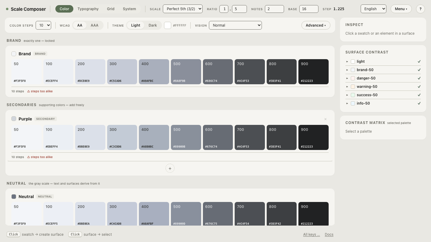
Open this input’s anatomy in Scale Composer — the border, focus and state roles a surface derives, each checked against the 3:1 floor at derivation, with failing parts marked against their adjacent colors.
Can borders stay subtle and still pass?
The tension is real: hairline borders are the current fashion, and a 3:1 border is unmistakably visible. Three resolutions hold up:
- Spend the 3:1 only where the border is the sole boundary. Inputs get the visible border; purely decorative card outlines can stay faint, because decoration is exempt.
- Let the background difference be the boundary instead. A filled field on a contrasting ground can identify itself by its fill — but then the fill difference is what owes 3:1, and most subtle tints fall far short, as the ≈1.1:1 row above shows.
- Keep the focus state at full strength. Whatever subtlety the resting state buys, the focus indicator is the one moment the boundary is being actively hunted — spending the savings there defeats the purpose.
This is also a place where derivation earns its keep: Scale Composer’s role
set includes border, borderSubtle, focus and state roles, with the
3:1 floor applied where the role’s job requires it — a subtle border exists
as its own role precisely so the load-bearing one is not quietly lightened
into it.
Walk a border to the floor
The difference between 1.5:1 and 3:1 is easier to feel than to read about. Take the border role and walk its lightness toward the floor — watch the ratio against fill and card climb as the gray darkens, see where 3:1 lands visually, and judge for yourself how much subtlety survives a border that a user can actually find.