Large Text Contrast Rules
The audit finding nobody expected was the hero. The headline — brand blue on white at ≈3.3:1 — had been classified as exempt from the body-text floor months earlier, correctly: at its desktop 40px it qualified as large text, where 3:1 suffices. What the audit caught was the mobile breakpoint. The responsive scale dropped the same headline to 22px, and at 22px regular it is not large text anymore. Same color, same element, same stylesheet — a pass on one screen width and a failure on another.
WCAG counts text as “large” from 18pt (24px) at regular weight, or from 14pt (18.66px) at bold — and large text’s contrast floor drops from 4.5:1 to 3:1. The size that decides is the rendered size on the actual screen, not the size in the widest mockup. The carve-out is real and useful, and it is also the most misapplied rule in this corner of the standard — which is why it gets its own piece of our contrast guide.
What exactly counts as large text?
The definition of large-scale text draws two lines: 18 point at regular weight, or 14 point at bold. The standard speaks in points, screens speak in pixels, and the conversion — assuming the CSS reference pixel, where 1pt = 1.333px — lands on the two numbers worth memorizing: 24px regular and 18.66px bold. Both are “and up”: 24px regular qualifies, 23px regular does not; 18.66px bold qualifies, 18px bold does not.
Two soft edges are worth naming honestly. “Bold” is not pinned to a specific weight number in the criterion — 700 is safely bold, and whether a 600 semibold counts is judgment territory. And the definition makes no distinction below regular weight: a 24px thin face qualifies by the letter of the rule, even though its hairline strokes are exactly where low contrast hurts most. The rule is a floor, not a model of legibility.
Why does large text get a lower floor?
Because stroke thickness changes what the eye can resolve. Contrast sensitivity depends on spatial frequency — how fine the detail is. The thin strokes of small text are high-frequency detail, where human contrast sensitivity is at its weakest and every point of contrast matters; the thick strokes of a display headline are low-frequency, where the visual system performs near its best and can tolerate a dimmer difference. That is the perceptual reading of the carve-out, lightly held: bigger strokes are simply easier signals, so the standard asks less of their color.
Where does the carve-out legitimately help?
Wherever mid-lightness brand color meets display type. Many brand palettes live in the band that fails body text but clears 3:1 — and for them the carve-out is the difference between “unusable for type” and “usable exactly where the brand wants to be loudest.”
The worked case: a lighter brand blue, #4A8CF7, measures ≈3.3:1 against
white — computed, and short of
the 4.5:1 body floor. As a 32px headline it is
large text, the floor is 3:1, and the pairing passes legitimately. The same
blue set as 16px body copy fails. Flip the pairing for a hero: white display
text on a #4A8CF7 background is the same ≈3.3:1 — legal at 48px, while the
16px white subhead sitting under it in the same hero fails its floor. One
fill, one headline that passes and one line of small print that does not.
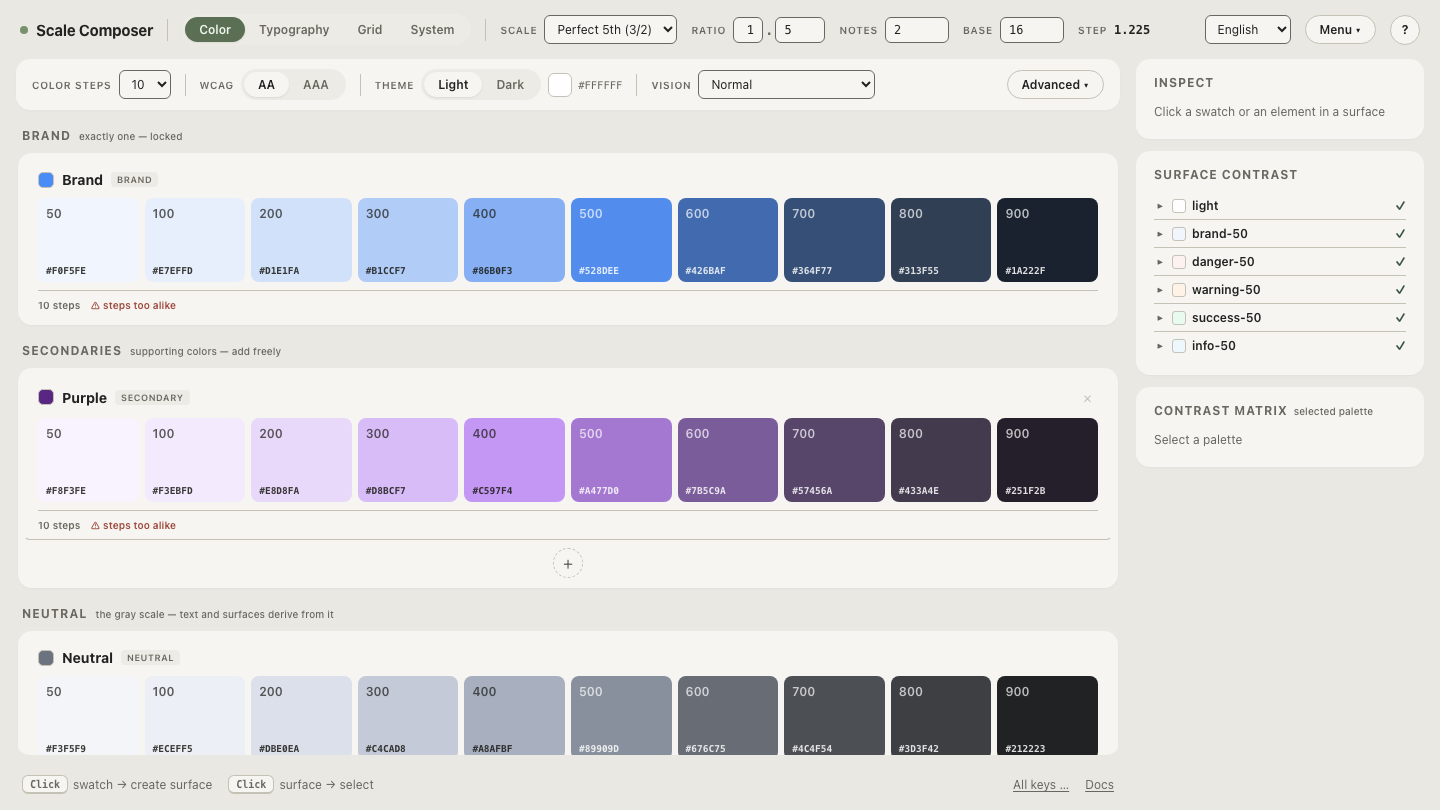
Open this blue at both floors in Scale Composer — the same pairing checked as body text and as large text, one floor broken and one cleared, with the APCA Lc alongside.
Which floor applies at which size and weight?
| Text | Large? | Floor |
|---|---|---|
| 16px regular body copy | no | 4.5:1 |
| 18px bold subheading | no — the bold line is 18.66px | 4.5:1 |
| 18.66px (14pt) bold | yes | 3:1 |
| 20px regular lead paragraph | no | 4.5:1 |
| 24px (18pt) regular | yes | 3:1 |
| 32px thin display numeral | yes by the letter — judge thin faces harder | 3:1 |
| 40px headline that renders 22px on mobile | large on desktop only | 4.5:1 at the small end |
For AAA conformance the same definition applies with both floors raised: 7:1 for normal text, 4.5:1 for large.
What are the common misapplications?
Four patterns cover most of the wrong calls:
- “It’s a heading, so it’s large.” The rule reads sizes, not semantics —
an
h3at 18px regular is normal text and owes 4.5:1. - Applying it to buttons. Most button labels are 14–16px at regular weight, nowhere near either threshold; testing the one oversized button and generalizing quietly extends the carve-out to a whole component class.
- “It’s bold, so it’s large.” Bold lowers the size threshold; it does not remove it. 18px bold sits below the 18.66px line and owes 4.5:1.
- The breakpoint trap — the failure in the opening. The rule follows the rendered size, so fluid type that crosses 24px (or 18.66px bold) somewhere in its range changes floors somewhere in its range. The check belongs at the smallest rendered size, not the largest.
Audit the borderline band
Text that lives between roughly 17px and 24px is where the wrong calls cluster — close enough to the thresholds that weight, fluid scaling or one design tweak flips which floor applies. Load a borderline pairing and check it against both floors — a 20px-class heading tested at 4.5:1 and at 3:1, so you can see whether your color survives being reclassified before a breakpoint decides it for you.