rem vs px vs em for Font Sizes
A documentation site ships with one innocuous rule: li { font-size: 0.875em }.
Top-level list items render at 14px, exactly as intended. Then someone nests a
list, and the inner items render at 12.25px. A FAQ page with three levels of
nesting bottoms out at 10.7px. Nobody typed those numbers — for font-size,
em resolves against the parent’s font size, so every nesting level multiplies
by 0.875 again.
The practical ruling for font sizes: use rem for nearly everything, keep
px for details that shouldn’t scale with text (borders, sometimes shadows),
and reserve em for the rare genuinely local relationship — an icon sized to
whatever text sits next to it. rem resolves against the root font size, so
it respects the reader’s browser setting and never compounds. em compounds
through nesting, which is exactly the list bug above. px ignores the
reader’s setting entirely.
This article is part of our type scale guide: once a scale generates the sizes, the remaining question is which unit carries them into the stylesheet.
How does each unit actually resolve?
pxis fixed:16pxrenders at the same computed size regardless of any font preference. Page zoom still enlarges it — zoom scales everything — but the browser’s font-size setting has no effect on it.rem(“root em”) resolves against the computed font size of the root element, which defaults to 16px and follows the reader’s browser setting.1.5remis 24px on a default root and 30px on a 20px root — a constant per page, the same at every nesting depth.em, used onfont-size, resolves against the parent’s computed font size — which makes it a chain.0.875eminside0.875eminside0.875emgives 14 → 12.25 → 10.72px. The same three list levels declared as0.875remrender 14px at every depth.
That chaining is the sharpest practical difference between rem and em, and
it is why “relative units” is not one category: one is relative to a stable
anchor, the other to whatever happens to be above it in the tree.
Why does rem respect the user where px doesn’t?
Browsers expose a default font size setting — typically 16px — and people who
need larger text raise it, some to 20px, some well beyond. That setting
changes the root font size, so every rem value follows it; every px value
silently discards it. The distinction matters because the setting is not the
same thing as zoom: page zoom is a per-site adjustment that scales the entire
layout, images included, while the font-size preference is a persistent,
browser-wide statement about the reader’s eyes. A px stylesheet overrides
that statement without anyone noticing — the page simply stays small.
WCAG’s resize text criterion
(1.4.4) requires that text can be resized to 200% without loss of content or
functionality. Full-page zoom gets most pages there, so px sizing does not
automatically fail — but a rem-based hierarchy is what lets the reader’s own
default setting work too, rather than forcing them onto zoom for every site.
The intuitive case is simpler than the compliance one: the reader has told the
browser, once, how big text needs to be for them. rem passes the message
through; px drops it.
What does one scale look like in px and rem?
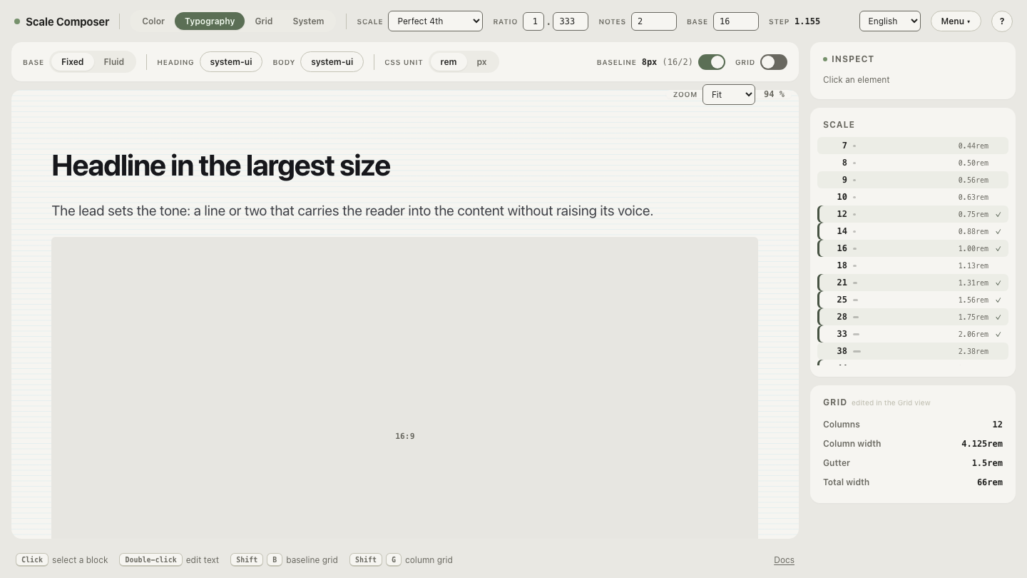
Here is a perfect-fourth modular scale (ratio 1.333, two notes per interval) on a 16px base — the px values rounded first, then converted at 16px per rem, which is the usual token workflow:
| Step | px | rem (÷ 16) | Computed if the reader’s default is 20px |
|---|---|---|---|
| −2 | 12px | 0.75rem | 15px |
| 0 (base) | 16px | 1rem | 20px |
| +2 | 21px | 1.313rem | 26.3px |
| +4 | 28px | 1.75rem | 35px |
| +6 | 38px | 2.375rem | 47.5px |
| +8 | 51px | 3.188rem | 63.8px |
Read the last column against the second: with a raised default, the px column would not move at all, while the rem column reproduces the whole hierarchy 25% larger — every size scaled by the same factor, proportions intact. The reader gets a bigger version of your typography, not a distorted one.
Open this scale in Scale Composer — 16px base, perfect fourth, two notes: the same six steps as the table. Then change the base to 20 and you are looking at the right-hand column live — what every size becomes for a reader who raised their default.
When is em the right unit?
When a measurement should follow the text right next to it, whatever size that
text happens to be. The classic case is an inline icon: give it a width and
height of 1em and it matches its text in a button, a heading, or a caption
without per-context overrides. Component-local padding can work the same way —
a button padded in em keeps its proportions when the same component ships in
a small and a large variant. The test is locality: if the value’s reference
point is “the text here,” em encodes that relationship directly. For
font-size itself, use it deliberately and one level deep at most — chains of
em font sizes are how the nested-list bug gets written.
When is px the right unit?
When scaling with text would be wrong. A 1px hairline border exists to
separate regions; if a reader doubles their text size, the hairline doing its
job at 1px is usually still right at 1px — scaled up it becomes a design
element nobody asked for. Shadows often fall in the same category: they encode
elevation, not reading size, though some systems do scale them by choice. The
principle mirrors the rem argument from the other side: rem for everything
that should grow with the reader’s text, px for the few things whose job is
independent of it.
See your scale through a reader’s eyes
Take the ruling for a test drive: open the same scale at a 20px
base — the table’s last column, live — and compare it against
the 16px version. Everything holds its shape; only the size changes. Then
audit your own product: if its font sizes are declared in px, this bigger,
undistorted version is exactly what readers with a raised default are not
getting.