Type Scales for Mobile vs Desktop
A 51px h1 earns its size on a desktop page: it anchors the layout, sets the hierarchy at a glance, and still leaves the first paragraph in view. Send the same heading to a 375px-wide phone and it stops anchoring and starts devouring — four words wrap into three lines, the opening paragraph drops below the fold, and the reader meets a wall of display type before any actual content.
A responsive type scale solves this by flattening the top, not by shrinking everything: body text stays at 16px on every screen, and the ratio drops on small ones — for example from 1.333 on desktop to 1.2 on mobile, which brings that 51px h1 down to about 33px while body text doesn’t move a pixel. The two scales share one base, one set of steps, and one set of role names; only the ratio differs.
This article covers the mobile-vs-desktop decision specifically; for how scales and ratios work in the first place, start with our type scale guide.
Why can’t the desktop scale just shrink?
Because the bottom of the scale is pinned. To bring a 51px h1 down to 33px by uniform scaling, you’d multiply everything by about 0.65 — which takes 16px body text to roughly 10px. And body text is the one size with no room to give on mobile, for two reasons:
- Readability. Phone text is read at arm’s length, often in motion and in daylight. 16px is a widely used floor for sustained reading on mobile; mobile font sizes below it push many readers into pinch-zooming.
- A practical gotcha worth knowing by name. Safari on iOS zooms the whole page when the user focuses a form field whose font size is below 16px. A long tail of “why does my page jump when I tap the email field” bug reports is exactly this behavior; keeping inputs at 16px avoids it entirely.
So the constraint is asymmetric: the top of the scale has room to move, the bottom doesn’t. That’s why the mobile adjustment is a flattening.
There’s also a perceptual reason flattening works, rather than merely fitting: hierarchy is judged relative to its frame, not in absolute pixels. On a 1440px-wide canvas, an h1 needs to tower over its surroundings to organize them; on a 375px canvas it competes with far less, and roughly twice the body size reads with comparable authority to three times the body size on desktop. A mobile typography scale is flatter, not smaller — the same perceived hierarchy, re-derived for a smaller frame.
What changes on mobile — the base or the ratio?
Keep the base, lower the ratio. The base stays at 16px because it’s the pinned point; the ratio drops from 1.333 to something like 1.2. Every role keeps its step number, and every step recalculates.
An equivalent move is to keep one ratio and cap heading levels at lower steps: mobile h1 uses step 3 (38px) instead of step 4 (51px), and each level below follows suit. That reuses desktop sizes instead of computing new ones, which some teams prefer for a smaller size inventory — though note the floor: shift six roles down one step on a five-step ladder and the lowest heading lands on body size, so capping usually pairs with merging the lowest heading roles. Both approaches flatten the top; the worked example below uses the ratio drop, which keeps all six roles distinct.
What do the same six roles look like at both ratios?
Base 16px in both columns, sizes rounded to whole pixels:
| Role | Step | Desktop (ratio 1.333) | Mobile (ratio 1.2) |
|---|---|---|---|
| caption | −1 | 12px | 13px |
| body | 0 | 16px | 16px |
| lead / h4 | 1 | 21px | 19px |
| h3 | 2 | 28px | 23px |
| h2 | 3 | 38px | 28px |
| h1 | 4 | 51px | 33px |
Two details reward a second look. The span compresses from 3.2× body size (51/16) to about 2.1× (33/16) — the hierarchy keeps its order but lowers its voice. And the caption row moves up: 16 ÷ 1.2 is 13.3, so the smallest text gets slightly bigger on the small screen. Flattening pulls both ends toward the base, which is what a phone wants — a 12px caption is harder to defend at arm’s length than a 13px one.
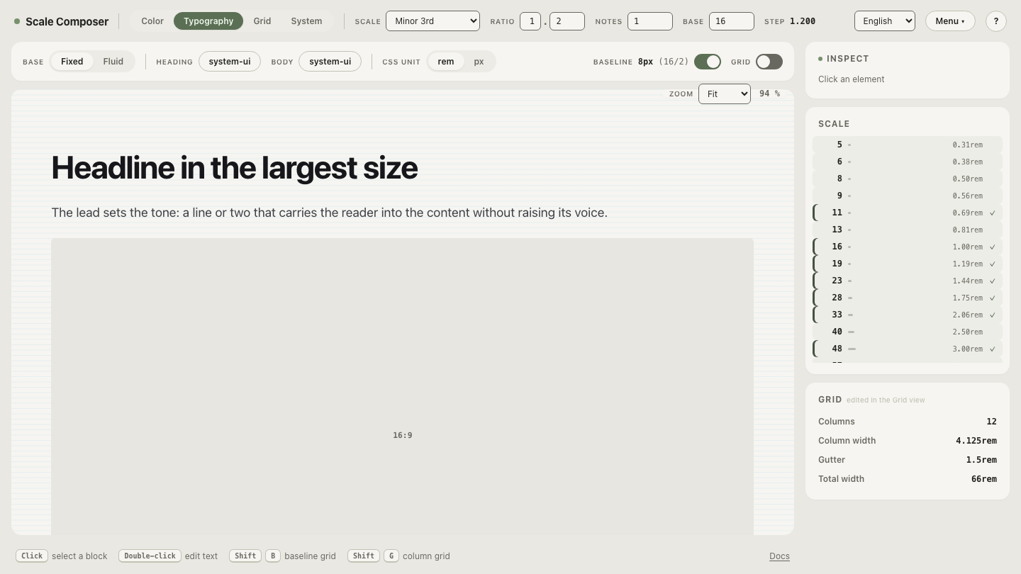
Open the mobile scale in Scale Composer — base 16, ratio 1.2 — and drag the ratio up toward 1.333 to watch the desktop hierarchy re-emerge step by step.
How do you switch scales at a breakpoint?
Two scale definitions, one set of names. The role name is the stable API; the value behind it swaps at the breakpoint. In CSS custom properties:
:root {
  --text-h1: 2.07rem;   /* ≈ 33px — mobile scale, ratio 1.2 */
  --text-h2: 1.73rem;   /* ≈ 28px */
}

@media (min-width: 768px) {
  :root {
    --text-h1: 3.16rem; /* ≈ 51px — desktop scale, ratio 1.333 */
    --text-h2: 2.37rem; /* ≈ 38px */
  }
}
Elements reference var(--text-h1) and never know which scale is active —
components don’t change, the media query does the switching. The
@media mechanics are documented on MDN;
the remaining design decision is where to put the breakpoint, and a single
switch somewhere in the 600–900px range is a common starting point.
Tokens are what make the two-scale setup clean rather than clever. The
Scale Composer exports each scale as DTCG tokens, CSS custom properties, a Tailwind
v4 @theme block, or Figma Variables — the role names stay identical across
both exports, so the mobile and desktop definitions differ only in their
values.
Is a hard switch the only option?
No — fluid type is the smooth alternative: instead of two static scales and a breakpoint, sizes interpolate continuously with the viewport width, so the h1 travels from 33px to 51px gradually rather than jumping. The trade-offs are genuinely different — smoother transitions, but there is no longer a single answer to “what size is the h1?” — and this site covers fluid versus breakpoint typography separately. For a first system, two static scales are the easier starting point: simpler to reason about, test, and hand to a team.
Find your own mobile ratio
The numbers above are a starting point, not a law — a text-dense product might flatten less (say 1.25), an editorial site more. The way to find your value is to watch the collapse happen: drag the ratio down from 1.333 toward 1.2 and note where each heading stops fighting the screen but hasn’t yet stopped ordering it, while body text stays planted at 16px the whole way. Start from the desktop version of the same six roles in the Scale Composer.