The vw Unit Pitfall
The headline shipped as font-size: 8vw and looked superb on the phone it was
designed on — ≈31px on a 390px screen, confident and perfectly proportional.
The first screenshot from an office monitor told a different story: at 1920px
the same headline rendered at ≈154px, six words as a wall of type, and on
wider monitors it kept going. Nothing was broken, in the sense that the
browser did exactly what it was told. That is the vw pitfall in one sentence:
the unit does exactly one thing, and it never stops doing it.
Bare viewport units fail as font sizes for four mechanical reasons: vw has no bounds, it ignores both browser zoom and font-size preferences (a WCAG 1.4.4 failure), it fuses size and growth rate into a single number, and when type and spacing all scale with the viewport, nothing on the page is anchored. The standard fix is clamp() with a rem + vw expression; bare vw earns a place only for full-viewport display text with a rem floor.
This guide is the cautionary reference in our fluid typography guide — what goes wrong, computed at real widths, and the ladder of fixes.
Why does vw font size keep getting written?
Because the seduction is real. One declaration — font-size: 4vw — and text
is perfectly proportional to the screen: no media queries, no tiers, no tables
of sizes. A vw is 1% of the viewport width (see
web.dev’s guide to viewport units
for the mechanics), so 4vw reads as “text that is always 4% of the screen” —
which sounds like exactly what responsive typography was supposed to be. Every
failure below is that same property seen from a different angle: perfect
proportionality is the problem.
What breaks with pure vw font sizes?
1. No bounds. 4vw is ≈14px at a 360px viewport and ≈77px at 1920px — both from the same declaration. There is no floor under readability on small screens and no ceiling over absurdity on large ones. The other failures can be argued about; this one is just arithmetic.
2. Zoom-deaf. Browser zoom scales the CSS pixel, which scales px- and rem-based text — but the viewport’s CSS width shrinks by the same factor, so a vw-based size recomputes to the same physical size. Zoomed to 200%, pure-vw text does not grow at all, and it ignores the browser’s font-size preference for the same reason. That fails WCAG 1.4.4. (The full rem-versus-vw zoom arithmetic is its own topic; the one-line version is that only the rem share of a fluid size responds to zoom.)
3. Slope lock. With bare vw, the size at any given width and the rate of growth are the same number. Want body text at 16px on a 360px phone? That is 16 / 360 × 100 ≈ 4.44vw. But 4.44vw keeps growing at the same rate for every additional viewport pixel, arriving at ≈85px by 1920px. You cannot say “16px on phones, and gently up from there” — choosing the size chose the slope, and the slope is wild.
4. Everything proportional, nothing anchored. The same logic then gets applied to padding and margins (“they scale, so they match”), and the page becomes a scale model: at every width the same poster, photographed from nearer or farther. Text-to-space proportions never adapt, information density never increases on larger screens — a desktop monitor shows the phone layout, enlarged. A page where everything is proportional to the viewport is indistinguishable from a zoomed phone design.
What does 4vw actually render?
The table that makes the case — bare 4vw against a bounded clamp built for the same job (a display heading meant to read ≈28px on phones and cap at 48px):
| Viewport | font-size: 4vw | clamp(1.75rem, 1.4615rem + 1.2821vw, 3rem) |
|---|---|---|
| 320px | 12.8px | 28px (min holds) |
| 360px | 14.4px | 28px |
| 768px | ≈30.7px | ≈33.2px |
| 1280px | 51.2px | ≈39.8px |
| 1920px | 76.8px | 48px (max holds) |
Where the two columns roughly agree — around the high 700s — is the kind of width where 4vw “looked right” in someone’s browser during development. Everywhere else they diverge, and the clamp column is the one a designer would sign off at every row.
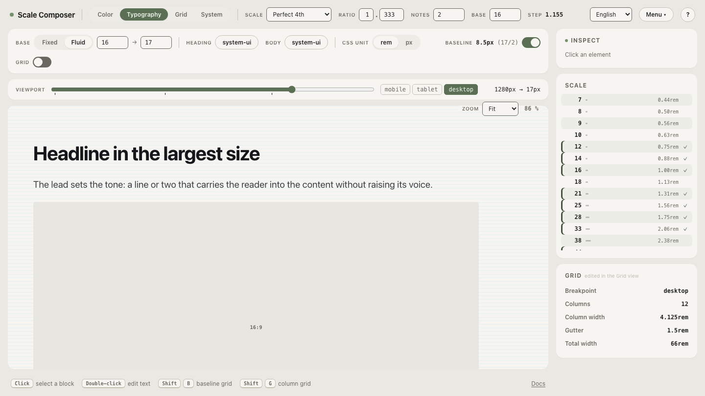
The second column, live: open a bounded fluid setup in Scale Composer — fluid mode is defined by four numbers (the base at vp-min, the base at vp-max, and the two viewports), and the CSS export writes each fluid value as a clamp with its real pixel range in a comment: the bounds 4vw never had, made explicit.
How does clamp() fix each failure?
The fixes stack, one per failure:
- Bounds:
clamp(min, …, max)restores a floor and a ceiling — the small-screen and huge-screen disasters become the two flat zones of the curve. - Zoom: the preferred expression mixes rem with vw. In the table’s clamp, most of the mid-range size comes from the rem term, so zoom reaches most of the text.
- Slope: intercept and slope are two independent numbers. “16px at 360px and a gentle rise” is now expressible: the rem term sets the anchor, the vw term sets the rate.
- Anchoring: the root-clamp architecture — one fluid clamp on the root font size, everything else in rem riding it — scales type and spacing on one shared slope while borders and fine geometry stay in px. The page breathes; it doesn’t zoom.
When are viewport units for font size legitimate?
One carve-out, stated precisely: full-viewport display text — a hero line, a poster number — where poster-like scaling is the actual design intent, and only with a rem floor:
font-size: max(2rem, 6vw);The max() guarantees the text never renders below 2rem, and under deep zoom the shrinking CSS viewport hands control to the rem floor, so the text is not permanently zoom-deaf. Through the normal range it still scales like a poster — which here is the point. That trade is defensible for a few display words; it is a poor trade for headings in running content, and no trade at all for body text.
Replace the number that did two jobs
Take the table’s lesson into the tool: load the bounded setup and change one parameter at a time — raise the base at vp-max and watch the export’s pixel-range comments follow while the floor stands still. Size and slope moving independently is the whole repair: 4vw was one number doing two jobs, and clamp() is the demotion it needed.