When NOT to Use Fluid Type
A team ships fluid typography across their analytics dashboard, and the first casualty is the QA pipeline. Every table row’s height is now a function of window width; the screenshot-diff suite — built on the assumption that the same page renders the same pixels — drowns in false positives, and every legitimate regression hides in the noise. The type itself looks fine. The workflow around it broke.
Fluid typography has real drawbacks, and they cluster: dense application UI where sizes must be predictable, QA and handoff workflows built on fixed renders, extreme glide ranges that change a page’s character mid-glide, zoom-critical audiences served by steep slopes, and the plain onboarding cost of sizes that are formulas. For products living in those clusters, fixed sizes — with or without breakpoints — are the better call. This capstone of our fluid typography guide catalogs the failure cases the technique’s advocates skip.
Why does dense app UI resist fluid type?
Three reasons stack. First, budgeted heights: tables, toolbars and list rows are designed against a height budget — a 40px row holds 14px text with its padding, exactly. Let the text glide and the budget either breaks (overflow, clipped descenders) or every container goes fluid too, which multiplies the moving parts in exactly the kind of interface that has the most parts. Second, narrow real ranges: an app window on a desktop lives between roughly 1000 and 1900px — a glide across that band changes body text by a pixel, all cost and no visible benefit. Third, specifiability: app teams reason in exact values (“labels are 13px”) for density decisions, keyboard-row alignment, virtualized list math. “Labels are a formula of the window width” makes each of those harder for no gain a dashboard user would notice.
What does fluid type do to QA and handoff?
It removes the fixed render those workflows assume. Screenshot-diff testing compares pixels at agreed widths; with fluid values, every width is a distinct render, so the suite either pins its test widths (and stops covering the glide it ships) or accepts noise. Pixel-spec handoffs suffer the same way: a redline saying “17.3px at this width” is technically correct and practically useless. The workflow answers exist — test at the clamp’s endpoints plus the layout’s breakpoints, hand off the four fluid parameters instead of per-width values — but they are process changes, and a team adopting fluid type without adopting them experiences the technique as breakage. The cost is real even when it is worth paying; in screenshot-heavy organizations it sometimes isn’t.
Why do extreme ranges backfire?
Because a glide is an interpolation, and interpolation between two good designs is not automatically a good design. A gentle glide — body 16→18px — passes through values that all read as the same composition, slightly retuned. A dramatic one — body 14→28px, say — passes through a middle zone nobody designed: at 900px wide the page is neither the compact phone layout nor the airy desktop one but an unexamined average of the two, and it is the render many users actually get. The wider the range, the more of the product’s life is spent in territory no one looked at. The working rule: keep glides gentle (the 1.1–1.15× band), and when a design genuinely needs to transform between phone and desktop — different hierarchy, not just different size — use breakpoints, which express transformation honestly, and let fluid handle only the drift between them.
Where do zoom and familiarity costs land?
Two smaller entries, stated briefly because siblings cover the depth. The accessibility one: a clamp’s zoom response degrades as its slope steepens — gentle glides are ~90 % rem-driven and zoom nearly proportionally, steep ones shift weight onto the vw term and respond at 150–170 % when the user asked for 200 %. Products serving low-vision audiences should either keep slopes shallow or stay fixed. The human one: fluid systems make “what size is this text?” a computed answer, and every new teammate pays a small tax learning to read clamps before they can debug type. Neither cost is disqualifying; both belong on the invoice.
Is it all-or-nothing?
No — and the mixed modes are often the right answer. Fluid spacing over fixed type is a legitimate combination for app UI: margins and section gaps breathe gently with the window while text stays at specifiable sizes — the layout adapts, the content doesn’t wobble. The reverse — fluid type in the content column of an otherwise fixed app shell — suits documentation inside products. And per-surface splits are coherent: a marketing site fluid, the app behind the login fixed, both generated from the same scale.
The decision checklist, compressed:
| Signal | Leans |
|---|---|
| Content-driven pages, wide audience widths | fluid |
| Dense data UI, narrow window range | fixed |
| Screenshot-diff QA, pixel handoffs | fixed (or process change first) |
| Reading-heavy, low-vision audience | fixed, or fluid with a gentle slope |
| Marketing + app from one system | mixed, per surface |
See the same system rendered in fixed mode — the identical scale, ratio and hierarchy with the glide switched off: exact sizes at every width, the app-UI configuration.
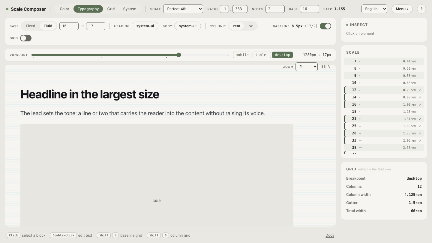
The decision is a toggle, not an architecture
The quiet good news at the end of the drawbacks list: choosing wrong is cheap to reverse when fluid is a rendering mode on top of the scale rather than a rebuild of it. The sizes, the ratio, the hierarchy and the tokens are identical either way — fluid mode adds four parameters and swaps the export’s values from rem constants to clamp expressions. Flip the Fixed/Fluid toggle on the same system and watch the exports switch; run your product’s honest answers through the checklist above, pick a mode, and know that the day the answer changes, the change is one toggle — not a migration.