Line Height in Fluid Systems
When font sizes glide with the viewport, line heights have three ways to respond: unitless multipliers that scale with whatever the size currently is, rem-based baseline multiples that ride the same root clamp and lock the size-to-leading ratio through the entire glide, or per-value clamps that let leading follow its own curve. Most fluid systems need the middle answer, a few display styles earn the third, and knowing which is which keeps fluid type from unraveling vertically. This is the leading-specific piece of our fluid typography guide; what line height should be at each size is the type scale’s territory — this article is about what it should do while sizes move.
What happens to leading if you do nothing?
It depends on the unit, and the difference is the whole topic. A line height declared in px stands still while its text glides — a heading growing from 28px toward 31.5px inside a fixed 36px line gets visibly tighter as the viewport widens, and past some width the leading that looked generous on a phone reads cramped on a desktop. Nobody chose that compression; it is the default outcome of mixing one fluid quantity with one frozen one — the same drift that argues for fluid spacing, playing out inside the text block itself.
So the real question is not whether leading should respond to the glide — it must — but which mechanism carries it.
When are unitless multipliers enough?
line-height: 1.5 is computed against the element’s own font size, so it
glides automatically: 1.5 of 16px on a phone, 1.5 of 18px on a wide screen,
1.5 of every value between. For body text this is simple and correct — the
unitless form
also inherits safely, which is why it has been the standard recommendation
for years.
The cost appears across the scale, not within one size. Large text wants proportionally tighter leading than body text — the size-dependent curve every type system encodes — so one unitless value for the whole page is wrong at the ends regardless of fluid mode. Per-level unitless values (1.5 for body, 1.3 for headings, 1.1 for display) fix that and still glide. What unitless values cannot give you is a shared rhythm: each element’s leading is a private ratio, and no common unit ties the text block’s heights together.
How do rem-based baseline multiples behave in a glide?
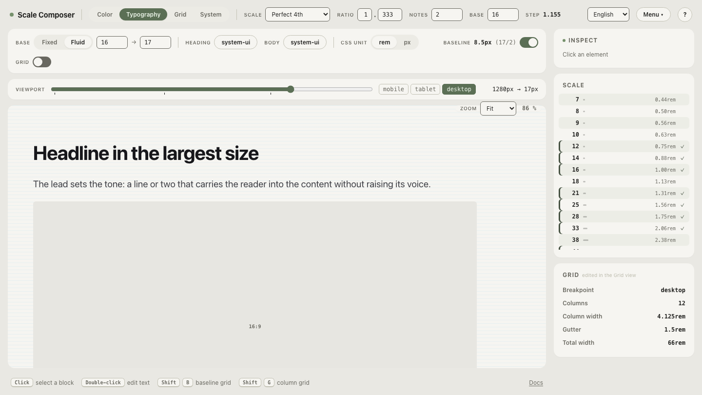
This is Scale Composer’s approach, and it has a property worth spelling out. Line heights in the system are baseline multiples expressed in rem — body 16px sits on a 24px line written as 1.5rem, a heading’s 36px line is 2.25rem. In fluid mode, the root font size carries the glide and every rem value rides it — sizes and line heights alike. Both numerator and denominator scale by the same factor, so the ratio between a size and its leading is locked at every viewport width.
Traced concretely — a 1.75rem heading on a 2.25rem line, base gliding 16→18 across viewports 360→1280:
| Viewport | Root | Heading size | Line height | Ratio |
|---|---|---|---|---|
| 360px | 16px | 28px | 36px | ≈1.286 |
| 820px | ≈17px | ≈29.8px | ≈38.3px | ≈1.286 |
| 1280px | 18px | 31.5px | 40.5px | ≈1.286 |
The proportion the designer set is the proportion every reader gets, regardless of screen — and because all line heights are multiples of the same rem-based baseline, the rhythm unit itself glides: the 8px baseline is 8px at the narrow end and 9px at the wide end, with every text block still counting whole units of it. Vertical rhythm survives fluid mode by scaling, not by breaking.
Open a fluid system with the line-height column visible — sizes and leadings both in rem, riding one root clamp, with the ratios holding still while the viewport simulator moves.
When does leading deserve its own clamp?
When a style should change its character through the glide, not just its size. The classic case is display text: a hero heading growing from 28px on phones to 48px on desktops arguably wants its leading to tighten as it grows — big type reads as a shape, and shapes want less air. A per-value clamp expresses that: size glides 28→48px while the leading glides 32→52px,
h1 {
  font-size: clamp(1.75rem, 1.2609rem + 2.1739vw, 3rem);     /* 28 → 48px */
  line-height: clamp(2rem, 1.5109rem + 2.1739vw, 3.25rem);   /* 32 → 52px */
}
and the ratio falls through the glide by design: 32/28 ≈ 1.14 at the narrow end, 52/48 ≈ 1.08 at the wide end (both expressions verified at both endpoints). That falling ratio is unreachable with unitless values or baseline multiples — they hold ratios; this curve bends one.
The cost is the usual per-value cost: two clamps per style to keep consistent, and a leading that no longer lands on the shared baseline. The honest guidance: reserve it for the one or two display styles where the character shift is the point, and let the locked-ratio machinery carry everything else.
Which mechanism for which text?
- Body and UI text — baseline multiples in rem (locked ratios, shared rhythm) or per-level unitless values if rhythm is not a goal. Either glides correctly; the rem road additionally keeps the baseline grid alive.
- Headings — baseline multiples, with the tighter-per-level ratios the type scale already assigns. The glide preserves whatever curve you set.
- Display — the one candidate for its own leading clamp, when a ratio that bends through the glide is genuinely wanted.
Check your own ratios through the glide
The failure mode this article exists to prevent is silent: leading that drifts while everyone looks at font sizes. Open the fluid system and read the ratio at three widths — drag the viewport simulator to the minimum, the midpoint and the maximum, and check that each level’s size-to-leading ratio is the one you chose. If a ratio moves and you didn’t design the movement, the unit — not the value — is where the fix lives.