Design Tokens vs Style Guide
The new brand portal launched to applause: every color painted as a generous swatch, hex codes typeset in the captions, spacing diagrams, a page per component. Within a year it was quietly wrong. A contrast fix had nudged the brand blue in code; the portal still showed the old value; and designers had learned to eyedropper from the newest production screen instead. The most carefully made documentation in the company had become the least trusted.
A style guide and design tokens document different halves of one system:
the style guide carries intent and usage for humans — when each heading level
applies, how the voice sounds, what a don’t looks like — while tokens carry
the values for machines, as named entries a build step reads directly. They
compose by reference: the modern guide names tokens (accent, space-4)
instead of embedding their values, so it cannot go stale the way that portal
did. This article takes the documentation-architecture view; the token
fundamentals live in our design tokens guide. (If
the terms blur: a design system is the umbrella, and the style guide and the
token file are two of its strata — this piece is about how those two divide
the work.)
What does a style guide do that tokens cannot?
A style guide is a set of standards for how things are designed and written, and its irreplaceable content is judgment, not numbers. When to use which heading level, and why skipping one hurts. What the photography should feel like, shown as a good and a bad example side by side. Why the accent color is reserved for actions, and the accessibility rationale behind which pairings are allowed. How the brand sounds — with the sentence it would say and the sentence it wouldn’t.
None of this fits a token schema. A token can state that text-primary is a
particular near-black; it cannot explain what counts as primary text, or hold
a don’t-example — which is among the most information-dense forms of design
documentation and has no token equivalent. This is the style guide’s real
job, and tokenization doesn’t touch it. What dies is only the guide’s other
habit: carrying values.
What do design tokens hold that a style guide cannot?
The exact answers. brand-600 is one specific blue — #2563eb, which is
oklch(0.546 0.215 262.9) — stored once, in a file that Figma, a stylesheet
build and a native app
read without a human in between. A guide can only
display a picture of that value and hope each reader extracts it faithfully;
the token is the value, with no rendering step to survive and no reader to
approximate it.
How did style guides become “living”, and why wasn’t that enough?
The history runs in three generations. The first was static: printed manuals, then PDFs and web pages, with values painted into swatches and captions — copies from the day they shipped. The second, the living style guide, generated its pages from production code, so the swatches showed what actually shipped — but it was still read-only: a mirror of values rather than a source of them, true while you looked at it, with no authority over the next change. The third shape inverts the relationship: the documentation references tokens by name, the token file owns the values, and other artifacts — including the guide’s own swatches — are rendered from it. A guide built this way cannot lie about values, because it doesn’t carry any.
Why do documented values rot?
Because every value a document embeds is a copy, and copies maintained by
different hands drift apart — the same one-sentence mechanism behind most
design-versus-code drift stories. A guide that says #2563EB is correct until
the first retune anywhere else in the system; a guide that says brand-600
stays correct through every retune, because it states a relationship instead
of a snapshot. The intuitive version: a copy can be stale, a pointer cannot.
Asking the reader to look one thing up is the price of never telling them
something false.
What does the same button documentation look like both ways?
Value-embedded, the way the first-generation portal wrote it:
Primary buttons use the brand blue (#2563EB) as their background, with white text, 16px of side padding and a 6px corner radius.
Token-referenced:
Primary buttons use
accentas their background, withon-accenttext,space-3side padding andradius-smcorners. Use one per view, for the page’s main action; anything else takes a secondary button. Current values live in the token file.
Now run a rebrand through
both. The palette re-derives from a teal seed:
brand-600 keeps its name and stores a new value, and accent — the role
the button documentation names — still points at it. The token-referenced
paragraph is untouched and still true. The value-embedded paragraph now
states a false hex — and its other three embedded values (white, 16px, 6px)
are separate liabilities, each waiting on its own retune. Notice also what
the token version gained room for: freed from carrying values, it spends its
length on usage — one per view — which is the content a guide exists to
hold.
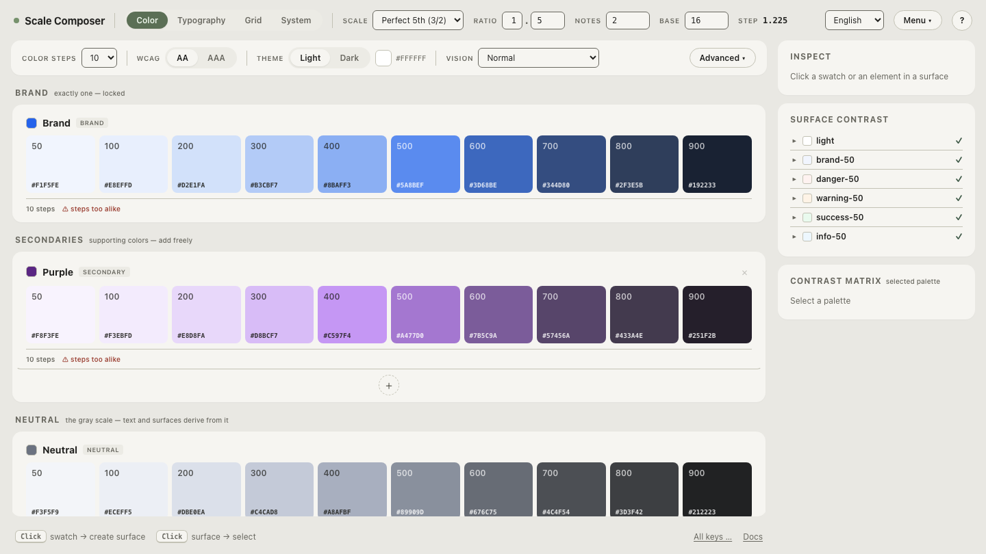
Open the roles this documentation names in Scale Composer —
the semantic layer with accent, on-accent and the rest of the derived
roles beside their current values and the contrast floors each pairing is
checked against. This is the half of the pair a token-referenced guide points
at: retune the seed and the names hold while the values answer differently.
How do tokens, documentation and examples compose?
As a trio with one direction of reference. The token file holds the values. The style guide holds intent and usage, naming tokens wherever a value is meant. Live examples — rendered components, swatch pages, specimen text — are generated from the token file, so even the pictures are views of the source rather than rivals to it. Each artifact does the one job it is structurally suited to: prose transfers judgment, tokens transfer values, and rendered examples transfer the gestalt that neither prose nor JSON can. Teams sometimes run the trio as a pair — tokens plus a referencing guide, examples deferred — and that works; collapsing to one artifact is the arrangement that fails, whichever one is kept.
Rewrite one paragraph of your guide
The shift is easiest to judge on a single paragraph. Take one value-carrying rule from your current guide — the button spec above is a template — and rewrite it to name roles instead of embedding numbers. Generate the token set for your guide to reference — seed it with your brand color, let the derived roles become the names your documentation points at, and export the file so the guide’s values have a home that isn’t the guide.