What Is a Color Ramp (Color Scale)?
A color ramp — also called a color scale — is one hue expressed as an ordered run of lightness steps: typically around ten swatches of the same color, from a near-white tint down to a near-black shade, labeled from 50 at the light end to 900 at the dark end. The ramp is the atomic unit modern UI palettes are built from — a palette is a set of ramps, not a set of individual colors.
That structure is close to universal now. Google’s Material Design organizes its entire system around tonal scales of each hue, Tailwind ships every default color as a stepped scale, and Radix publishes its colors as twelve-step scales. The step counts and labels differ; the idea does not: color arrives as an ordered family, not as a swatch. This article covers what a ramp is, what each step is for, and why the structure won — the foundation for everything else in our color scales guide.
Why one color at many intensities, rather than many colors?
Count what a single blue button asks of an interface. A resting fill. A hover shade. A pressed shade. A disabled version. A focus ring. A pale wash behind the row it just selected. A border for its outlined variant. A darker blue that stays readable as link text. One brand color — and already eight distinct values, before dark mode doubles the list.
That is the intuition the ramp is built on: interfaces need the same color at many intensities far more often than they need many colors. Most of what looks like color work in a UI — states, emphasis, depth, selection — is really intensity work on hues already present.
Without a ramp, each of those needs gets answered by invention: an eyedropper, a “lighten by 20 %”, a by-eye guess — each made in isolation, each slightly off from the last, until the product carries a dozen almost-blues nobody can reliably tell apart or remember. With a ramp, every need is answered by a neighbor: the hover fill is typically the next step along, the selected wash comes from the lightest steps, the border from the light-middle ones. Choosing replaces inventing, and consistency stops depending on memory.
What does each step of a color ramp do?
The bands below are a working convention shared by many systems rather than a rule, but they hold up well in practice:
- 50–100 — tints and backgrounds. Washes, selected rows, subtle chips: color felt across a surface rather than looked at.
- 200–300 — borders and hover fills. Dividers, input strokes, the fills of secondary hover states.
- 400 — the bridge. Icons and secondary emphasis; often the least-used step.
- 500–600 — the brand core. Buttons, links, active states: the version of the color people would name as “the brand blue”.
- 700–900 — text and dark surfaces. Steps dark enough to read as text on the light tints, and to serve as brand-toned dark surfaces.
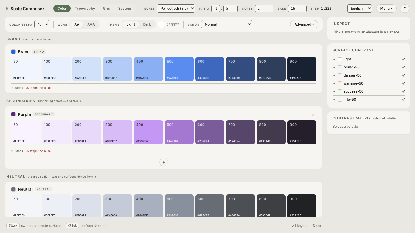
Here is that anatomy on a real ramp, generated in Scale Composer from the seed
#2563eb — which is oklch(0.546 0.215 262.9) — with the scale ratio at
1.333:
| Step | L | Hex | Typical job |
|---|---|---|---|
| 50 | ≈0.97 | #F1F5FE | page wash, selected-row background |
| 100 | ≈0.94 | #E2EBFC | hover wash, tinted chips |
| 200 | ≈0.88 | #C8D9F9 | dividers on tint, decorative borders |
| 300 | ≈0.81 | #A5C1F6 | default borders, input strokes |
| 400 | ≈0.72 | #7DA5F2 | icons, secondary emphasis |
| 500 | ≈0.63 | #4E82EE | buttons, links, active states |
| 600 | ≈0.52 | #3A64BA | hover and pressed on the core |
| 700 | ≈0.42 | #334C7F | text on the light tints |
| 800 | ≈0.36 | #2D3C58 | dark surfaces, high-emphasis text |
| 900 | ≈0.25 | #192233 | darkest text, brand near-black |
Two details are worth reading out of the table. The seed’s own lightness (≈0.55) lands between steps 500 and 600 — the generated ramp places its brand core where the brand color actually lives. And the lightness values are not evenly spaced: the light steps sit close together while the dark end takes bigger strides, because the light end is where the jobs crowd. That spacing is deliberate — generated ramps place their steps on a curve, which is a topic of its own.
Open this ten-step blue ramp in Scale Composer — the same table as live swatches, each step labeled, with its lightness and hex visible.
Where do a ramp’s step values come from?
In hand-built ramps, from a designer’s eye. In generated ramps, from rules — worth a summary because it explains what the screenshot above is doing. Steps are placed on a lightness curve that concentrates resolution at the light end. Saturation follows its own plan, peaking where the ramp works hardest and held to a floor at the ends so the extremes stay recognizably on-hue. Chroma is capped below the gamut ceiling at each lightness, so no step gets clipped into a different-looking color. And when two neighboring steps come within 0.02 L of each other — roughly a just-noticeable difference — the Scale Composer warns that they have started to collapse into sameness. Each rule is its own topic; the point here is that a ramp’s steps are placed, not collected.
Is a color ramp the same as a gradient?
Related, but no. A gradient is continuous — every value between two colors
exists. A ramp is discrete: a fixed set of named steps. (The term “color
ramp” also lives in 3D and data tools — Blender’s Color Ramp node,
cartographic ramps — where it usually means mapping a value range onto a
gradient; UI design borrowed the word for the stepped form.) The discreteness
is the point: steps can be named, referenced in code as tokens like
blue-500, exported, and versioned. A gradient can only be sampled; a ramp
can be spoken about.
How many steps does a ramp need?
Around ten is the common default, and Scale Composer’s variants bracket it: an eight-step set for leaner palettes, ten as the default, and a twelve-step set that adds 950 and 975 — near-blacks that earn their keep in dark interfaces. More useful than the count is the distribution: whatever the number, a ramp needs most of its resolution at the light end, where the surface and border jobs crowd.
A ramp proves itself by what it can answer. Put a single swatch next to a full ramp in Scale Composer — task both with the same card: a fill, a hover, a border, a tinted background, readable text on the tint. The swatch answers once and runs out; the ramp has a neighbor for every question.